The Seven Network logo promises such a bright spectacular performance that the audience will not be able to move away from the screen for seven or more hours in a row. The emblem is a symbol of uninterrupted broadcasting and selection of the best shows and films.
The Seven Network: Brand overview
| Founded: | 4 November 1956 |
| Founder: | Seven West Media |
| Headquarters: | Eveleigh, New South Wales, Australia |
| Website: | 7plus.com.au |
The Seven Network is one of Australia’s most popular television channels. It operates as part of the free-to-air television network and has delighted viewers with interesting programs for more than 60 years. The most famous series, shows, movies, news blocks, etc., periodically appear on the air.
The free-to-air network is now owned by Seven West Media, a major media company with the highest ratings in Australia. It is headquartered in Sydney. But it wasn’t always like this. The channel has a long history, during which not only the owners have changed, but also the scale of broadcasting.
Meaning and History
The foundation for forming today’s The Seven Network was laid back in the 1950s. At that time, several independent stations appeared in different country cities, which operated only in a certain territory. The first was founded in Melbourne and launched in 1956.
Later came a station in Sydney. In 1959 the list was completed by a station in Perth, which became the first commercial network in the city. Brisbane and Adelaide’s stations also followed. All of them functioned as independent units. But, over time, the owners set out to create partnerships and merge the stations. From this point, the history of The Seven Network began.
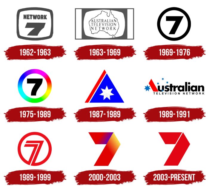
1962 – 1963
In 1962 (July 1), a fateful decision was made, which was the beginning of forming the prototype of the modern channel. Its essence was to unite the two major stations, HSV-7 (Melbourne) and ATN-7 (Sydney). Later this union was joined by Adelaide and Brisbane stations.
As a result, a new Network 7 network emerged in the television space. The company took care not only to create high-quality broadcasts but also to create a visual identity. For example, viewers saw on their screens a laconic icon in the form of a television with the characteristic number 7 and an inscription inside.
The design accurately described Network 7 and the vector of its activity. There was nothing extra in the logo, just a big number in bold type, the name of the company in printed style, and a border in the form of a screen.
This meant that the company was concentrating solely on creating quality on-air products that appeal to Australians. The effort was not in vain, and soon the channel’s corporate identity became recognizable. It did lend itself to changes later, but the number 7 always remained on the logo.
1963 – 1969
1963 was another period of dramatic change for the channel. This year saw some internal changes to the company, resulting in its larger name, Australian Television Network. The rebranding was not only reflected in the name but also the corporate logo. The contours of a TV set remained in the new badge but already in a new format.
Inside the monochrome frame, there was a map of the continent (only contours) and a three-level inscription, made in capital letters without serifs. The updated logo signaled that the company’s course remained unchanged but that the television network had expanded its reach. This meant that the brand was evolving and striving to improve its technology.
1969 – 1976
This period could be called a return to its roots in terms of identity. The Australian network returned to the laconic name Seven Network. This happened in 1969. The logo and corporate identity were also changed at that time. A brutal and powerful symbol appeared on the TV screens in a minimalist design. The color of the badge did not change – it was still made in strict black and white.
The filling of the emblem has changed. All inscriptions were removed, and only the traditional number 7 was left. It looked more massive than on previous versions. But this did not spoil the emblem. On the contrary, it looked very elegant and modern according to the standards of that time.
The choice of such a design symbolized the national positioning of the channel and the strengthening of its internal structure. Seven Network was moving steadily and confidently towards high ratings on television. And in the years that followed, it succeeded.
1975 – 1989
The next stage of the company’s development began in 1975. Black and white television was replaced by color broadcasting. Under the influence of the event, the television channel’s logo was also changed. The contours of the emblem became softer and, at the same time, more expressive, and the right side of the number 7 was slightly curved. This added a certain elegance. In addition, the colors of the frame changed.
The bright ring was painted in iridescent shades with gradients. The execution was bolder than the previous version. This meant only one thing – Seven Network became a recognizable brand that was able to make a name for itself at the national level. In addition, the owners were always trying to “keep up with the times,” so they changed the design to match new trends.
1987 – 1989
During this period, another rebranding of the television network took place. In 1987 the company changed its logo and name concept. Seven Network again became the Australian television network. But, this time, a completely different design was chosen. The symbol of the channel became an icon in the form of a triangle, made in 3 colors.
The logo combined white, red, and blue colors. Most of it was painted in blue. There was a white star in the background of this area, and the emblem was complemented with a red diagonal line on the left. It was the only badge with no inscriptions or pronounced numbers. The seven here were read-only in the symbol of the seven-pointed star. While emphasizing boldness and expressiveness, the bright logo did not last long.
1989 – 1991
In 1989 it was decided to refine the emblem. The triangle was dissolved and turned into the letter A, and the remaining details were attached to the inscription. The first word beginning with the triangle meant “Australian” and the rest “television network.” All together denoted the name of the television station. The star and triangle changed colors, emphasizing the company’s willingness to change.
In addition, the style was “freshened up” with the addition of blue snowflake-like stars. Despite the stylish design, this design was soon changed. In January ’89, the company returned to the traditional name Seven Network.
1989 – 1999
After returning the name, the board decided to change the logo fundamentally. Designers created a completely new concept of corporate identity, which confirmed the brand’s desire for perfection in everything. Now the red logo appeared on the screens.
In the center is located the already familiar to viewers number 7 but in a more interesting version. It got the original texture, which implied a white line inside. The circle remained the same but changed its color to red. This design was particularly memorable and symbolized the dawn of activity.
2000 – 2003
The beginning of 2000 was a significant period for Seven Network. At this time, the brand’s visual identity reached a new level. The circular logo was replaced by a badge with a ribbon. The number 7 was given a new rendition in conjunction with the Olympics, which took place in Australia over the summer. As one of the best TV channels on the national scale, Seven Network timed the logo to the event. It was decided to use the logo in 5 colors (green, red, yellow, orange, and blue).
2003 – today
After the Olympics, there were changes in the corporate style of the TV network again. This time, the ribbon style of the image was retained, as well as the dimensions of the number (thickness, shape, and size). The new icon consisted of 2 thick red elements placed at a small distance. It symbolized reliability, expressiveness, and stability. In 2012, a small adjustment was made to the design – the upper right corner became light red.
Font and Colors
The modern Seven Network logo is made in the best traditions of minimalistic visual identity. It combines contemporary fashion trends with elements that emphasize respect for the brand’s history. The emblem is based on the iconic seven, which was present on many of the company’s icons at different times.
At the same time, it is made in a modern style. This can be seen in the choice of form. Two angular trapezes that do not intersect, but are close to each other, look very stylish on a white background. Such a design is associated with high quality, transparency, and professionalism. These are the principles on which the work of the channel is based.
The Seven Network color codes
| Lust | Hex color: | #e30614 |
|---|---|---|
| RGB: | 227 6 20 | |
| CMYK: | 0 97 91 11 | |
| Pantone: | PMS Bright Red C |
