


![]() The Simpsons Logo PNG
The Simpsons Logo PNG
Although The Simpsons logo is animated, it also has a static version used on posters, flyers, and other printed media. And the legendary cartoon of all time has a very simple logo, so it is well recognizable.
Matt Groening created The Simpsons for the Fox Broadcasting Company. Its first full episode aired at the end of 1989. From seasons 1 to 32, the series was produced by Gracie Films and 20th Television. Later production remained with 20th Television.
The animated story takes place in the United States, in the fictional city of Springfield. The name was useful for the concept because many towns across North America share it. The series follows the Simpson family. Homer is shown as a beer-loving, idle father; Marge is his intelligent wife and homemaker; Bart, Lisa, and Maggie form the children’s line. The city around them is filled with recurring figures, including a shopkeeper, a priest, a neighbor, a school principal, a bartender, police officers, friends, and acquaintances.
Before the half-hour series, James L. Brooks developed The Simpsons as short films for The Tracey Ullman Show. Groening already had an idea for a satire of a typical American family and used the project to bring it to television. He did not rely on a direct prototype. Instead, he created a fictional dysfunctional family and named its members after relatives. Bart became Groening’s alter ego, but under another name.
The shorts debuted in 1987 and stayed within The Tracey Ullman Show for three seasons. After that, the sketches were expanded into a 30-minute program. In the 1989/1990 season, The Simpsons became the first Fox series to reach the top 30. Its later growth turned the project into a franchise with a feature film, comics, video games, and books devoted to its characters.
Meaning and History
![]()
Although the Simpsons logo has become a recognizable pop culture symbol, it contains no complex elements – just the cartoon show’s name painted in bright colors. All wordmark versions use a simple sans-serif font, making the lettering recognizable and easy to read. They are lettering, one-of-a-kind letters created specifically for the cartoon series. They appear to float in the air, which goes well with the opening intro of the American animated sitcom. The colorful, visually light emblem suits the show, which has become a unique cultural phenomenon. The authors of the project have shown their creativity in everything from character development to the design of the inscription “The Simpsons.”
What is The Simpsons?
The Simpsons is an American animated series that has achieved legendary status. It is written in a humorous style and parodies modern society, morals, and manners. It tells the story of the Simpson family in the fictional town of Springfield. The author of the satirical cartoon is Matt Groening. The production studio is Fox Broadcasting Company. The production houses are Gracie Films and 20th Television. Time of appearance: 1987.
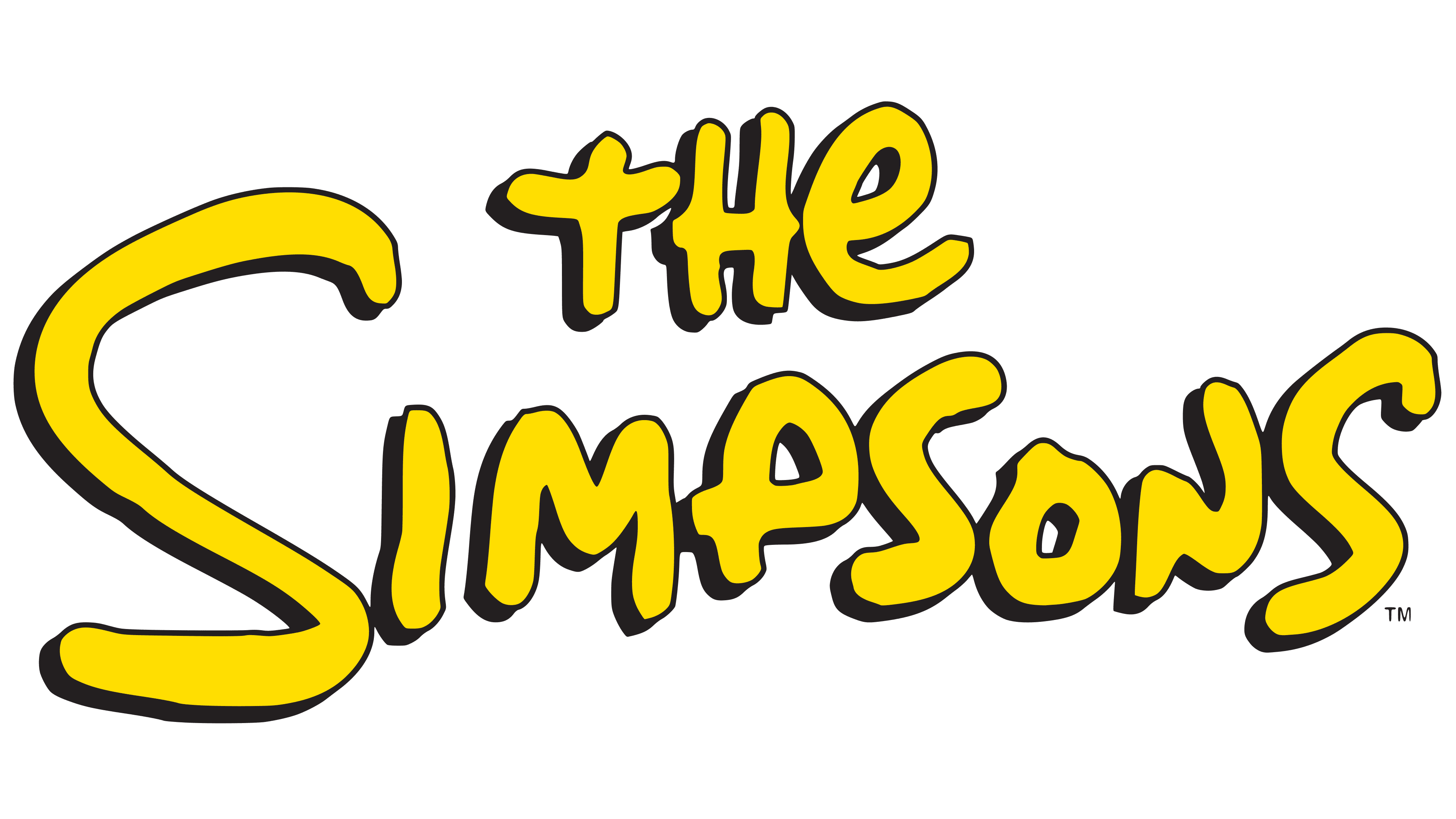
1987 – 1989
![]()
The first logo of The Simpsons was curved. The arch was formed from the name of the animated series, composed of individually designed letters. Their visual style was snaggly, like the very life of the family they represented. The characters had varying heights and leg lengths as if they had been written carelessly by hand. They were in uppercase and bold. Below them was the phrase “By Matt Groening,” arranged in a similar design but stretched horizontally. The main color scheme was black on white.
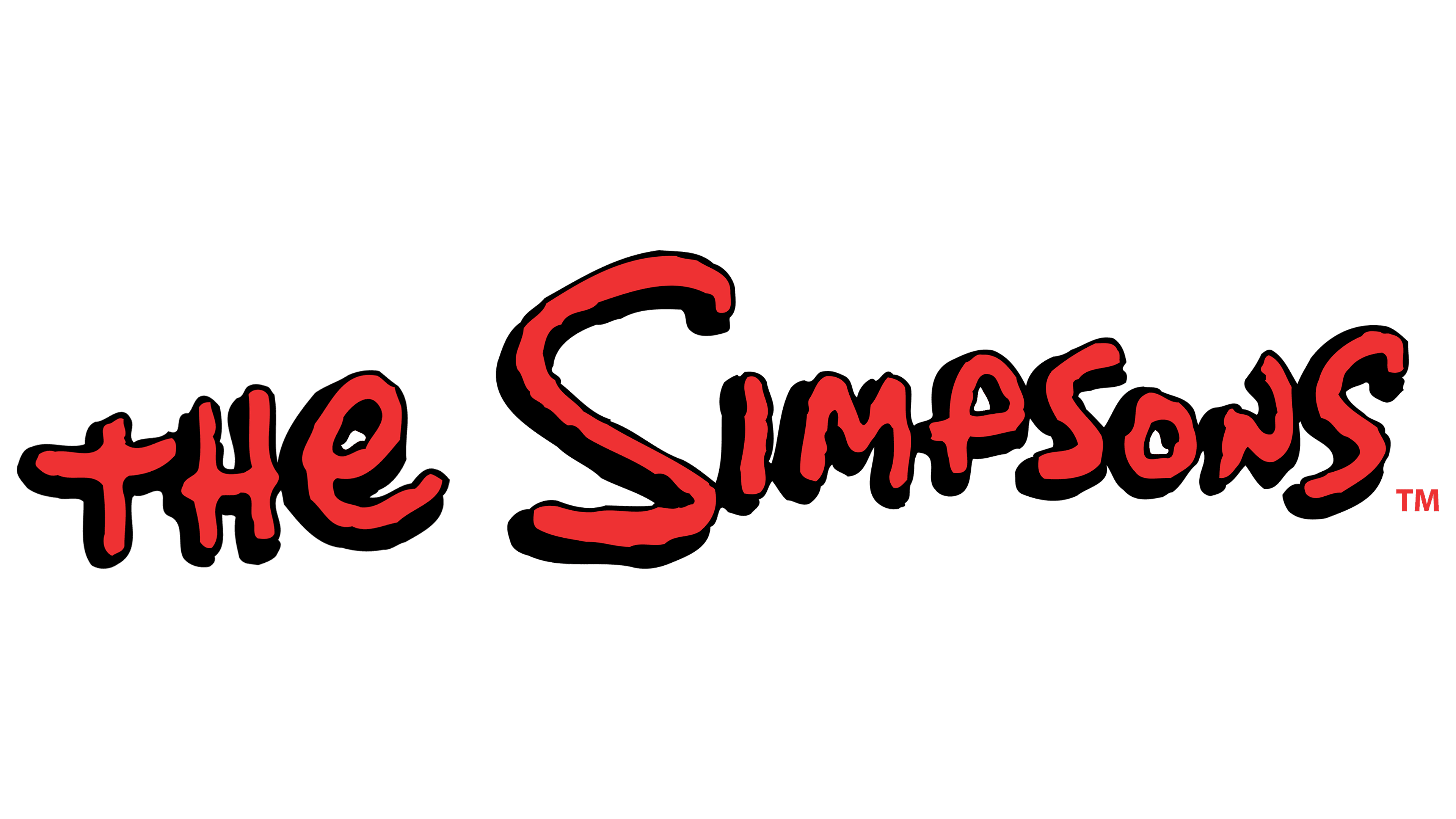
1989 – today
![]()
A different format logo is in use now:
- The designers removed the bottom part of the text because the animated skit was split off from the show and made into a separate animated series.
- They regrouped the words, placing them horizontally.
- The developers added color to the details.
The result of their efforts is the familiar visual identity, with sloppy, blown-out letters and shadows near each one. The characters now look as if they are double: the upper glyph is red, and the lower one is black. This combination makes the inscription appear three-dimensional, as if floating above the surface. The feeling of hanging in the air was needed for the logo to look harmonious against the sky background, where it appears at the beginning of the cartoon. The letters are uppercase, grotesque, and vary in height and shape.
Font and Colors
A change in The Simpsons’ identity was required when transitioning from the splash page on The Tracey Ullman Show to the credits of a full animated series. Therefore, the logo became clearer, simpler, and larger. The size mainly affected the letters: the designers enlarged them to improve the name’s readability. Today, the two-level icon of the legendary cartoon is an example of progressive animation. It expresses the bold, energetic, rebellious spirit and desire for freedom of the American people.
The logo uses a custom-designed typeface. It is called Simpson. The typography is by the design company Sharkshock. The colors are bright, contrasting, and even fatal: red lettering with black outlines around each letter. Such a combination of aggressive shades on a casual inscription makes the emblem versatile: it can be placed on different backgrounds without losing the sharpness of the crooked letters.