 Teenage Mutant Ninja Turtles Logo PNG
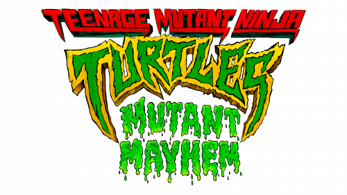
The Teenage Mutant Ninja Turtles: Mutant Mayhem logo resembles a mutating font, ready to touch the audience, infecting them with dangerous mutagen. Only the blades of the main characters stand guard, protecting the world.
Teenage Mutant Ninja Turtles: Brand overview
In 1984, the world of comics witnessed the birth of a unique phenomenon: the Teenage Mutant Ninja Turtles (TMNT), brought to life by artists Kevin Eastman and Peter Laird. This creation introduced four ninja turtles, each named after famed Renaissance artists, under the tutelage of their rat sensei, Splinter. What began as a satirical take on the ninja and martial arts frenzy of the era, captured in a single comic book, unexpectedly blossomed into a cultural icon.
This original comic, with its dark and edgy narrative, soon transcended its one-off status, evolving into a beloved series under Mirage Studios that continued for years in a distinctive black-and-white format. The TMNT’s journey took a pivotal turn in 1987 with the debut of an animated TV series on CBS. This adaptation, complete with a catchy theme song, transformed the turtles from a niche parody into a household name, inspiring a vast array of toys, video games, and merchandise, further cemented by two live-action movies in the early ’90s.
Despite periods of fluctuating popularity through the ’90s and 2000s, marked by various reincarnations in comics, television, and film, the TMNT franchise found new vigor in 2009 when Nickelodeon stepped in as the new custodian. With Nickelodeon’s backing, the turtles were reimagined in a contemporary computer-animated series from 2012 to 2017, breathing new life into the saga.
Now, nearly four decades since they first emerged from the sewers of New York City, the TMNT legacy continues to thrive. With a new series streaming on Netflix and anticipation building for a sixth live-action movie slated for 2023, the Teenage Mutant Ninja Turtles remain as relevant and beloved as ever, proving their enduring appeal with tales of martial arts, camaraderie, and, of course, a shared love for pizza.
Meaning and History
The emblem of the cartoon is consonant with the general sign of the turtles, yet it has acquired more vivid and imaginative features. Designer J.J. Villard managed to convey the spirit of battles, monsters, and dangers that accompany the animation. The sign became the most memorable symbol out of the seven cartoons made for the franchise.
What is Teenage Mutant Ninja Turtles: Mutant Mayhem?
It was a franchise initially conceived as a parody of superhero comics but unexpectedly gained significant popularity. The story continued in TV series, cartoons, books, and a multitude of children’s products featuring the characters. The first edition was released in 1984. Teenage Mutant Ninja Turtles: Mutant Mayhem is a cartoon released in 2023 as a reboot of the previous series. The story’s author is Brendan O’Brien.
2021 – 2022 (prototype)
News of the Teenage Mutant Ninja Turtles cartoon reboot came in 2020, with plans for filming emerging earlier in 2018. While the project was in development, a temporary logo was used.
The image differs significantly from the final version. The sign is more authentic than the simple, straight green letters drawn in comics and early films. However, it is still simpler than the final emblem.
The red stripe with a white inscription seems to race through the sewer tunnel where the mutants lived. The Turtles’ lair was near an abandoned subway station. The letters have multiple sharp traces on the left. These are minor paint streaks from the speed of movement. The inscription echoes the characters who move very quickly, as ninjas should.
Below, slightly in a semicircle, runs a yellow-green inscription made of jagged, awkward letters. The name matches the appearance of the turtles. Due to exposure to harmful substances, the heroes acquired green skin and an unusual appearance.
The arch-shaped design conveys the idea of protection. The teenagers are engaged in cleaning New York City from villains and protecting its residents from danger.
The black color of the background is the archetype of the night. Most events in the cartoon occur at night, as the Ninja Turtles only emerge on the surface in the dark. And in the tunnels where they live, there is always semi-darkness.
2023
By the time the animation was released, the Turtles had a final version of the emblem. Instead of a white inscription on a red background, they used a volumetric red font. Each word received:
- The first letter has a pointed end, like a katana blade – a sword for battles.
- Underlining in the shape of a sickle on a chain, used by the turtles.
The inscription looks sharp and dangerous. The words “Teenage Mutant Ninja” emphasize that the turtles are teenagers. To create the characters, the authors carefully studied children’s behavior to present heroes as close to the audience as possible.
Fans admire their strength, friendship, and martial arts abilities. The friends wield deadly weapons, like true ninjas. Their ability to achieve their goals and defeat villains is valued in the teenage community. Therefore, the guys immediately attract attention and admiration from the target audience.
At the center of the emblem is the green with yellow edging inscription Turtles. Before the transformation, Michelangelo, Leonardo, Raphael, and Donatello were ordinary turtles living in the sewers. Harmless, slow, and calm. However, the extreme letters with glyphs in the shape of fangs speak of a significant transformation of the characters due to mutation—the yellow edging – the new appearance. The wide line is like a shell covering the characters and helping them defend against the harsh world.
In the center, in the form of a green slimy inscription from which liquid drips, is the name of the series: Mutant Mayhem. The main plot of the cartoon revolves around the villains’ attempts to turn all animals into mutants. This would allow the turtles to blend in and live a peaceful life. However, the heroes have to sacrifice their dreams and engage in a fight with a group of mutants planning this crime.
The slime is the mutagen that led to the changes in the turtles and other mutants. Upon contact with the liquid, a living object turns into a combination of itself and the last living creature or object it touched before contact.
Font and Colors
Yellow, green, and red made the logo bright enough to attract a child audience.
- Red signifies danger. The heroes constantly face death from monsters and villains like Superfly. The teenagers have to stop cunning plans to infect the planet’s inhabitants.
- Green – the color of life and simultaneously the shade of a dangerous substance for mutations.
- Yellow – optimism and friendship. The guys support each other and dream of recognition.
The font of the inscription is unique due to the transformation of letters in a style that combines the sharpness of ninja weapons and the pliable slime of the mutagen.
