


![]() The Vampire Diaries Logo PNG
The Vampire Diaries Logo PNG
The thin and graceful emblem of the series speaks of noble heroes who dealt with nobility and kings. The thin thread connecting the past and the future is the blood that grants immortality. The Vampire Diaries logo hints at sophisticated feelings that hurt the heart.
Meaning and History
![]()
The events of the series take place in the fictitious town of Mystic Falls, allegedly in Virginia. It harbors a supernatural secret involving a teenager named Elena Gilbert, played by actress Nina Dobrev. The protagonist’s parents were killed in a car accident. Further, the film features a love triangle between a girl and two vampire brothers. They protect Elena from various threats, confront villains, and save the city. The story unfolds as memories.
In addition to the complex relationship within the trinity, there are many accompanying plots related to the main characters’ environment. In addition, the topic of the city’s council of elders is revealed, whose descendants have long opposed ghosts, witches, magicians, werewolves, vampires, and other evil spirits. The pilot episodes were filmed in Vancouver (British Columbia), while the main episodes were filmed in Covington, Georgia.
At first, Kevin Williamson was not interested in the series, as he felt it was very corny and echoed the famous Twilight film series. However, Julie Plec convinced him, forcing him to read the same book. Therefore, in the winter of 2009, the CW TV channel approved the presented material and officially ordered the first season for next spring. After high ratings, the management entered into a cooperation to continue filming.
Williamson and Plec were appointed producers, writers, and directors. Under their leadership, the scenery was made, locations were chosen, screensavers and emblems were drawn. There are two of them – in black and white, as the personification of the dark and light sides in the series. The first symbolizes Katherine Pierce; the second, Elena Gilbert, played by the same actress.
Font and Colors
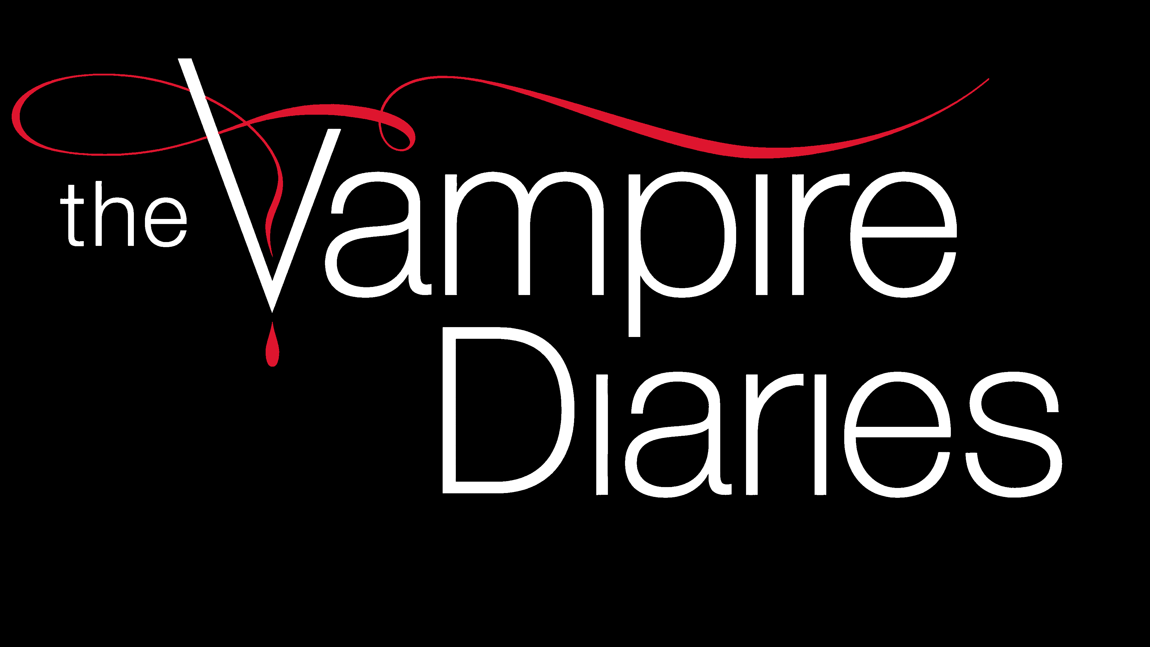
The logo is designed in a text style with minimal graphic elements. The central detail is the television series title, spread over two lines. The upper one is occupied by the word “Vampire,” with the article “the” written in lowercase. The bottom row is reserved entirely for the “Diaries” type in the same typeface. The letters are thin, even, grotesque, with accent marks on the first characters (they are uppercase; the rest are lowercase).
The basic letter “V” is made. Its left side is higher than the right and is braided with a narrow red ribbon, from which a drop of blood hangs. Thin curled line with wide loop-like elements. It stretches to the right in a long, curved strip but does not reach the very edge. The signs are white and cold, which is emphasized by the black background they are set against. In the second version, by contrast, the base is white, and the inscriptions are painted in an intense black shade.
This contrast creates the necessary drama because he prevails in the film. Tellingly, the lowercase letter “i” has a dot in none of the logo variants. It’s like a hint that not everything is so simple, and not every supernatural story ends – they have an open ending that can be continued indefinitely as long as long-lived vampires exist in a parallel world.
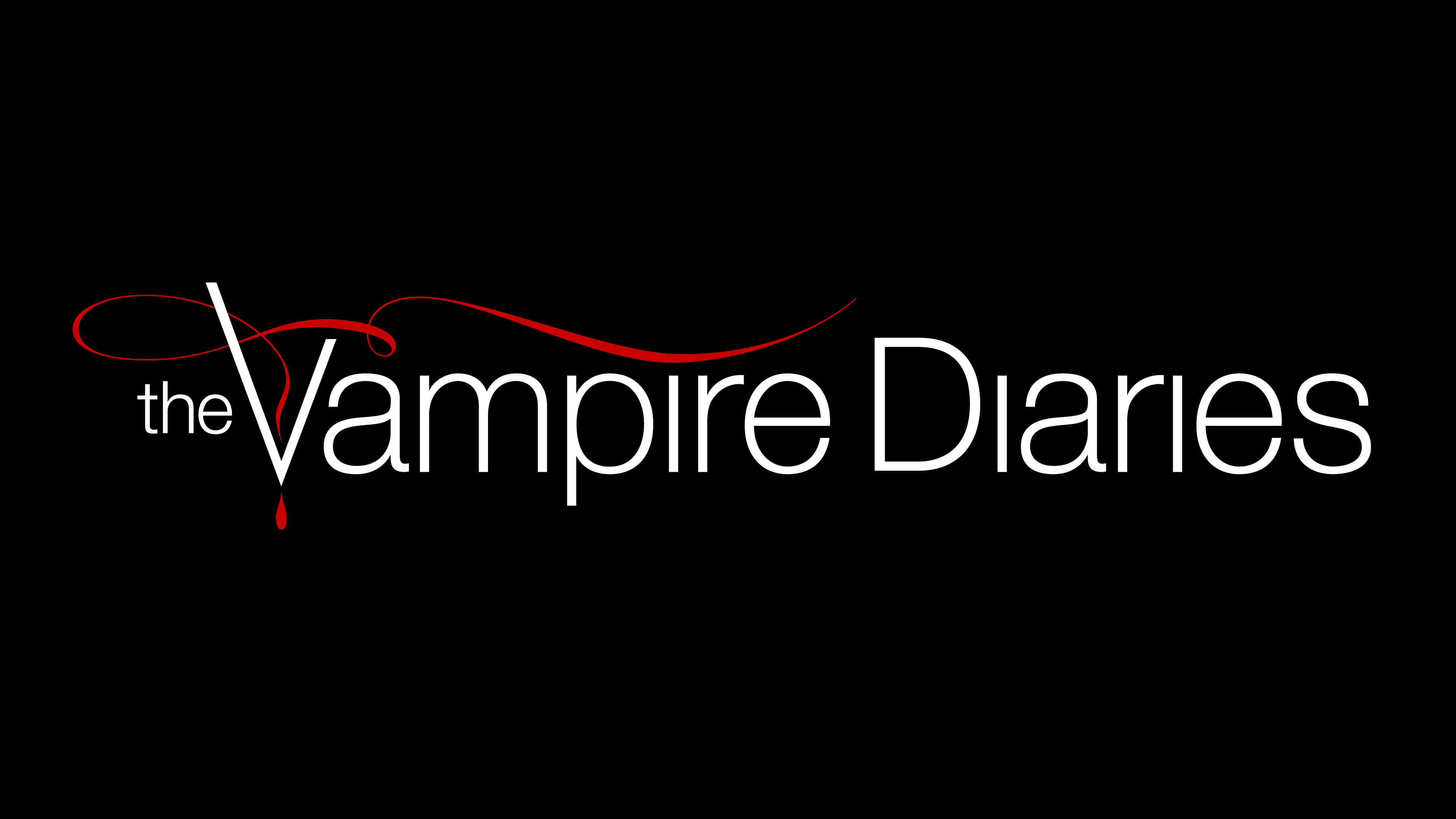
The inscription on the headpiece and in the emblem is set in Helvetica Light, thin, simple, smooth, and chopped. The only thing that distinguishes it from the classic version is the “V” elongated on one side, reminiscent of a standard checkmark.
The color palette consists of the traditional mix of “dramatic” colors: black, white, and red. They symbolize a keen relationship at the height of feelings. In addition, red personifies blood, which is inextricably linked to the theme of vampires.