The new herbal cheeses, “Nurishh,” recently got its brand visuals and beautiful packaging thanks to the London-based design agency This Way Up.
In connection with the emergence of such a trend as flexitarianism (spontaneous vegetarianism), many manufacturers of nutritional supplements and specialized edible products are thinking about expanding their range. Vegetarianism is becoming more widespread, and mindful eating has become a whole concept for the younger generation that monitors health.
In 2020, the idea to conquer the market with a unique product – vegetable-based cheese – came from the Bel Group. This success story began when the management acquired All in Foods, the cheese startup. Turning to the creative bureau This Way Up, the company was right. Talented designers have already worked on projects for healthy food and drinks brands, and among their major customers were such well-known companies as Danone and Marmite.
With a detailed analysis of the niche, it became clear that the key concept in this category is the unification of food in the family. This means that there are “heroes” of the kitchen in the family who are trying to successfully cope with a difficult task – to feed everyone tasty and satisfying, regardless of what one or another family member prefers to eat.
Later they came up with a name – kind, soft, dear, and homely – Nurishh. The authors decided to convey the tandem of health and taste as equivalent components of nutrition. Designer Beth Kelsall believes that design needs to convey taste to make it more attractive to the consumer. Therefore, the special niche of cheese products for vegetarians and adherents of a certain type of food has opened up a free space for bright and exceptional product design.
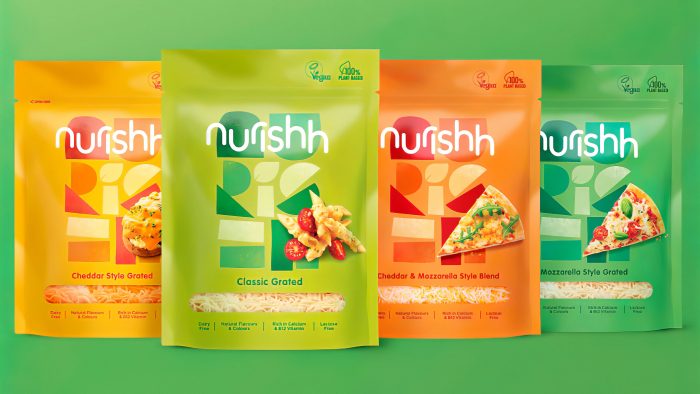
Nurrish was the brand that broke the cheese stereotypes. Catchy tones, an unusual font, a minimum of formalism, modular forms at random – this is the naughty visual nature of the new brand.
Illustrative letters, abstract shapes, and lowercase letters of different pleasant shades create a homely atmosphere and attract a potential buyer with their appearance. Indeed, judging by the packaging design, this product is not a limitation but an alternative novelty.
The rounded, flowing font and blocks that look like slices of cheese accurately convey the atmosphere of a snack in the company of relatives when each family member cuts off a tidbit in their Way.
Cheese of vegetable origin in new packaging has already gone on sale so that similar models can be found already in the USA and Europe.


