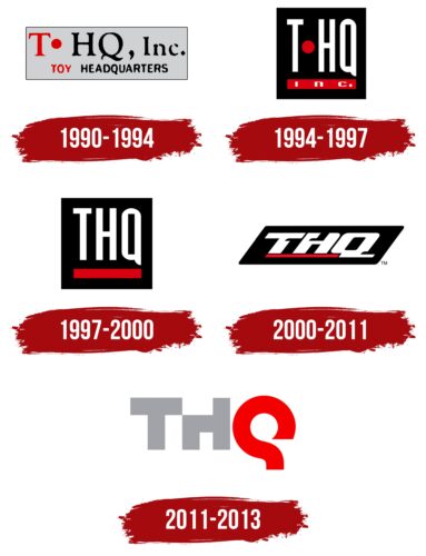
The THQ logo is full of creativity and imagination. The sharp lines of the emblem and smooth contours convey work with high technology, reflecting the precise execution of codes and programs that allow the creation of unforgettable game hits.
THQ: Brand overview
| Founded: | April 1990 – January 23, 2013 |
| Founder: | Jack Friedman |
| Headquarters: | Agoura Hills, California, U.S. |
Meaning and History
The company’s logo was developed in 1990 when the company was founded. The verbal sign showed that Jack Friedman prophesied a big future for his brainchild since he already had experience with LJN Toys Ltd. at the time, and the new company had every chance to become a profitable major corporation. During the company’s short existence, there were several logo transformations. Rebranding helped to keep up with the rapidly changing world of technology with which THQ worked.
What is THQ?
In the past, it was a major US video game publisher. It held licenses for developing games based on cartoons and movies of major film companies: Disney and Nickelodeon. The net profit in the last years of operation was 130-140 million dollars.
1990 – 1994
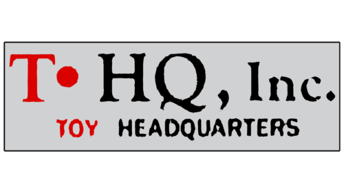
The first logo includes the emblem common in the future and its decoding. On an elongated gray rectangle, there are three letters: a red T, followed by a dot, after which a black HQ, below the abbreviation the red inscription Toy and black Headquarters, which is the full name of the company.
Initially, the company was engaged in toys and board games. The analogy with the headquarters attempts to represent a place where games are developed, replicated, and published. The choice indicates that the company is the heart of a large industry: in addition to its developments, it had licenses to release toys and video games based on the films of major known meters of the entertainment industry, such as Disney, Pixar, DreamWorks, and Nickelodeon.
The gray background resembles a sticker on a box or the packaging of a board game itself.
1994 – 1997
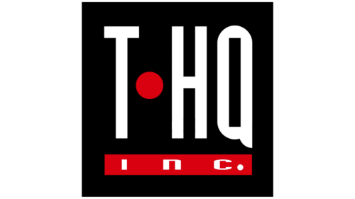
In 1994, Jack Friedman left the business, and the company decided to focus solely on video games. Because of this, the emblem changed its shape to a black square, corresponding to a disk box, floppy disk, or memory card for PlayStation. The full name wouldn’t fit such a background, so it was shortened to an abbreviation. The red dot between the letters echoed the red line below the name, on which the addition Inc. rested.
The dot hinted at multiplication to convey the massive number of games stacking up and preparing for sale at THQ. The line resembled a loading bar.
1997 – 2000
In 1997, THQ was incorporated under The Delaware General Corporation Law. Very favorable laws for business development now govern the company and become a corporation. Changes marked the logo update. The primary look and form of the mark remained with minor simplifications: the dot between the letters and the inscriptions on the red line disappeared.
Now, the abbreviation reminded of a play on words (the straight pronunciation of the letters also sounds like “Thank you”). The company was thankful to fate and its clients and was happy about the changes.
The elongated white elements conveyed growth, and the underline increased the company’s weight and significance in the market. During this period, THQ actively signed contracts and bought its competitors. Deals with Electronic Arts and Codemasters allowed them to represent the interests of other companies in the video game market.
2000 – 2011
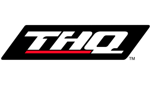
The company updated its logo for the new millennium to demonstrate a desire to move into the future. The whole composition of the emblem seemed to be moving forward. The floppy disk shape became outdated. The black square turned into a parallelepiped, the letters of the inscription leaned to the right, and the tail of Q continued the red line.
The full glyphs of THQ conveyed expansion. On the contrary, the line became thin, like an arrow moving forward. Technology does not stand still. Game downloads are much faster, and tiny memory cards and flash drives are enough to store information.
The dynamism of the mark, as noted in THQ, indicates the expanding libraries of games for known franchises and the company’s aspiration for leadership.
2011 – 2013
The PlayStation is no longer as popular. Therefore, THQ decides to develop tablets further. The first one was presented in the middle of 2010.
The new development stage was reflected in the emblem. The sign turned out to be modern in a high-tech style, which embodies prestige. The silver metal T and H are complemented by a red curve, forming Q. The elements look unusual to emphasize the publisher’s creativity and changes for the better. The “H” does not have the upper half of the left leg. Thanks to this technique, the TH combination resembles a table and chair where the company’s clients typically play. The user should also sit down to work with the tablet.
The shape of the letter Q resembles a ring road from which a straight highway departs. The company is ending its circular motion and “exiting” onto a straight road. The form of the letter also resonates with gaming disks.
In 2012, THQ went bankrupt. The Swedish company Nordic Games (now Embracer Group) bought the rights to the trademark and several assets. In 2016, it changed its name to THQ Nordic. Now this name remains with its subsidiary companies.
Font and Colors
Light gray is the basis of the mark. It embodies hard work and continuous improvement. In combination with it, red is used for the letter Q as a shade of leadership and innovation. Sometimes the last element is made in blue or purple. The former signifies technology: new developments and the implementation of the most advanced discoveries. Purple shifts the focus to fantasy, mysticism, and imagination. This shade reveals the creative side of the company and the development of new game plots.
The font of the inscription is unique due to the serious transformations of the letters. This technique emphasizes the individuality of THQ.
THQ color codes
| Quick Silver | Hex color: | #a1a2a7 |
|---|---|---|
| RGB: | 161 162 167 | |
| CMYK: | 4 3 0 35 | |
| Pantone: | PMS 422 C |
| Red | Hex color: | #f50000 |
|---|---|---|
| RGB: | 245 0 0 | |
| CMYK: | 0 100 100 4 | |
| Pantone: | PMS 172 C |
