


![]()
The largest clothing resale platform, ThredUp, has updated its brand identity and logo, emphasizing its leadership in the secondhand industry. Along with the visual changes, the company introduced an improved interface and AI-based features that simplify the buying and selling of clothing.
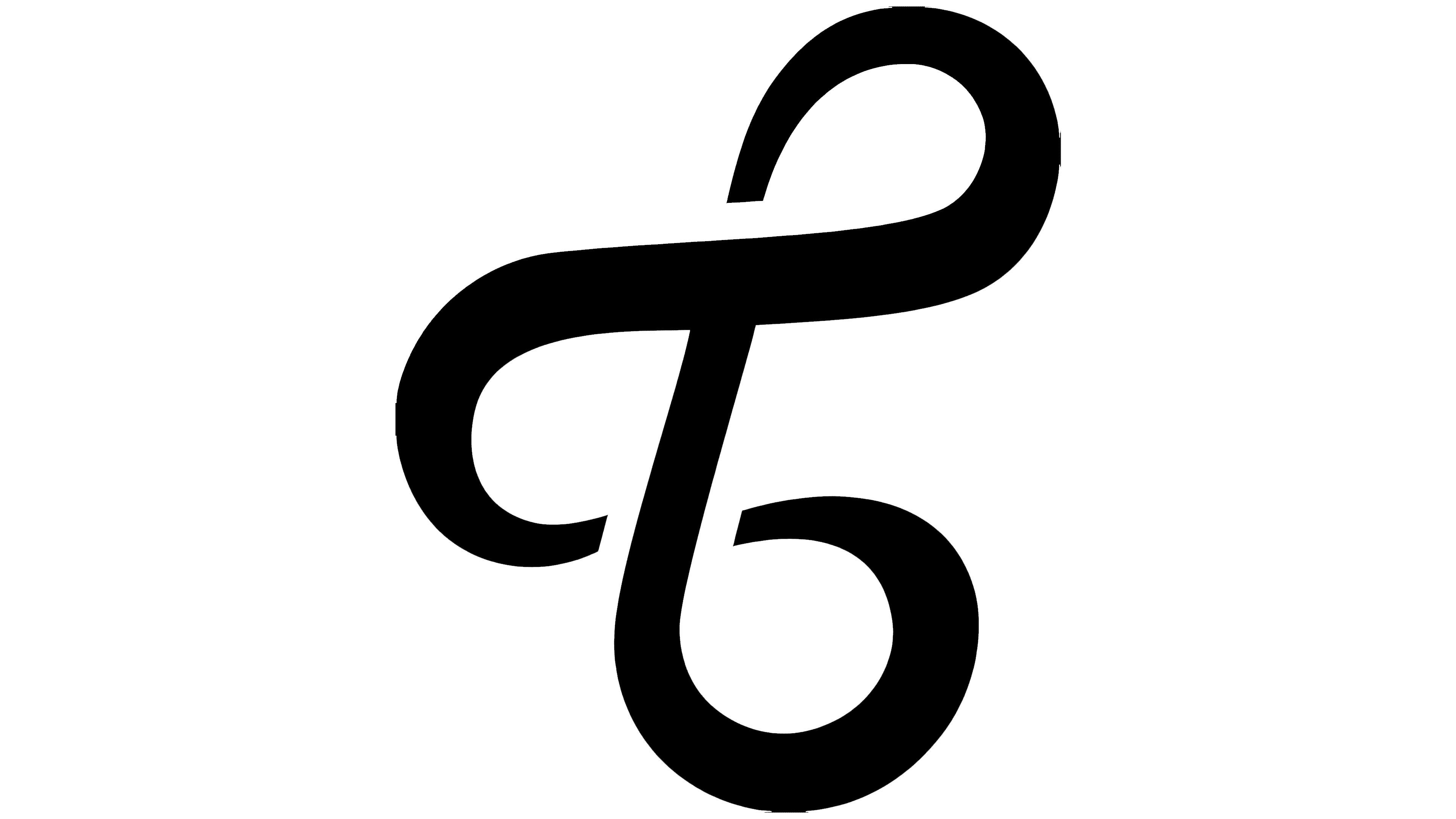
The new visual identity is defined by clarity and simplicity. The main symbol is an emblem shaped like an infinity sign, resembling the letter “T” and a thread. It reflects the idea of circularity and conscious consumption. It symbolizes the connection between people, the brand, and the concept of giving items a second life.
![]()
According to co-founder and CEO James Reinhart, ThredUp’s goal since its launch in 2009 has been to change the perception of secondhand clothing. The new style and AI technologies help make this format part of everyday life and show that fashion can be smart and inspiring.
The rebranding reflects ThredUp’s evolution from a startup to a leading player in the resale market. The new AI tools personalize shopping by selecting clothing based on the user’s style and preferences, making the process convenient and enjoyable.
Senior Vice President of Marketing Kristen Brophy noted that the brand aims to combine care for customers and the planet. According to her, this approach helps shoppers save money, refresh their wardrobes, and support a sustainable fashion cycle.
To date, ThredUp has processed over 250 million clothing items from 60,000 brands across a hundred categories. The company actively collaborates with global retailers, offers resale-as-a-service, and continues to develop its own technological solutions.
![]()
The updated style and new AI features strengthen ThredUp’s position in the United States and promote a global culture of conscious consumption.