


 Thunder Cats Logo PNG
The ThunderCats logo blends power, agility, and mystique, capturing the essence of the iconic animated series. The emblem features a striking combination of sharp edges and sleek curves, symbolizing the ThunderCats’ strength and grace. The depiction of a roaring feline head signifies their ferocity and courage in the face of adversity. The bold colors and intricate details add energy and visual appeal, reflecting the vibrant, imaginative world of Thundera.
ThunderCats began in the early 1980s, when writer and concept developer Tobin Wolf conceived humanoid warriors with cat-like features. Rankin/Bass Animated Entertainment acquired the concept and produced the series, while Japan’s Pacific Animation Corporation handled the animation work. This production model, with U.S. development and Japanese animation, was common in 1980s television and helped control costs.
The characters and visual style were developed under the direction of artist Ted Wolf. The story centered on Lion-O, a young lord armed with the Sword of Omens, whose magical eye could see beyond normal vision. Around him stood Panthro, Cheetara, Tygra, WilyKit, WilyKat, and Jaga. Their main enemy was Mumm-Ra, an ancient necromancer who wanted control over Third Earth.
ThunderCats premiered in January 1985 on U.S. syndicated television. The series entered a crowded market for children’s animation, competing with Filmation’s He-Man and the Masters of the Universe. Its adventure format, clear heroes and villains, and strong visual symbols helped it build a large young audience. At the same time, LJN released action figures, while Marvel Comics published a ThunderCats comic series from 1985 to 1988.
The original show ran until 1989 and produced 130 episodes over four seasons. After production ended, ThunderCats kept a nostalgic audience among viewers who had grown up with the series. Rights later passed to Warner Bros. In July 2011, Cartoon Network and Warner Bros. Animation launched a reboot with Studio 4°C, using a more anime-influenced style and a more detailed visual approach. It stopped in 2012 after 26 episodes. In 2018, Cartoon Network introduced ThunderCats Roar, a simplified comedy version that received mixed reactions from longtime fans.
Meaning and History
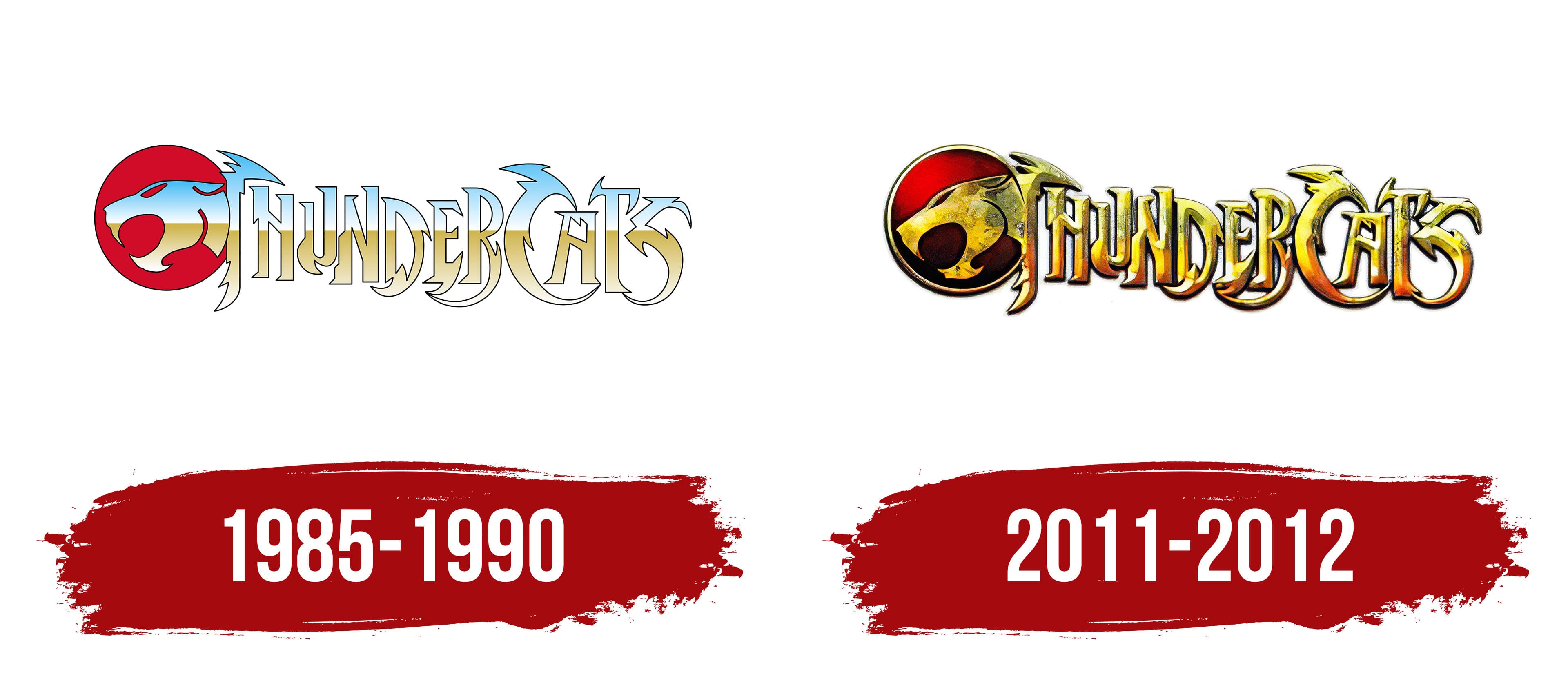
The animation for the original TV show was produced in Japan, while the writing, production, and voice acting were done in the USA. Initially, Rankin-Bass Productions handled the cartoon’s distribution, but later the parent company did. At that time, it was called Telepictures Corporation. In 1986, it merged with Lorimar Productions, forming Lorimar-Telepictures. It was, in turn, acquired by Warner Bros., which secured full distribution rights to ThunderCats and became its monopolist in 1989.
Several eponymous comics also appeared with the same characters and a similar logo. The first was published in 1985 by Marvel Comics. It was published in Star Comics for three years. Then 24 issues were released. Marvel UK launched another series. It contained 129 issues. Several other printing companies dealt with the franchise: Wildstorm Productions (in 2002) and Panini Comics (in 2011).
In addition, video games were developed, and a film script was written (by Paul Sopocy). A movie based on it was expected in 2020 but was temporarily postponed. Also, many products with the original ThunderCats logo have been presented. Currently, two brand emblems are known, and another one is planned for the release of the new film.
1985 – 1990
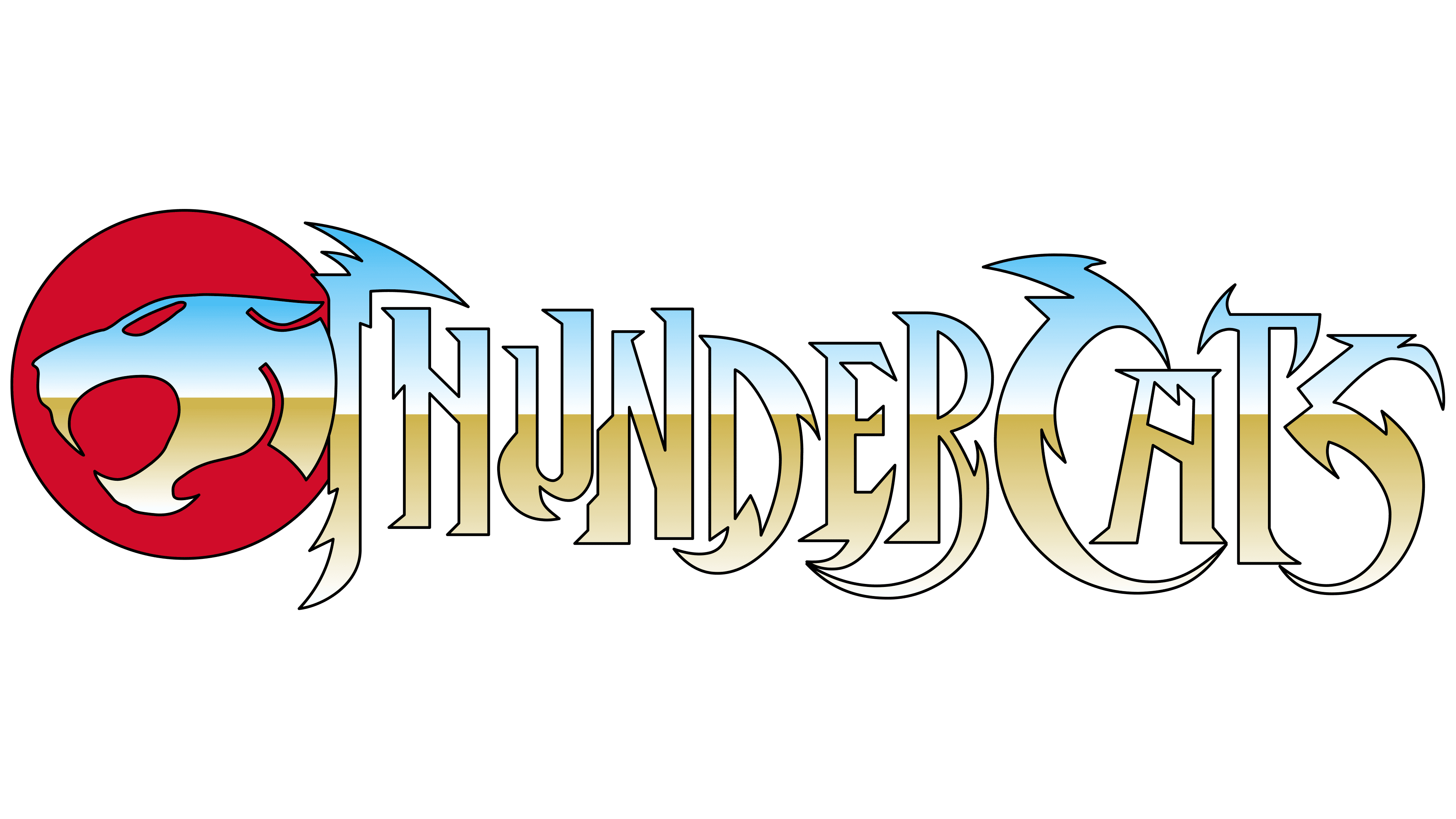
The debut sign has two parts: a graphic (on the left) and text (on the right). It features a profile image of a wildcat’s head in a fearsome snarl, with squinted eyes and pinned ears. The animal’s mouth is wide open, with its front fangs protruding from both the upper and lower jaws. The background to the beast is a red circle. Next to it is the name of the media franchise. It is made of pointed elements resembling claws, fangs, or ruffled fur on the mane. The bottom half is beige; the top half is light blue.
2011 – 2012
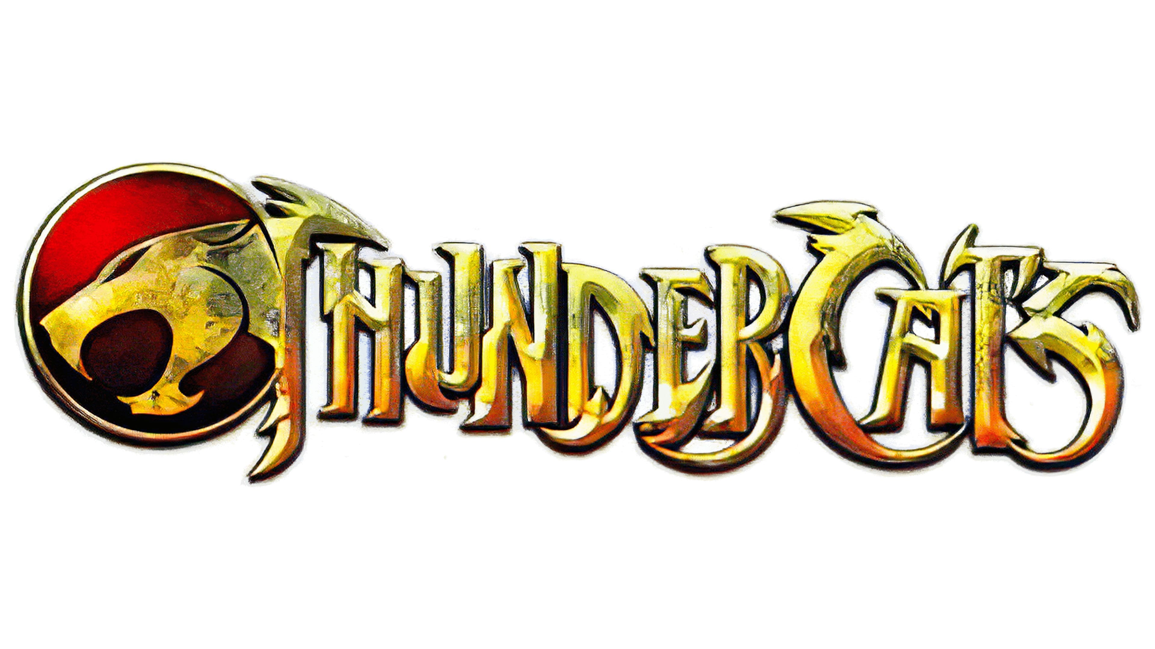
The emblem uses the same uppercase font and sharp spikes as the previous logo. The designers only changed its color, adding golden hues. They slightly turned the cat’s head downwards, changing the tilt angle, and added a thin ring as a border to the red circle. The blue color disappeared; the entire logo turned brown, with slight wear and tear on both the letters and the head.
Font and Colors

The developers of the ThunderCats visual identity logo utilized the principle of similarity. Although the cat’s head is drawn separately, it visually continues the “body” formed by the media franchise’s name. To display the fierce temperament of humanoid aliens in a cat-like form, the artists added numerous sharp strokes to the letters. These are not only at the tops but also on the other parts. Despite the changes, the logo’s shape, concept, and structure remained the same.
From the very beginning, a unique typeface with no analogs was proposed for the logo and opening credits. It, like the franchise, is named Thundercats. The font developer is designer Neale Davidson.

The original palette includes red (the background circle for the cat) and several shades of gold (the head and letters). Light blue was also used in the first logo.