The Ticketmaster logo is associated with small pieces of paper. This is a prototype of the tickets that users buy on the platform. The emblem demonstrates advanced online technologies that provide convenience and ease of use.
Ticketmaster: Brand overview
| Founded: | October 2, 1976 |
| Founder: | Albert Leffler, Peter Gadwa, Gordon Gunn III |
| Headquarters: | Beverly Hills, California, U.S. |
| Website: | ticketmaster.com |
Meaning and History
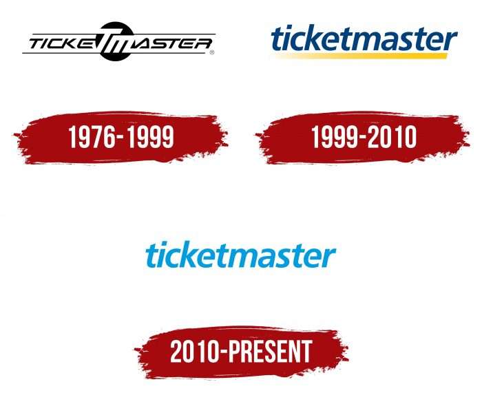
The company was founded in 1976 and, until 1982, specializing in the sale of equipment for ticket machines. Then she began distributing tickets, opened a travel agency, and acquired a platform where fans could buy souvenirs. Whatever the organization did, it always had a logo with its name. In different periods, it looked different: at first, it was a black and white inscription with additional decorative elements, and now a colored and minimalistic word sign is used.
What is Ticketmaster?
Ticketmaster is a seller of electronic and paper tickets for various events. This company belongs to Live Nation Entertainment and is based in the USA but provides services worldwide. It has been operating in the entertainment industry since 1976, popularizing theater performances, concerts, musicals, sports events, and much more.
1976 – 1999
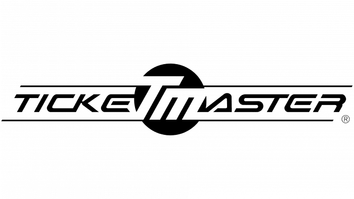
The early Ticketmaster logo contained the company’s name in two typefaces. “TICKE” and “ASTER” were written in black italics with unusual styling. The letters “CK” were connected at the bottom with an elongated line, and “ST” were merged at the top. The “A” looked like a triangle, the middle “E” stroke was hanging in the air, and a portion of the vertical line was missing in the upper left corner of the “R.”
The TMs in the center was large and white. From them extended two black lines that outlined a line. The designers have drawn a dark circle behind the “T” and “M” to make these letters distinct.
1999 – 2010
In 1998, a controlling stake in Ticketmaster was taken over by USA Networks, and a year later, the brand received a new logo. It bore the same inscription as before but in a different design. The developers removed the old graphic elements, including the circle, and then made all the letters italic, lowercase, and dark blue. Instead of a thin black line, a wide yellow stripe appeared at the bottom, indistinct on the left side.
2010 – today
The word mark’s creators felt that it was not minimal enough, so they removed the stripe and left only the company’s name. And to compensate for the lack of light shades, the designers repainted the word in aquamarine color.
Ticketmaster: Interesting Facts
Ticketmaster, known for selling and distributing event tickets, has quite the story.
- Starting Up: In 1976, college student Albert Leffler and his partners founded Ticketmaster. They wanted to make buying tickets easier and grew it into a leading ticket company.
- Tech Pioneer: Ticketmaster was among the first to use computers to sell tickets. This move made buying tickets faster and ditched the old paper methods.
- Big Merger: In 2010, Ticketmaster merged with Live Nation, a big name in live shows. This merger created a giant in entertainment, combining ticketing and concert promotion.
- Going Digital: Ticketmaster embraced online sales, selling most tickets through its website and app. This makes buying tickets convenient and reduces the use of paper tickets.
- Battling Scalpers: To stop bots and scalpers from grabbing all the tickets, Ticketmaster uses special tech like CAPTCHA, programs like Verified Fan, and dynamic pricing to keep tickets fair for everyone.
- Worldwide Operations: Though we often consider it a US company, Ticketmaster operates in over 20 countries, helping millions find concert tickets, sports tickets, and more.
- Personal Touch: Using data, Ticketmaster suggests events you might like, making it easier to find shows that interest you.
- Eco-friendly Moves: Ticketmaster promotes paperless tickets and mobile entry, reducing waste and smoothing getting into events.
- Smart Partnerships: Ticketmaster teams up with other companies to improve its offerings, from streaming services for live events to tech firms for better ticket security.
These points show how Ticketmaster has evolved from a small startup to a key player in the ticketing world. It focuses on innovation, fights ticket scalping, and enhances the experience for event-goers everywhere.
Font and Colors
The stylized “ticketmaster” lettering is not just a registered trademark. A logo is an integral part of a brand, an important expression of identity. It has an animated version, in which attention is focused on the first “t,” and only then other letters appear. Such dynamism symbolizes the world of entertainment because Ticketmaster sells tickets for interesting and long-awaited events.
The company has its own official font TM Sans. It features minimal stroke contrast, open apertures, and geometric roundness. Despite this, a completely different typeface is used for the logo, similar to the modified Usual Medium Italic. The tops of both ts are angled like in Artica Bold Italic. The horizontal strokes of the letters “e” do not reach the baseline a bit.
Ticketmaster has always leaned towards blues and blues, and he continued this tradition with an azure hue. The rich tone is the center of the brand’s visual identity. It symbolizes wisdom, loyalty, and energy; therefore, it perfectly complements the lettering design.
Ticketmaster color codes
| Black | Hex color: | #000000 |
|---|---|---|
| RGB: | 0 0 0 | |
| CMYK: | 0 0 0 100 | |
| Pantone: | PMS Process Black C |

