


![]() Tidal Logo PNG
Tidal Logo PNG
The emblem is like a mosaic from which any figure can be laid out. The Tidal logo is the prototype of an impressive information base. Each user can extract the tracks of interest and create their own chain, a personal playlist of their favorite music.
The story of Tidal starts in Scandinavia. In 1998, Aspiro worked in mobile services. In February 2010, together with Platekompaniet and Telenor, it launched WiMP as a response to Spotify. The service focused on sound quality and editorial content, expanding to Sweden, Denmark, Germany, and Poland.
On October 28, 2014, Tidal replaced WiMP in the US, UK, and Canada. The platform combined CD-quality audio with video and curated materials, aiming to broaden the streaming format. Financial results remained weak, with Spotify leading the market.
In January 2015, Project Panther Bidco Ltd., controlled by Jay-Z, acquired Aspiro for about $56.2 million. He positioned Tidal as a service focused on artist revenue. On March 30, 2015, a relaunch in New York introduced co-owners including Beyoncé, Rihanna, Madonna, Kanye West, Nicki Minaj, Alicia Keys, Daft Punk, Coldplay, and Arcade Fire.
By 2016, Tidal reported about 3 million users, including 1.35 million on HiFi plans at $19.99. In comparison, Apple Music passed 10 million subscribers within a year of its 2015 launch. In 2017, Norwegian investigators examined manipulation of streaming data tied to releases by Kanye West and Beyoncé.
That same year, Sprint acquired 33 percent for about $200 million, aiming to bundle the service with mobile plans. In March 2021, Square, Inc. agreed to buy a majority stake for $297 million. In December 2021, it rebranded as Block, Inc., while Tidal introduced a free tier in the US and expanded HiFi access.
In 2023, Block recorded a $132.3 million impairment tied to Tidal and cut more than 10 percent of its staff. In April 2024, pricing tiers were merged into a single plan.
Meaning and History
![]()
The online service appeared in the second half of 2014, and at the beginning of 2015, Project Panther Bidco Ltd., along with its parent company Aspiro, took over. Such a global shift, oddly enough, did not affect the Tidal logo at all. The new owner decided not to redesign and left everything because, by that time, the music service had already gained worldwide fame. She was popular far beyond the borders of Norway, her geographical homeland. She was known in Europe and North America.
Shawn Corey Carter, known as Jay-Z, became the head of the Internet service. The New York producer and rapper has led many projects aimed at gaining fame and profit. For the same purpose, he bought Aspiro and its Tidal brand. After a profitable acquisition, the musician focused not on the business’s outside but on its inside. Under his management, the multimedia service ranked third among the largest streaming broadcasters.
What is Tidal?
Tidal is a paid streaming service for playing audio files, such as podcasts, tracks, concert recordings, and music videos. It provides access to a vast amount of content and promises high-quality sound. Its developer is the Norwegian company Aspiro. It began offering the music streaming service under the Tidal brand in 2014, and in 2021, it transferred a controlling stake to the American conglomerate Block, Inc.
Jay-Z achieved all this without changing the brand identity. He just slightly expanded the service’s functionality: he added the ability to pay for music downloads and purchase CDs. Also, the rapper has partnered with MQA to produce high-quality HiFi recordings.
In 2017, telecommunications company Sprint acquired a 33% stake in Tidal. But this did not affect the logo in any way. It still looks the same as it did in 2014: simple black lettering with a diamond pattern. This design was invented under the guidance of the technology firm Aspiro.
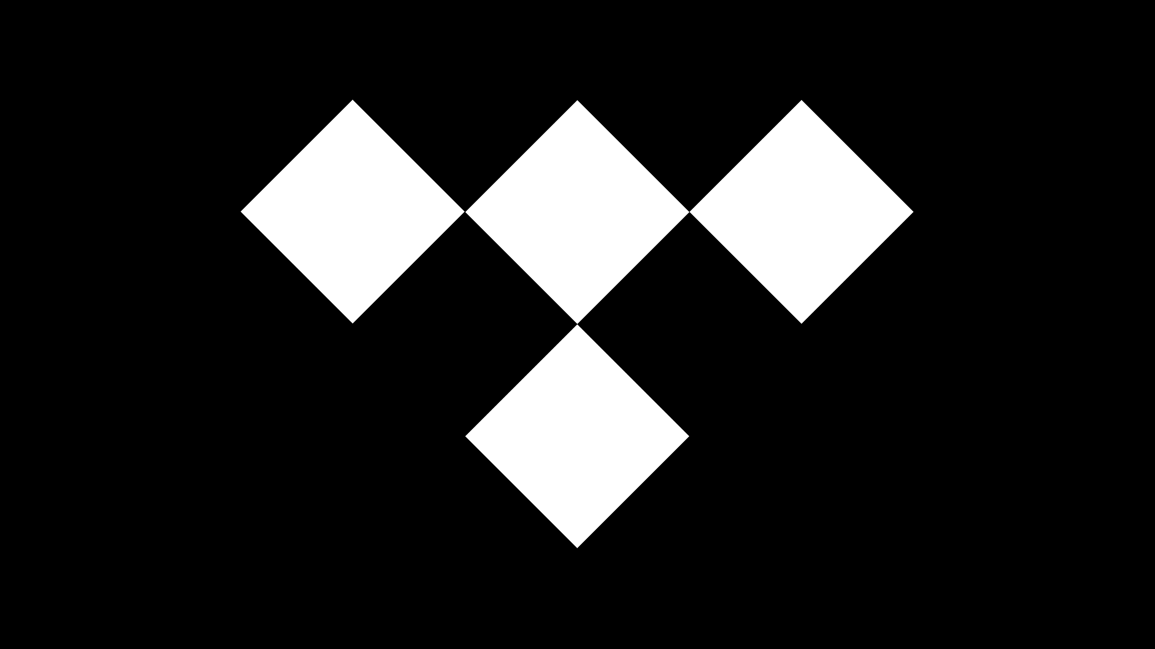
One of the main elements of the Tidal brand name is the geometric pattern shown above. The quadrangles are staggered. But this is not a collection of random shapes; it is the letter “T.” At least that’s how the designers saw her. They placed one black rhombus in the middle and three more of the same at the bottom, to the right, and to the left. The drawing supplemented the name of the multimedia service and became its first and last emblem.
Font and Colors
The font used by the logo creators is very similar to the Keep Calm font. It is taken from a 1939 propaganda poster. In 2000, a British store owner found a copy of the poster, after which the typographers studied the lettering style and created the Keep Calm typeface. Another similar font is Montserrat. It is based on the Montserrat city signage and is identical to Keep Calm, except for minor details.
The logo is completely black and white, but this is more of an advantage than a disadvantage. The monochrome color scheme underlines Tidal’s high profile and minimalist style.