 Tiger Aspect Productions Logo PNG
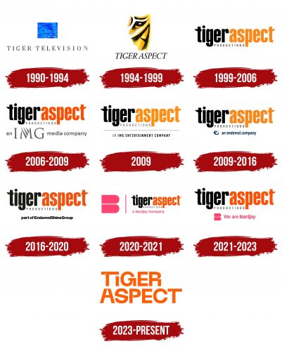
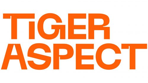
Tiger Aspect Productions logo is a striking testament to the company’s unrestrained creativity. Its unconventional design is encapsulated in the presentation of the company’s name, uniquely typed with notches, extensions, and original legs in the letters. It’s a complex and layered representation of the brand’s identity, embodying its creative spirit, innovative approach, and commitment to entertainment.
Unique Typeface: The letters of the logo contain notches, extensions, and original legs, creating a typeface that stands apart from the conventional. This artistic approach symbolizes the brand’s unorthodoxy and aligns with its association with non-traditional content, such as the comedy “Mr. Bean.”
Two-Level Inscription: The strict, two-level inscription provides a sense of structure and stability. It represents the platform’s commitment to maintaining a solid foundation, even while embracing bold and creative endeavors.
Semi-Bold Capital Glyphs: The use of semi-bold capital letters accentuates the importance and strength of the brand. It reflects confidence and asserts the company’s significant presence in the entertainment industry.
Calming Orange Color: The calming orange hue used in the logo conveys warmth, friendliness, and approachability. This color choice resonates with the company’s intention to reach audiences with engaging and inviting content.
Alignment with Brand Identity: The logo’s innovative design aligns perfectly with the company’s identity, rooted in creativity, novelty, and entertainment. It’s a fitting representation for a brand that dares to step outside the conventional norms of television and media.
Reflecting Genre Diversity: By embracing an unconventional design, the logo hints at the brand’s diversity in content genres, from comedies to thought-provoking dramas. It suggests a willingness to explore different avenues and not be confined to one particular style or genre.
Ease of Recognition: The unique characteristics of the logo make it easily recognizable. It helps create a distinct identity, ensuring the brand stands out in a competitive market.
Connection with Audience: The combination of strict layout with creative typography and the friendly orange color signifies the company’s ability to connect with its audience on various levels. It reflects a blend of professionalism and creativity that appeals to diverse viewers.
Manifestation of Creativity: The design is not merely a name but a manifestation of the company’s creativity. It sets the tone for what the audience can expect from the brand – innovation, originality, and entertainment.
Versatility: The logo’s design is versatile enough to be relevant across different platforms and media. Whether it’s a television screen, a website, or social media, the logo retains its visual appeal and meaning.
Tiger Aspect Productions: Brand overview
| Founded: | 1988 |
| Founder: | Peter Bennett-Jones |
| Headquarters: | London, England, UK |
| Website: | tigeraspect.co.uk |
Established in 1988 by Peter Bennett-Jones, Tiger Aspect Productions, initially known as Tiger Television, has been a cornerstone in television production for over three decades. Nestled in the heart of London, the company primarily dedicates itself to creating an array of television content, particularly comedy series.
Tiger Aspect Productions has brought many notable sitcoms to life, such as the globally loved “Mr. Bean” and the charming “The Vicar of Dibley.” Additionally, they introduced “Benidorm” and “Peep Show” to the small screen, further establishing their comedy repertoire. Their creativity isn’t confined to comedy; they’ve also ventured into the realm of drama series, presenting audiences with shows like “Murphy’s Law,” “Hustle,” and the intriguing “Ripper Street.”
As the company evolved, Tiger Aspect broadened its horizon into film, introducing Tiger Aspect Films. This expansion saw them producing a variety of films such as “Omagh,” “TwentyFourSeven,” and the gripping “The Girl with the Dragon Tattoo.”
Endemol Shine Group, a renowned global content creator, producer, and distributor, became the parent company of Tiger Aspect in 2014. Since then, Tiger Aspect has flourished, creating successful television shows and films, including the Emmy-winning series “The Night Manager” and “Band of Brothers.”
With a history of over three decades, Tiger Aspect Productions has solidified its position as a leading television production house in the UK, relentlessly innovating and delivering content that continues to engage audiences across the globe.
Meaning and History
What is Tiger Aspect Productions?
Tiger Aspect Productions is a film and television production company based in the United Kingdom, known for its productions such as “Mr. Bean,” “Murphy’s Law,” “Robin Hood,” “The Vicar of Dibley,” and others. It was founded by Peter Bennett-Jones in 1988. The main office is located in London. Since 2009, the brand has been owned by the company Endemol UK.
