The TJ Maxx logo is designed to be striking, attracting customers’ attention as it’s used as signage above store entrances. It’s a universal symbol that characterizes the company as ambitious, creative, and resourceful in retail.
TJ Maxx: Brand overview
| Founded: | 1976 |
| Founder: | Bernard Cammarata |
| Headquarters: | Framingham, Massachusetts, U.S. |
| Website: | tjmaxx.tjx.com |
Meaning and History
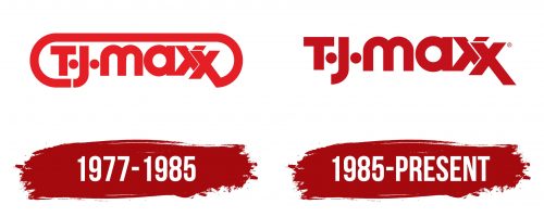
Being a part of TJX, TJ Maxx inherits its style. Hence, the brand’s logo is as dark red as the parent company’s and contains an inscription. This version was introduced in 1985, replacing a similar wordmark that was brighter and adorned with a long curving stripe. Designers emphasized the double “X” to highlight the store chain’s uniqueness. For the same reason, they depicted two small circles to the right and left of the “J.” These stylized dots should be placed after the letters “T” and “J.”
What is TJ Maxx?
TJ Maxx is a department store chain owned by TJX Companies. It was launched in the U.S. in 1976 and has since expanded to over 1,200 locations, making it one of the largest in the country. In Europe and Australia, it’s known under the brand name TK Maxx. The stores offer a variety of products at discounted prices, including dishes, furniture, cosmetics, toys, and clothing.
1977 – 1985
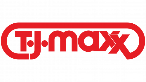
The logo features a red inscription, “TJ Maxx,” where the first two letters are uppercase, and all the rest are lowercase. Despite the differing cases, the size of the glyphs is consistent. From the bottom of the “J” to the lower right corner of the final “X,” there’s a stripe extending across the top, forming an incomplete frame for the emblem. To ensure the stripe began at the same level on both sides, designers had to lower the “X.” For visual balance, it overlaps the preceding letter. Flanking the “J” are bold dots reminiscent of eyes, making the glyph look like a quirky hooked nose.
1985 – today
After the redesign, the decorative stripe was removed, but the positioning of the letters remained unchanged. The brand’s management kept both “X”s connected – one in line and the other slightly below, having an elongated diagonal. This memorable detail makes the TJ Maxx logo instantly recognizable. The same goes for the signature dark-red color.
Font and Colors
The font of the inscription is reminiscent of Gordon Regular, which Francis X Mahoney designed. It features both straight strokes and rounded edges. However, the emblem’s creators modified the “x” letters to align with the department store chain’s concept.
The color scheme traditionally incorporates dark red and white. One is used for the text, and the other for the background, and they can be alternated.
