The TLC logo symbolizes the energy and passion with which the brand approaches its work. At the same time, it conveys the goal of the channel – to inspire and entertain the audience with diverse content. The visual softness of the emblem indicates that TLC aims to create a comfortable atmosphere for viewers.
TLC: Brand overview
| Founded: | October 1980 |
| Founder: | Warner Bros. Discovery |
| Headquarters: | Maryland, United States |
| Website: | tlc.com |
TLC was launched in 1980 under the name ACSN – The Learning Channel, to broadcast documentary films about nature, science, technology, medicine, history, etc. Its ratings were low due to the academic delivery of information, so the channel decided to abandon educational programs and started showing entertainment shows. Among its television series are Hoarding: Buried Alive, about people cluttering their homes with trash; Long Island Medium, about a self-proclaimed psychic; and My 600 Pound Life, about the life of those who suffer from pathological obesity. One of the most scandalous was a reality show about a large family, 17 Kids and Counting.
Meaning and History
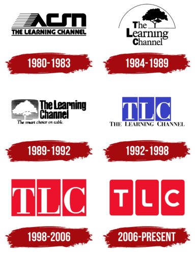
The original TLC logo reflected its initial name: ACSN – The Learning Channel. The new abbreviation, consisting of the letters “T,” “L,” and “C,” appeared on the emblem only in the 1990s when the brand was renamed, and the emphasis shifted from educational programs to entertainment shows. “TLC” should be deciphered as “The Learning Channel,” although now the channel is not focused on educational content. Thus, its logo continues to maintain a historical connection with the idea of learning and acquiring new knowledge.
What is TLC?
TLC is a cable channel that broadcasts in the USA and Canada. Its headquarters are located in Silver Spring, Maryland. It was created in 1980, and in 1991 it became part of Discovery. Initially, the channel specialized in educational content, but by the late 1990s, it introduced shows aimed at attracting a wider audience, for example, programs about the lives of sick people, crime, and home improvement.
1980 – 1983
At the dawn of its existence, TLC was known as ACSN – The Learning Channel. This name is presented on a black and white logo and arranged in two rows. The top level is occupied by a stylized abbreviation, which features a unique design. The “A” lacks a crossbar, making the letter resemble an inverted “V.” Thin parallel lines emanating from it extend to the left. They symbolize movement, progress, and the expansion of knowledge. The “C” and “S” are connected, reflecting the integration and connection between different aspects of education. The phrase “THE LEARNING CHANNEL” occupies the second line and is placed between two horizontal bars. It is done in a bold sans-serif font, some of its angles rounded.
1984 – 1989
In 1984, the “ACSN” abbreviation was removed from the brand’s name. Now the phrase “The Learning Channel” is divided into three lines and doesn’t have an underline. The initial “T,” “L,” and “C” are executed in capital bold sans-serif letters. All other letters are lowercase, semi-bold, and have short serifs. A tree depicted in the upper right corner embodies growth, development, and the power of education, and the strong roots of this plant are typically associated with stability and steadiness. The logo is covered with an arc from a thin black strip, which visually resembles a rainbow – a symbol of transformation and prosperity.
1989 – 1992
The tree silhouette, which was previously black, has become white and is set against a multitude of thin horizontal lines forming a stylized television screen. The negative space effect is used here. The brand name is on the right and occupies two lines. It is styled in a bold sans-serif font. At the bottom is the advertising slogan “The smart choice on cable.”, set in thin italics.
1992 – 1998
In 1992, the channel’s name was shortened to TLC, but the phrase “THE LEARNING CHANNEL” still appears on the logo of this period. It is written in black glyphs at the very bottom. The main space is occupied by the white letters “T,” “L,” and “C,” each of which is located in its blue rectangle. Here a contrast serif font is used.
1998 – 2006
The full variant of the name was removed because the channel abandoned educational content in favor of sensational shows about design and people. The rectangles serving as the base for the abbreviation were repainted in a rich red color. This change reflects the dynamism and brightness of the programs that TLC offers.
2006 – today
In 2006, the channel decided to abandon home improvement and design shows. To mark a new milestone in its history, it changed its logo, making it more balanced. Now the “T,” “L,” and “C” are inside red rectangles with rounded corners. The letters are reduced and slightly lifted. The designers removed the serifs, aiming for visual softness.
Font and Colors
The modern abbreviation “TLC” consists of bold glyphs without serifs, some of whose angles are rounded. They are created based on an individual design, but the “C” in shape resembles the corresponding letter from the Churchward Isabella Medium font by BluHead Studio.
The white inscription against the background of red rectangles looks stylish and is easily readable. It’s a classic color combination, signifying a balance between calmness and bright emotions.
TLC color codes
| Spanish Red | Hex color: | #ec122b |
|---|---|---|
| RGB: | 236 18 43 | |
| CMYK: | 0 92 82 7 | |
| Pantone: | PMS Bright Red C |
