The largest Asian marketplace has a Tmall logo that looks mysterious, but that’s what made it famous. The original style of the emblem immediately makes it clear that the online store is intended for Chinese people who love unusual and practical things.
Tmall: Brand overview
| Founded: | April 2008 |
| Founder: | Alibaba Group |
| Headquarters: | China |
| Website: | tmall.com |
Meaning and History
Tmall is considered the largest Chinese online platform in the B2C sector. It used to be called Taobao Mall but had to split from Taobao due to branding issues. The main marketplace sold products of low quality and dubious origin, while the Taobao Mall section featured original products of famous brands. The only thing they had in common was very similar names, which often confused customers. As a result, the sites were divided. This is how Tmall appeared, which since 2012 has been officially called Tian Mao in China, that is, “heavenly cat.” This unusual name served as the basis for all his logos. They depict a cartoon cat in black with large round eyes.
What is Tmall?
Tmall positions itself as the largest online retail platform in Asia. This is a site that forked from Taobao.com in 2010 with its domain. In 2011, Tmall became an independent company within the Alibaba Group, and a year later changed its Chinese name to Tian Mao.
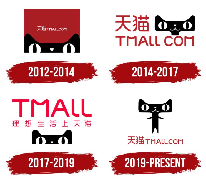
2012 – 2014
London-based studio Superunion designed most of Tmall’s visual identity, including the color scheme, mascot, and wordmark. The specialists drew inspiration from the phrase “sky cat” (Tian Mao), so they built a branding around the image of a personified cat. They decided to turn him into a conductor for the clients of the marketplace.
The custom-drawn logo featured a dark red rectangle. A black cat’s head occupied the lower part, but not all, but only its top with large ears, a triangular nose, and round white eyes, inside of which were vertical pupils. The head was extended horizontally. In the center of the square is a white inscription made up of two characters and the address of the e-commerce website: “TMALL.COM.” The hieroglyphs denoted the Chinese name of the brand: Tian Mao.
2014 – 2017
Another old Tmall logo featured a bilingual marketplace name and a black cat head on a white background, this time with a thin neck and no triangular nose. All lettering was in red. The hieroglyphs were at the top, and the words “TMALL COM” (without a dot) were at the bottom. Both lines were left-aligned. The cat’s head was located in the upper right corner.
2017 – 2019
Designers regrouped the e-commerce website logo. At the top was the inscription “TMALL,” and below it – seven Chinese characters. All glyphs have been recolored in deep pink with a hint of fuchsia. A black cat’s head was at the very bottom, peeking out just like in the first logo. The background was white.
2019 – today
Tmall now has a full-length cat logo. The animal stands behind its hind legs, and the front legs are spread apart as if trying to maintain balance or inviting hugs. The mouth, consisting of two curved lines, resembles a friendly smile. The Chinese name of the brand is written in red at the bottom. In the same line is his domain address: “TMALL.COM.” The designers left a custom sans-serif font in which many of the corners are rounded.
The marketplace also uses two short versions of the logo. One of them serves as an application icon. Its base is a red square with rounded sides. It contains the white characters for Tian Mao and the already familiar black cat head that peeks out from below.
The second short Tmall logo is the website icon displayed in the browser in front of the page name. It looks like a red square with a white “T” in the middle. In the lower part of the quadrangle, a black stripe is drawn, supplemented on both sides by triangular elements that imitate cat ears.
The cat in the Tmall logo is shaped like the English letter “T” and the Chinese character “天” for “sky.” This coincidence is not accidental because, in 2012, the trading platform officially became known as Tian Mao, which translates as “sky cat.” Tmall is only an international brand name. On the other hand, the phrase “Tian Mao” can be interpreted as “lynx,” but, judging by the emblem, it is the cat meant.
The final link in the rebranding of the site, which is separated from Taobao, is a new logo. It was accepted due to a competition for the best design, which lasted almost two months. Representatives of the trading platform received more than 12 thousand works. Among them, the most winning was the cat – the current mascot of Tmall.
The artists drew inspiration from the word “Mao,” which is also the name of the politician Mao Tse-Tung and translates as “cat.” There is an interesting story connected with this. Shortly before Tmall split from Taobao and moved to its domain, the Chinese segment of the Internet noticed that on a banknote with a portrait of the creator of China, a decorative pattern folds into the silhouettes of three mysterious cats. Allegedly, one of them stands on its hind legs, and the other two worship it. Moreover, the animals have large heads, elongated horizontally, round eyes, and triangular noses.
The designers of the Tmall emblem decided to play on this fun fact by depicting a “sky cat” that should act as a guide for visitors to the marketplace. As a result, a partially anthropomorphic character has become the central element of the concept, and the rest of the identity is built around it.
Font and Colors
All Tmall logos are united not only by the image of a cat but also by the same typography. Designers have developed an individual sans-serif typeface for wordmarks: the domain address of the trading platform is written in a grotesque with rounded corners. The capital ” M “has a most unusual look,” which uses a downward curved line instead of the central diagonals.
Both icons and the Tmall wordmark are bright red. This color in Chinese culture symbolizes joy, happiness, holidays, and celebrations. The cat in all versions is black, and his eyes, nose, and mouth are white.
Tmall color codes
| Safety Red | Hex color: | #be2026 |
|---|---|---|
| RGB: | 190 32 38 | |
| CMYK: | 0 83 80 25 | |
| Pantone: | PMS 485 C |
| Black | Hex color: | #000000 |
|---|---|---|
| RGB: | 0 0 0 | |
| CMYK: | 0 0 0 100 | |
| Pantone: | PMS Process Black C |
