


After watching American movies, I learned that baseball is associated with strong team spirit and support. Think of the uniforms worn by players, cheerleaders, and mascots, with various patches. They all use baseball team emblems to keep fans interested. Emblems are used as stripes on clothing, player uniforms, flags, and other souvenirs. Logos often symbolize teams with long histories and entire cities, states, or regions. They are undeniably recognizable, which helps attract fans’ attention.
What are the top 20 best baseball logos?
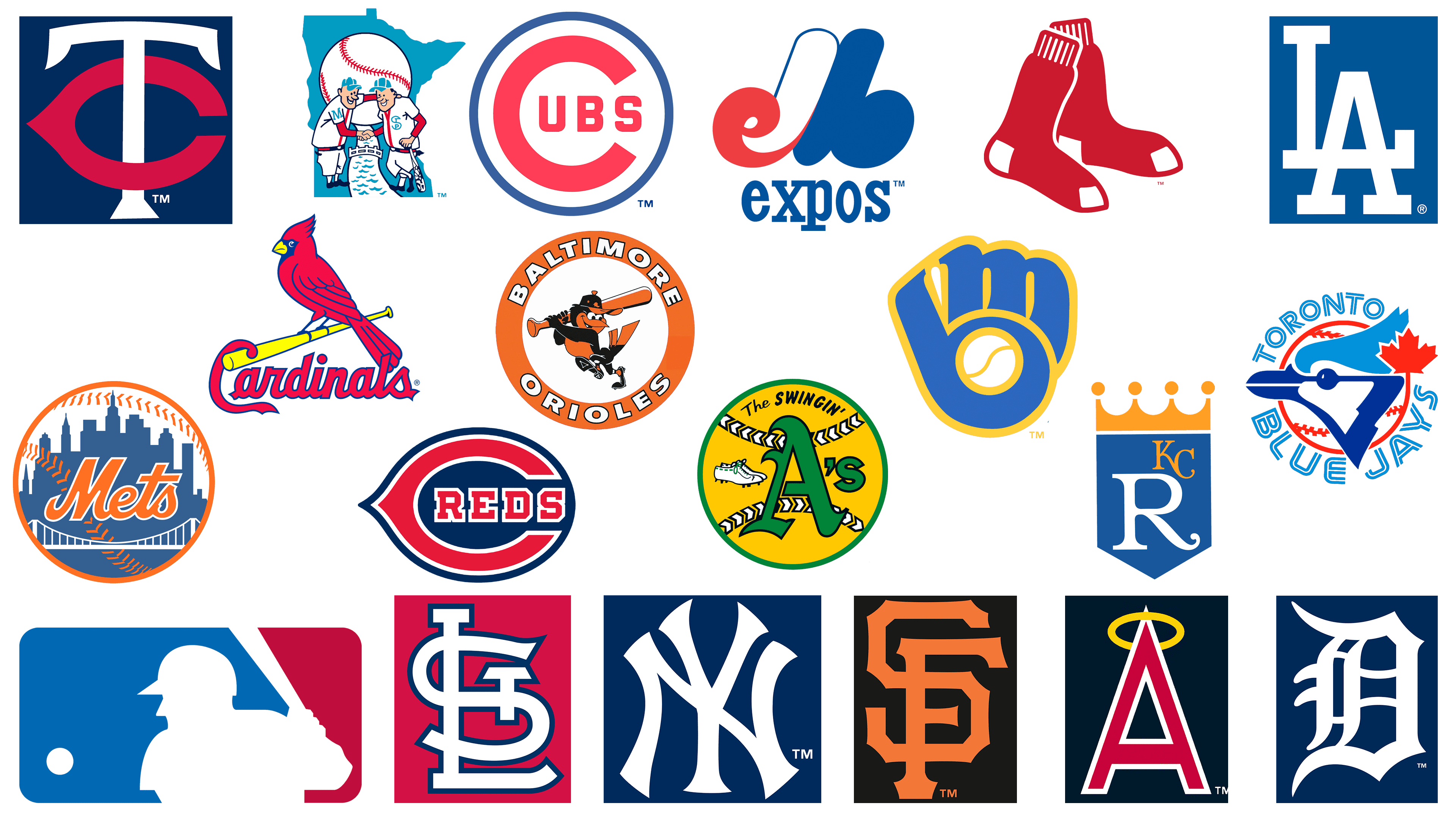
This is a ranking of the top 20 best MLB logos. The top ten includes club symbols of New York Yankees (NY logo), Toronto Blue Jays (1977-1996), St Louis Cardinals (STL logo), Kansas City Royals (1969-1992), Detroit Tigers (Old English D), Milwaukee Brewers (1978-1993), Oakland Athletics (1971-1982), Cincinnati Reds, Boston Red Sox and even Major League Baseball (“Batter”) graphics.
After analyzing our selection, you can see that most teams use a combination of red, blue, and white colors. This color palette symbolizes impulsiveness, but thanks to the blue, it also conveys confidence and reliability. Red increases heart rate and breathing, making fans empathize with the team.
20 Baltimore Orioles 1966-1991
![]()
The team’s emblem from 1966 to 1991 is still popular among fans. In 1966, the team used a cartoon bird holding a bat for the first time. This period is considered the most successful in the team’s history: since then, the Baltimore Orioles have won the World Series three times.
The team is named after the Baltimore Oriole, a small black-and-orange bird native to North America. The Baltimore Oriole is the team’s symbol and appears on all its logos. The bird is placed inside an orange circle with the team’s name.
19 Minnesota Twins: TC emblem
![]()
The team’s emblem consists of the letters TC, which can be deciphered as “Twin Cities.” The team is named after two cities, Minneapolis and St. Paul. The simple but colorful emblem is eye-catching. The graphic elements blend harmoniously to create a readable logo. White and red letters on a blue background create an eye-catching contrast.
The team’s primary emblem, worn from 1961 through 1986, is now worn on hats or as a patch on clothing.
18 Los Angeles Dodgers: LA emblem
![]()
The Los Angeles Dodgers, founded in 1883, are a baseball legend. The team’s emblem has remained virtually unchanged since 1958 and is one of the most recognizable in sports. The harmonious combination of blue and white makes it balanced and unobtrusive. The use of the color palette is associated with reliability. The emblem is often seen on caps and other paraphernalia. It also perfectly complements the team’s players’ uniforms.
17 San Francisco Giants: SF emblem
![]()
The SF emblem perfectly combines detail, color, and font. The team’s primary color palette is black and orange. The letters SF stand out against the black background. For their creation, the same font was used for the inscription Giant in the emblem (it is impossible not to notice the identity of the letters S). It took a long time to create the perfect logo. Beginning in 1958, the designers made minor adjustments. Changed the font and color saturation, but the idea of the emblem remained unchanged.
16 California Angels Halo-ed “A” 1972-1988
![]()
The modern version of the professional baseball club logo originated from the logo of this period. The balanced combination of colors and elements led to the team’s success. However, in 1995, the team abandoned the A’s logo and did not return to it until 2002. The dominant colors are red and blue, which are favorites among baseball teams. The yellow halo around the letter “A” is a good reference to the team’s name.
15 Minnesota Twins, Minnie and Paul
![]()
The baseball team we already know has a good emblem and an equally colorful logo. Minnie and Paul represent the cities of Minneapolis and St. Paul. Additional details on the emblem include the Mississippi River, a bridge, and a baseball. The idea behind the logo is to demonstrate the cities’ unity through the twins’ handshake. Illustrator Ray Barton created the logo for $15. The team made only one change to the image: adding lettering to the T-shirts dedicated to the twin cities.
14 New York Mets
![]()
The New York Mets team logo is one of the most successful in sports history. It was created in 1962 by illustrator Ray Gotto. Since then, the logo has remained virtually unchanged except for minor adjustments, such as dropping the tiny NY abbreviation. It has several elements and a successful color palette: blue, orange, and white. The logo is a baseball with the silhouette of New York and the Mets’ name inside. The successful combination of elements is timeless and new trends in logo design.
13 Chicago Cubs
![]()
The 1957-1978 team emblem was very successful and minimalistic, perfectly in line with current trends. The combination of red, white, and blue colors made the image bright and eye-catching. The team is now using a modified version of the old emblem, making the font and lines bolder and the colors more saturated. Throughout history, the baseball club has often experimented with logo variations to find the perfect one.
12 Montreal Expos 1969-2004
![]()
The Montreal Expos baseball team’s emblem is memorable for its clever use of color and detail. Immediately striking is the capital letter “M,” depicted in three colors: red, white, and blue. Looking closely, you can also see the letter “e” highlighted in red and “b” highlighted in blue. Since moving from Canada to Washington, D.C., the team has used an updated emblem with more detail.
11 St Louis Cardinals
![]()
The team’s emblem features a red bird perched on a bat. The cardinal has been present in every image throughout the team’s history. Some variations have featured a pair of birds, but the basic idea has remained the same. The flamboyant cardinal is eye-catching. It has become more detailed over time, and some elements have changed, such as the color of the beak and eyes. The letter “C” from the team name seems to hang off a bit, making the image more balanced.
10 Major League Baseball “Batter”
![]()
Jerry Dior created the famous Major League Baseball logo in 1968. He was also asked to create the logo for professional baseball’s centennial in 1969. Many speculate that the logo featured Harmon Killebrew, but the illustrator says the player’s silhouette was created in several ways. This image is still used by teams, who occasionally change the red and blue to their club colors.
9 Boston Red Sox
![]()
The Boston Red Sox baseball team’s emblem fully reflects its name. Red socks have been known worldwide since 1924. Over time, illustrators and designers added details to the famous logo, but since 2009, the team has abandoned those details. The team name is not even featured on the emblem, despite its high recognizability in sports.
8 Cincinnati Reds
![]()
The baseball team used the club’s name as the logo rather than symbols or mascots. The letter “C” is visually pleasing, and the color combination makes the image more dynamic. In the 40s, the team performed in three colors: blue, red, and white. The Cincinnati Reds won the World Series during this period, so the logo became synonymous with success. Now, black is used instead of blue, creating a shadow and a three-dimensional image.
7 Oakland Athletics 1971-1982
![]()
Get ready for an explosion of bright colors! The Oakland Athletics logo is the only logo in our collection that doesn’t use blue and red. Like the previous team, it is associated with success, having won the World Series from 1971 to 1974. The A’s baseball team (often referred to as the Oakland Athletics) features white sneakers with green laces. All the details are placed inside the baseball, using yellow and green.
6 Milwaukee Brewers “Ball in Glove” 1978-1993
![]()
In 1977, the team decided to hold a contest to change their logo. Contestants had to create an image that would look equally good on small and large objects or places. The winner was Tom Meindel, who created the famous blue-gloved baseball that soon became a fan-favorite logo. Although the team doesn’t use the image in its operations now, it remains the most recognizable image in history.
5 Detroit Tigers Old English D
![]()
The old letter “D,” the baseball team’s emblem, symbolizes the club’s history. It is used on the players’ uniforms and hats. The unique font and serifs on the ends turned an ordinary letter into a strong symbol. Fans believe that such an emblem is perfect for a baseball team. Designers experimented with images several times but eventually settled on the letter, only changing the weight and font over the decades.
4 Kansas City Royals 1969-1992
![]()
The elegant Kansas City Royals logo is the foundation of the baseball team’s corporate identity. Hallmark Cards was tasked with designing the logo. Fifteen artists worked on creating the image, and Shannon Manning was the winner. She harmoniously used all the trends of the time: geometry, bright colors, and laconism. The artist’s logo has served as the basis for all modern versions and has undergone minor changes over the years.
3 St Louis Cardinals: STL emblem
![]()
If you remember the logo as a red Cardinal on a baseball bat, you’ll agree that the team’s emblem is a concise complement. The three main letters are intertwined in white with a blue border on a red background. Many Hall of Fame members have worn this emblem, thereby increasing its status in the eyes of fans. In 2020, the team slightly changed the image, with designers making the outer blue line a little thinner.
2 Toronto Blue Jays 1977-1996
![]()
The team’s 1977-1996 emblem is considered the most successful in history. In 2020, the Toronto Blue Jays decided to return to this iconic image, which is well-perceived by fans. The logo of that period presents the main elements: the name, the country of origin, and the symbol. It uses a bright combination of white, blue, and red colors.
1 New York Yankees: NY emblem
![]()
Even those who do not understand baseball have heard of the New York Yankees. The team’s famous emblem, designed by Tiffany & Co. in 1877, is still used today. The image has witnessed the team’s meteoric rise and many victories. With a laconic font, the minimalist emblem retains its popularity and uniquely aligns with modern trends.
FAQ
How old is the MLB logo?
The official logo of Major League Baseball (MLB) was created in 1968 by designer Jerry Dior. MLB had asked the marketing firm where Dior worked to create a logo for the 1969 centennial celebration of professional baseball.
The logo features a silhouette of a batter in mid-swing, framed in red, white, and blue. This design captures the essence of baseball and its patriotic connection as America’s pastime.
The MLB logo first appeared on uniforms during the 1969 season, marking the 100th anniversary of professional baseball. Since then, it has become one of the most recognizable sports logos in the world. The logo has remained largely unchanged, retaining its classic, timeless look.
Over the years, the MLB logo has been used in various forms of branding, from merchandise to advertising, reinforcing Major League Baseball’s identity.
What is the baseball logo called?
The MLB logo, known as the “Batter” logo, was commissioned by the Major League Baseball Centennial Committee and introduced by Baseball Commissioner Bowie Kuhn. It was created for the 1869-1969 Professional Baseball Centennial Celebration, held on July 21, 1969, in Washington, DC.
The “Batter” logo features a mid-swing silhouette of a baseball player framed in red, white, and blue. This design captures the essence of baseball and its connection to American culture. It has become one of the most iconic symbols in sports, representing the tradition and excellence of Major League Baseball.
The logo was designed to mark the centennial of professional baseball, celebrating its 100-year history. Over time, the “Batter” logo has become synonymous with MLB, appearing on uniforms, merchandise, and promotional materials. It remains a key part of the league’s identity, reflecting its rich heritage and ongoing legacy in the sport.
What is the best logo in baseball?
According to a recent online poll, the Toronto Blue Jays logo is considered the best in Major League Baseball. The logo features a blue jayhead with a red maple leaf, capturing the team’s Canadian heritage.
This design was popular in the early 2000s and has made a comeback. Its clean lines, vibrant colors, and distinct imagery make it stand out. The logo represents the team’s identity and connects with fans.
How many MLB logos are there?
Major League Baseball (MLB) has 30 teams, each with a unique logo. These logos represent each team’s identity, history, and city. They appear on uniforms, merchandise, and promotional materials, serving as symbols for fans and players.
In addition to the team logos, there are the official MLB logo and the “Batter” logo. This logo represents the league as a whole. So, there are 31 significant logos in Major League Baseball.
What baseball team has a star as a logo?
Several baseball teams have stars in their logos:
- Houston Astros: Their logo features an orange five-pointed star, symbolizing the team’s connection to Houston, the Space City.
- Philadelphia Phillies: Their logo includes two small stars replacing the dots above the “i” letters.
- Seattle Mariners: Their logo has a four-pointed star styled as a compass needle, representing their maritime theme.
- Tampa Bay Rays: Their logo features a six-pointed star that looks like a flash of light.
- Texas Rangers: Their logo has two stars framing the team name, highlighting their Texas heritage.
- Washington Nationals: Their logo includes two stars, emphasizing their patriotic connection to the nation’s capital.
- New York Yankees: Their hat features four stars, adding to its classic, iconic look.
These stars represent different aspects of each team’s identity, from geographical connections to thematic elements, making each logo unique and meaningful.
What MLB team has the oldest logo?
As of 2021, the New York Yankees are the MLB team with the oldest logo. Their iconic logo, featuring the intertwined “N” and “Y,” was created in 1968 and has become one of the most recognizable symbols in sports.
The design has remained unchanged, symbolizing the team’s rich history and tradition. The simplicity and elegance of the intertwined letters reflect the Yankees’ long-standing success and dominance in baseball.
The Yankees’ logo has been a constant presence on uniforms, merchandise, and promotional materials, reinforcing the team’s identity and connection with fans. Its longevity and consistency make it a significant emblem in Major League Baseball, representing the enduring legacy of the New York Yankees.