


 Top Gun Logo PNG
The Top Gun logo is widely recognizable due to the movie’s popularity. It embodies the energy, skill, and outstanding abilities of military pilots and is also associated with aviation and the United States Navy. This emblem has become an icon of the film industry, symbolizing elite pilot training.
Top Gun began in 1986, when director Tony Scott filmed aerial combat with real military aircraft because computer-generated imagery could not produce convincing dogfights. Cameras were mounted on F-14 Tomcats and aircraft presented as Soviet MiG-28s. Pilots performed real maneuvers at high speed, while the crew worked around active jets and genuine flight risks.
The film appeared in the same year as Iron Eagle, another action production focused on military aviation, though made on a smaller scale. Its release had a measurable effect outside cinemas. According to the provided history, voluntary applications to the US Navy rose by 500 percent in 1986. Recruiting booths were placed in theater lobbies, where viewers could speak with Navy representatives after screenings and sign service contracts.
Decades later, Top Gun: Maverick returned to the same reliance on real aircraft and military hardware. Producers worked with the Department of Defense under a strict condition. Tom Cruise could take part in aerial filming. Yet, he was forbidden from piloting a modern combat jet himself, despite his aviation experience and long record of performing stunts.
Released in 2022, the sequel arrived 36 years after the original. It became the highest-grossing film of Tom Cruise’s career and ranked first among films released that year. Its box-office total placed it ahead of new entries from major Hollywood franchises supported by larger marketing budgets and established screen universes.
Meaning and History
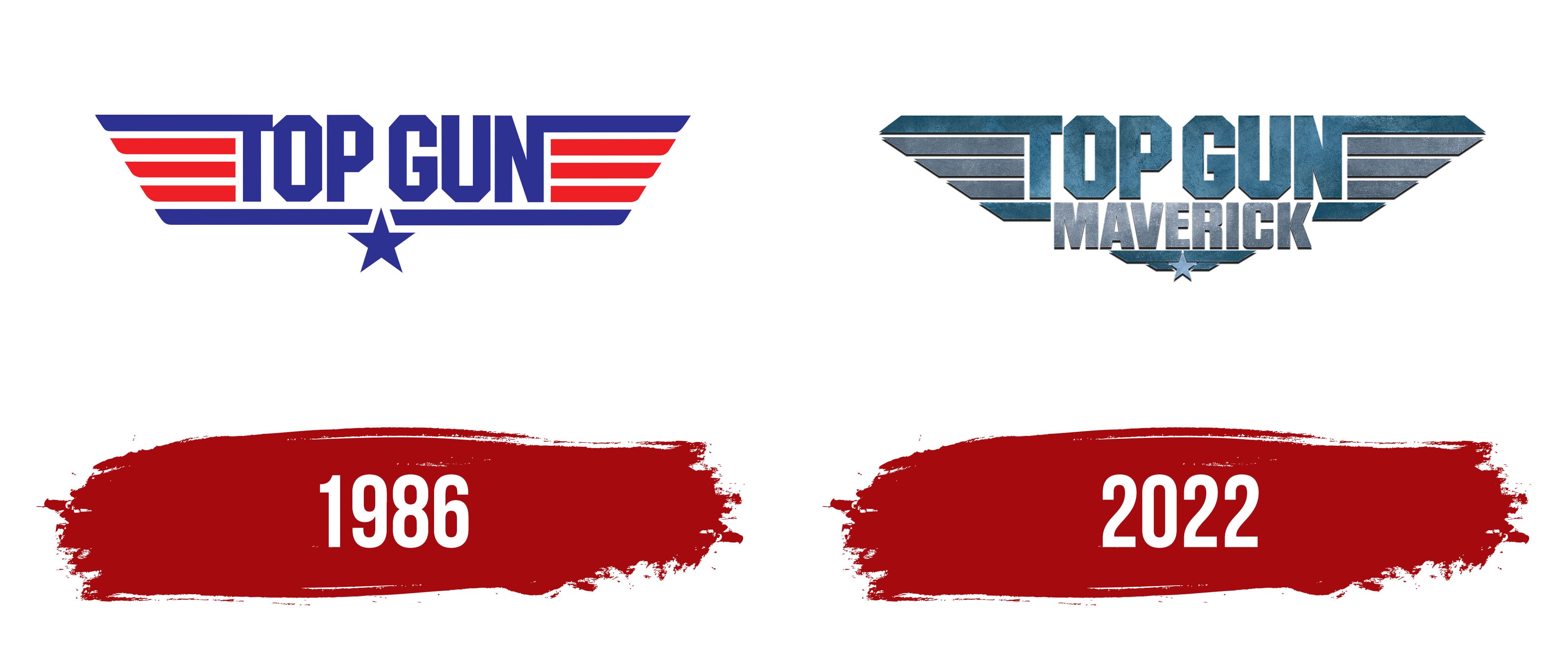
Each movie in the military pilots’ franchise has its own logo. They share a common design: the inscription “TOP GUN,” surrounded by horizontal lines that imitate wings. This title was inspired by the US Navy Strike Fighter Tactics Instructor program, also known as Top Gun, which ran from 1972 to 1996 at one of the U.S. Naval Air Stations. In turn, the wing stylization is linked to the classic shape of the United States Armed Forces aviation badges. Crew members receive them after training and certification. Unlike real badges, blockbuster emblems have a simplified appearance. They are adapted to the modern mass market because they promote products and souvenirs associated with the media franchise.
What is Top Gun?
It is a franchise based on the eponymous 1986 action movie. The original film was inspired by an article from California magazine and filmed by American producers Jerry Bruckheimer and Don Simpson. It tells the story of pilot Pete “Maverick” Mitchell, who entered the United States Navy aviation school. In 2022, the sequel to the blockbuster titled Top Gun: Maverick was released. Tom Cruise played the leading role in both films.
1986
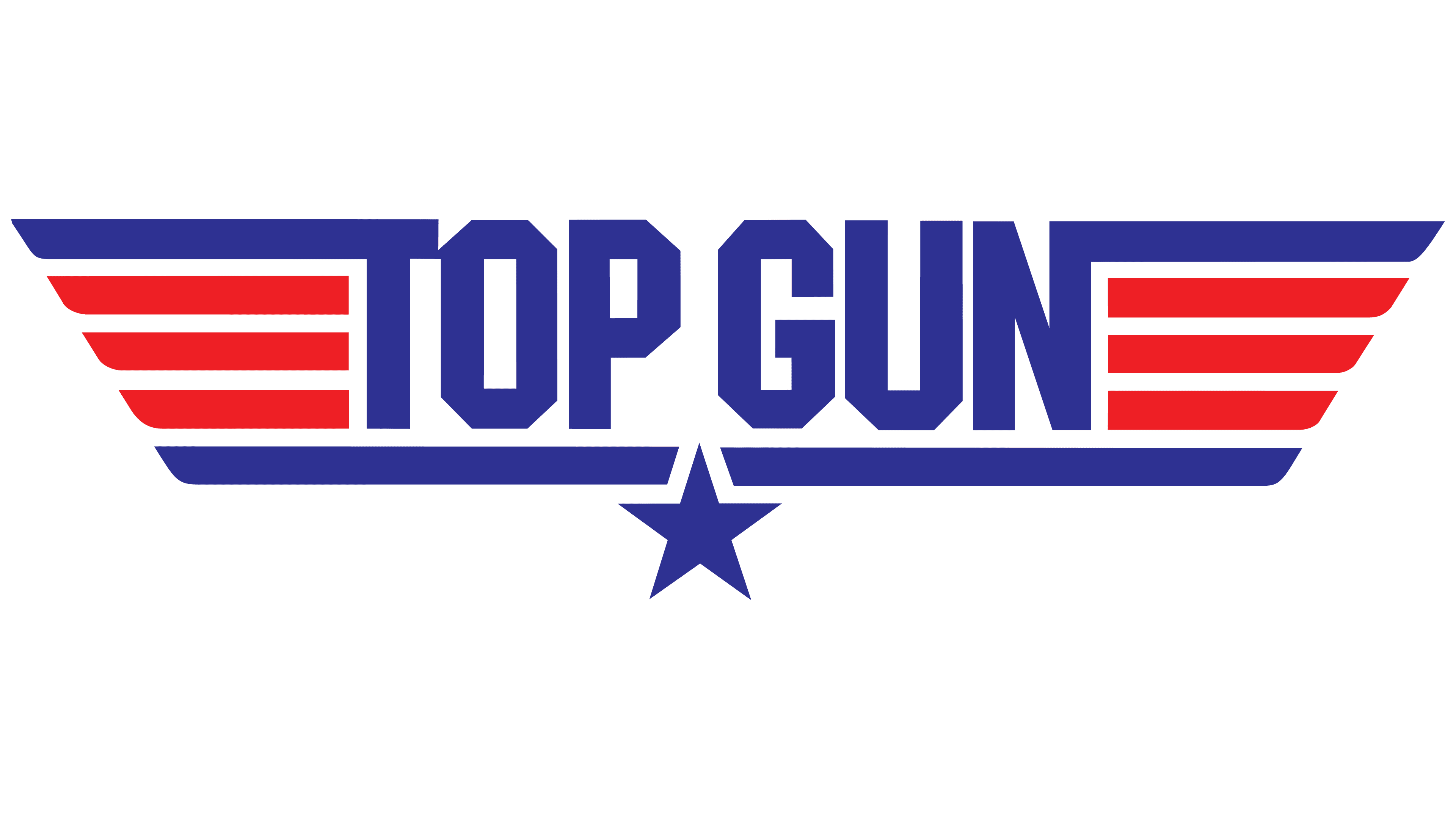
The logo of the original movie features the blue phrase “TOP GUN” in bold uppercase letters. The angular shape of the letters is combined with a pattern of horizontal stripes, which are stylized wings. They symbolize the ease of flight, freedom, and the pilots’ skill. The bottom line underscores the inscription and is divided in the middle by a five-pointed star. Stars are often used in US military symbolism because they reflect patriotism and service to the country. The top stripes are harmoniously integrated into the action movie’s title: they connect with the first “T” and the last “N.” And under each of them, there are three red lines. All parallels vary in length and have oblique ends. The blue-red color scheme and some elements are a nod to the United States flag.
2022
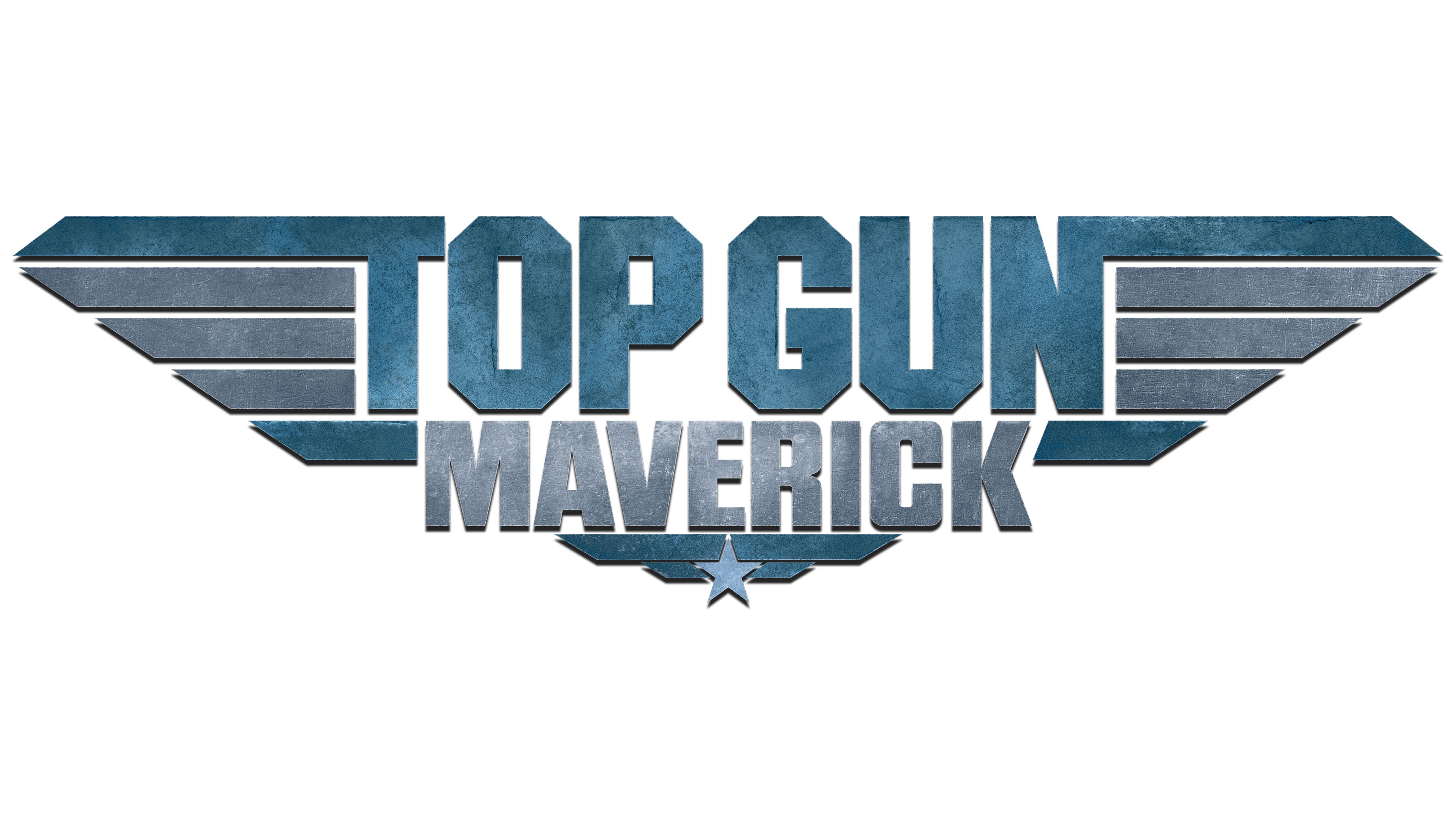
The logo for the 2022 movie is slightly different. In this version, under “TOP GUN” is the word “MAVERICK,” in uppercase, bold, with rounded corners. Even lower is a star on two short rectangles. The lines, resembling wings, have widened. The cut shape of the upper strips, which are connected to the letters, has changed: their ends are now inclined in the opposite direction. Due to the dark shadows, all elements appear three-dimensional. The silver-gray gradient evokes the color of carbon steel, while subdued blue shades with uneven spots symbolize the sky.
Font and Colors
Glyphs with individual designs were developed for the movie logo’s inscriptions. The font of the phrase “TOP GUN” is characterized by solidity and angularity. It is similar to the ITC Machine typeface, created by Bonder & Carnase, Inc. It may also have been influenced by Dex Gothic from URW. The word “MAVERICK” is set in a sans-serif font that shares common features with RB No 2.1, Eurostile Bold Condensed, and Compacta.
The combination of red and blue in the 1986 emblem is a reference to the colors of the American flag. The 2022 version features a color scheme characterized by various shades of gray and blue. The gradient and graininess effect give the image depth.