


 Toyo Tires Logo PNG
The Toyo Tires logo symbolizes tranquility, smoothness, and harmony. The emblem represents a modern company that has achieved impressive scale and growth by implementing new technologies.
Toyo Tires began on August 1, 1945, in Itami, Hyogo Prefecture, during the final days of World War II. Toyo Tire & Rubber Co., Ltd. was formed through the merger of Toyo Rubber Industrial and Hirano Rubber Manufacturing, with Rikimatsu Tomihisa as its first president. In postwar Japan, the company served the recovering transport sector while producing tires, rubber footwear, conveyor belts, and tubes.
In 1949, Toyo listed shares on the Osaka Stock Exchange, followed by the Tokyo Stock Exchange in 1955. That capital supported modernization as Japan’s car market expanded. In the early 1960s, Toyo moved into radial tires, following a broader industry shift also pursued by Bridgestone and Sumitomo. In 1966, Toyo Tire USA Corp. opened as its first overseas sales unit, giving the company access to the American tire market.
European expansion followed in 1975 with Toyo Reifen GmbH in Germany. In 1979, Toyo acquired California-based Nitto Tire, a 40-year-old performance tire brand. The two brands then developed side by side within the same group. In 1982, Toyo established a Canadian subsidiary and, in the late 1980s, opened its first North American plant in Mount Vernon, Illinois, to produce commercial truck tires.
The US SUV and pickup boom of the late 1990s gave Toyo a new position. Proxes S/T targeted sport trucks with a proper load index, while Open Country M/T followed in 2003 for off-road use. In 2004, Toyo opened its main US plant in Bartow County, Georgia. In 2008, it released 26, 28, and 30-inch passenger tires, and Mitsubishi Corporation acquired a 20% stake. A Malaysian plant opened in 2013, and a Serbian plant began operations in 2022.
Meaning and History
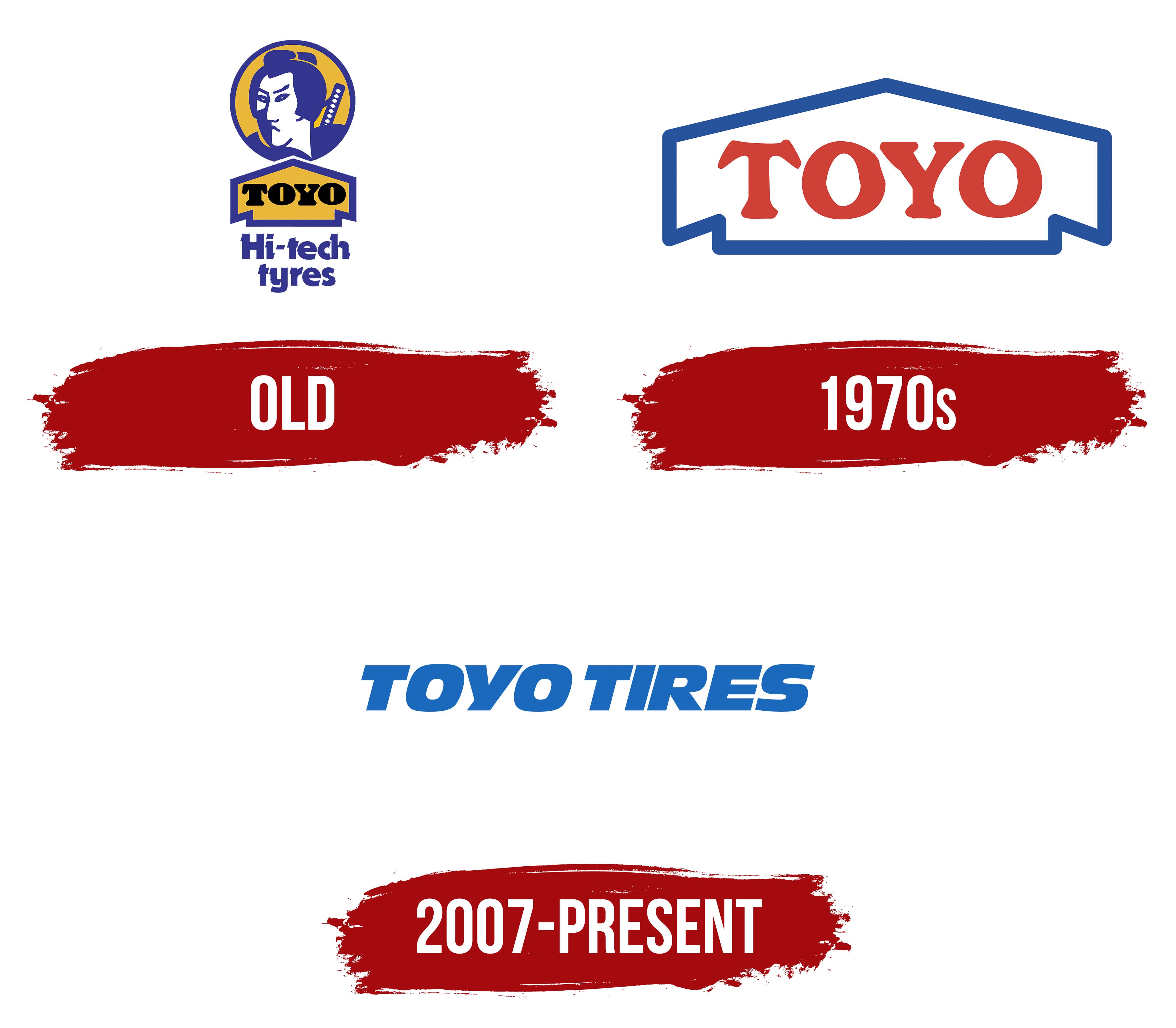
The old and new company logos are significantly different. The use of the English language in the first emblem points to the manufacturer’s ambitions. The company initially aimed for global sales and exports. The US office opened in 1966, which indirectly suggests the emblem’s emergence in the 1960s. Gradually, the company transitioned to a more contemporary visual identity, closer in spirit to a global corporation.
What is Toyo Tires?
A Japanese multinational corporation that manufactures rubber products. The main focus is on tires for transport and special equipment. The company has eight factories in Asia and America, generating $2.5 billion in net profit.
Old

The first logo featured a portrait of a samurai, a large arrow bearing the brand name, and an English inscription stating that the tires were made with advanced technology.
A portrait of a Japanese warrior dressed in traditional clothing, with weapons behind him, points to the values characteristic of the samurai, which the company strives to uphold in its activities. Loyalty to the cause, fair decision-making, and courage to continue working despite competition, difficulties, and problems.
The corporation may use the original name of the samurai Yoshida Tōyō, who, in 1853, was appointed head of his domain to oversee its reform and modernization. His image embodies leadership, wise management, and the pursuit of new modern technologies.
The impression is reinforced by the arrow, in which the name is inscribed. The logo points to the samurai portrait.
Also, Toyo in Japanese means wealth, abundance, prosperity, and fertility. Therefore, it predicts a happy future for the newly established company.
1970s

2007 – today
In 2007, the first factory outside of Japan and the USA was opened. This significant event, combined with the expansion of the US market through the acquisition of Nitto Tire and increased brand recognition through sports sponsorship, was complemented by a new visual identity.
The emblem had to represent a multinational corporation on a global scale, requiring a more formal and simple identity. A symbol is suitable for different subsidiaries and continents. Hence, the modern logo consists of the abbreviated name “Toyo Tires” in blue, without any drawings or figures.
The bold capital letters fully reflect the idea of scale and growth. A slight forward tilt of the inscription complements the impression, emphasizing the theme of movement and cutting-edge technology.
Font and Colors
In Japan, the color blue conveys tranquility and purity. The company conducts business honestly, fully complying with the law and not participating in any schemes. Business is conducted calmly and smoothly. This meaning is embedded in the choice of the logo’s shade. The European association of blue as the color of the sky complements this, speaking of ascent to Olympus and elevation. It indicates far-reaching plans and dreams. The blue shade represents technology and manufacturing.
The font resonates with Antique Olive Nord Italic. The straight, smooth glyphs indicate a smooth ride with the company’s tires.