


![]() Trader Joe’s Logo PNG
Trader Joe’s Logo PNG
Extravagance and originality are the main themes of the supermarket logo. The ability to remain interesting while selling ordinary goods is the main message conveyed by the Trader Joe’s logo. Stores are ready to open their doors wherever they are needed.
Trader Joe’s story began in 1958, when Rexall Drug Co. created Pronto Markets in the Los Angeles area and put Joe Coulombe in charge. He soon saw that the chain could not compete directly with 7-Eleven, so he looked for another customer: educated, well-traveled middle-class shoppers who wanted better wine, cheese, beer, and imported food than standard supermarkets offered.
In 1967, Coulombe opened the first Trader Joe’s on Arroyo Parkway in South Pasadena, California. The name was inspired by Trader Vic’s and its tiki atmosphere. Coulombe placed stores near colleges and universities, aiming at teachers, engineers, and public employees who were often ignored by larger chains.
The format featured private-label goods, a smaller, edited assortment, low-priced California wines, unusual beers, and imported foods. Hawaiian shirts and nautical interiors separated the stores from chains such as Safeway. In 1979, Coulombe sold Trader Joe’s to Theo Albrecht, co-owner of Aldi Nord, but the German owners kept a hands-off approach.
When Coulombe retired as CEO in 1988, Trader Joe’s had 27 stores in California and about $150 million in annual sales. John Shields expanded the chain to Arizona in 1993, the Pacific Northwest in 1995, and the Boston suburbs of Brookline and Cambridge in 1996. Dan Bane took over in 2001, when the chain had 156 stores in 15 states. By 2020, Trader Joe’s had more than 530 stores and an estimated revenue of $16.5 billion, while remaining privately owned by Aldi Nord.
Meaning and History
![]()
In 1957, Joe Coulombe started a project called Pronto Market. It was assumed that the stores would compete with 7-Eleven. But something went wrong, and in 1966, it was decided to liquidate them. Instead, Coulombe bought the Pronto Market brand from Rexall to completely change the concept.
As you know, at that time, there was practically no unemployment or inflation in the United States; many families lived carefree and often traveled. The network’s new owner focused precisely on this stratum of the population, taking the popular marine theme as a basis. The name Trader Joe’s is also associated with exotic motifs because the word “Trader” has a touch of South Seas romance. It was once criticized for being confused with Trader Vic’s. And it’s not just a coincidence: Coulombe wanted his stores to be associated with popular restaurants because those restaurants were also decorated in a tiki style.
Before opening the first outlet, the team of creators conducted a comprehensive branding effort. First, they reviewed the list of registered trademarks and found that no one was using the name Trader Joe’s Market. They could only find one Trader Joe’s in the phone book, which was in a small California town and sold old hubcaps.
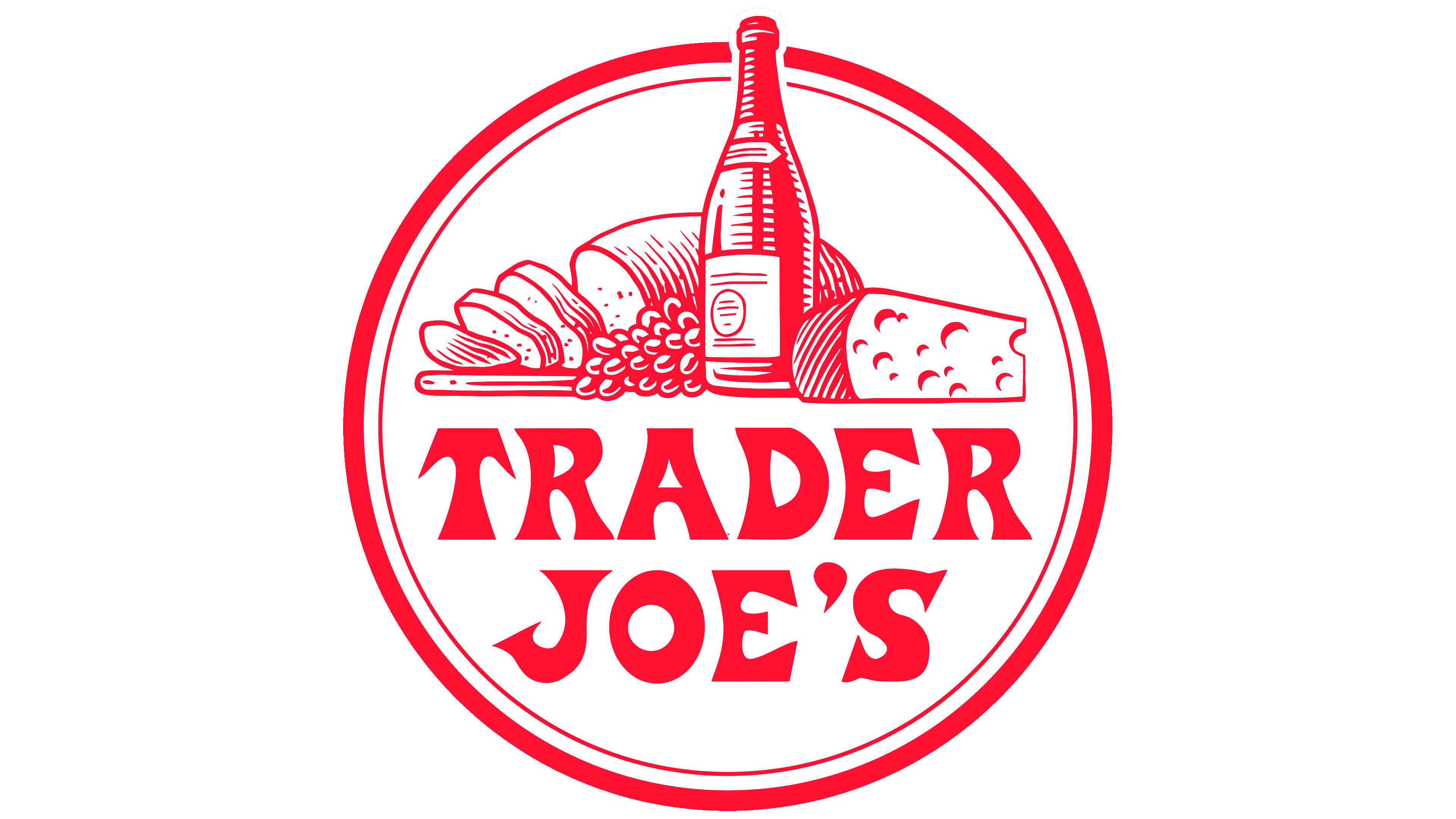
Secondly, the entrepreneurs turned to Fred Schroeder to help make the logo. This man became famous for his signs created for the restaurant Marie Callender’s. Ultimately, he came up with the stylish red “TRADER JOE’S” lettering that still adorns stores today. It first appeared above the entrance to the first Trader Joe’s, which opened in 1967 in a former bottled water factory. The trading floors were full of nautical artifacts, Hawaiian music played loudly, and all the employees wore Bermuda shorts and had ship ranks.
Over time, nothing has changed: the grocery chain has retained its name, visual image, and logo, though it has had to slightly modernize its interior design. Perhaps it is because of this commitment to tradition that it has become more popular than Trader Vic’s. Now the word mark “TRADER JOE’S” is the only thing that decorates the shops. The brand owners thought it looked bright and contained nothing extra, so it did not need improvement.
In addition to the main version of the logo, in which the trademark name is set on a single line, there is a variant with a split inscription. In this case, the words “TRADER” and “JOE’S” are lined up in a center-aligned column. They are adjoined by two red semi-arcs (one above and the other below), which make it seem as if the text is set against the circle’s background, dividing it into two parts.
Font and Colors

The brand’s name is styled in the exotic motifs of tiki culture. It is written in curly letters, so the word mark resembles the signs of coastal taverns and hotels. Of course, the emblem lacks the traditional nautical symbols, but it is still associated with the islands in the Polynesian Triangle. And now, after 50 years, it is associated with quality, affordable products sold at Trader Joe’s.
Fred Schroeder came up with an unusual inscription for the logo while designing the sign. The tiki-style exotic motifs, seascapes, and Aboriginal traditions inspired it. Initially, it was an individual set of glyphs. Later, based on the original text sign, a font called Road Jester appeared. Its author is Harold Lohner.
The red color of the inscription conveys a cheerful holiday atmosphere. The bright color attracts the attention of potential buyers.