The Treehouse Original logo is cartoonish because the target audience for this channel is children. The designers achieved a balance between bright colors and disproportionate shapes to make the emblem look harmonious despite the asymmetry.
Treehouse Original: Brand overview
| Founded: | November 1, 1997 |
| Founder: | Corus Entertainment |
| Headquarters: | Toronto, Ontario, Canada |
| Website: | treehousetv.com |
Treehouse is the name of a specialized channel operating in Canada. Broadcasts have an educational and entertaining character and are aimed mainly at the children’s audience (preschoolers). Broadcasts are in English, and the name itself is fully consistent with the themes of the channel. The main office is currently located in Toronto.
The channel’s visual identity is based on a youth style with bright elements and positive pictures. In the center is an inscription, similar to graffiti. The background is a green lawn, a bright blue sky, rays of sunshine, and gentle clouds.
Meaning and History
Treehouse is an exciting channel with an extensive television program designed for preschool-age children. It includes the latest episodes of popular children’s shows, educational programs, and cartoon series. In such a variety of programs, every child will be able to find an interesting solution for themselves.
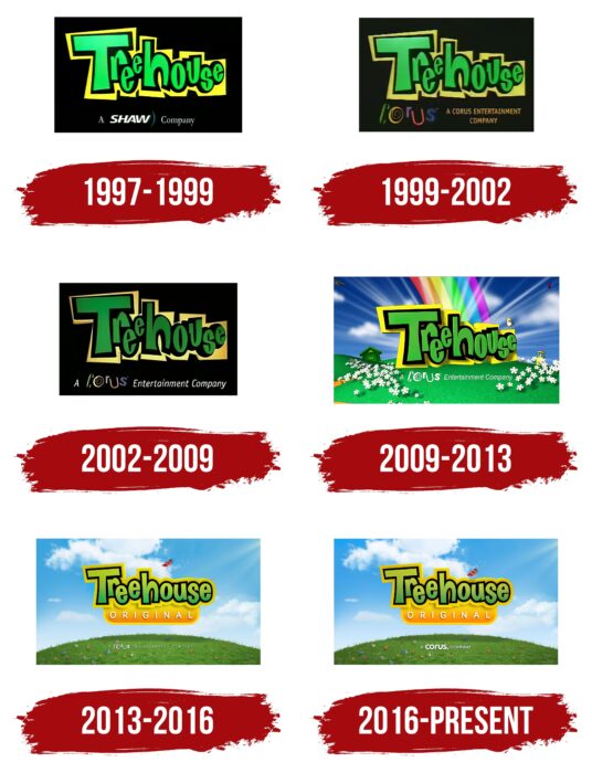
The chosen theme completely defined the brand’s visual identity. There was a perfect balance between bright colors and playful elements. The first logo was a direct hit. But, throughout its existence, it was repeatedly supplemented and modernized. All the presented versions did not deviate from the chosen direction in design.
What is Treehouse Original?
Treehouse Original is a television channel that broadcasts programs for children in Canada. It is one of the most popular in its category and offers viewers an extensive list of interesting programs. All of them are broadcast exclusively in English. The owner is YTV Canada, Inc., which is a subsidiary of Corus Entertainment.
1997 – 1999
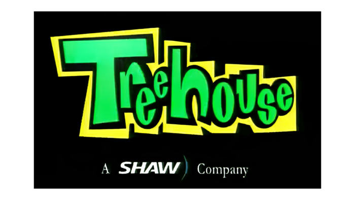
The first emblem of the channel was created back in 1997. That was the year the first Treehouse TV channel aired, and viewers saw an expressive branded badge. It looked bold and bright, which children especially liked. They could immediately recognize the channel with their favorite programs. This was promoted by the lush color palette created from green, yellow, black, and white.
A distinctive feature was the background. It is a neutral light shade in most logos, and here it was chosen black. This solution was needed for contrast. On the black background, we could see the massive letters of the name. It was reminiscent of the brightly colored inscriptions on the walls painted with special spray-paint cans.
The Treehouse lettering was done in three colors: yellow, green, and black (which created shadows). This gave a real 3D effect that matched the channel’s theme and emphasized the type of the programs. Underneath the name was also the inscription A Shaw Company. It symbolized affiliation with the company.
1999 – 2002
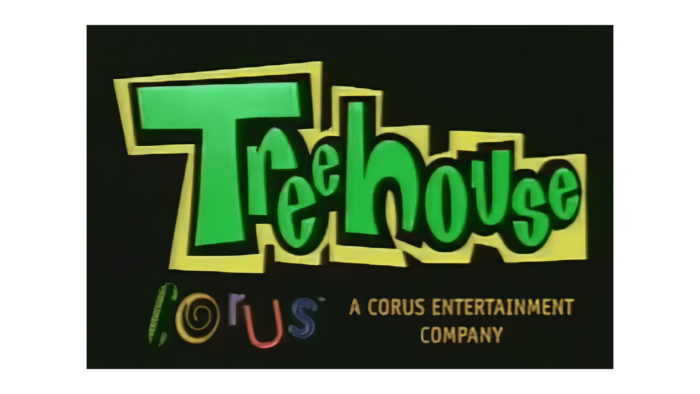
Two years after the channel’s first broadcast, its logo was changed. A few words were added to the bottom inscription. The new version of the inscription represented A Corus Entertainment Company. The colors of this inscription were changed from neutral white to a combination of different colors.
This solution symbolized goodwill, positivity, and fun. In addition, the coloring is reminiscent of the colors of the rainbow, which symbolize childhood and carefreeness. The font looked very fancy and, at the same time, stylish. The coloring of the main inscription did not change. Such changes showed updates and stability at the same time.
2002 – 2009
In 2002 the company achieved a major success in its field. The logo was renewed again. The changes were minor and only touched on the color palette shades and font sizes of the bottom lettering. The bright hues became more muted and darkened. The lower part of A Corus Entertainment Company became lighter and smaller in size. The font was still smooth, without serifs. In addition, the center portion was turned slightly, which widened the outline of the letters and made the logo appear more voluminous. The changes indicated the channel’s desire for improvement and development.
2009 – 2013
After the channel began working with providers and offering on-demand services, another rebranding decision was made. It was a completely new approach to the design of the corporate identity. The main innovation was a dramatic change in the background. Instead of a solid black square, the new version included a lawn, sunbeams, a rainbow, and a house.
The company name was still in bold, massive font, which became even more expressive. The letters were as if embossed on the general background and became realistic. The lettering colors remained the same – black, green, and yellow were used.
Other than that, the company that owned the canal was still inscribed at the bottom. The overall concept looked brighter, fresher, and more childlike. The cheerful and welcoming background was particularly different, which included a rainbow, a symbol of joy and goodness.
2013 – 2016
In 2013 there was a redesign of the picture again. Although it did not lose the main accents, the new version became more simplified. In the background, there were now only rays of the sun, lawn, and sky with blurred clouds. The picture was complemented by a beautiful miniature butterfly, which diluted the general background and emphasized the children’s orientation to the channel.
The central part in the form of the name was straightforward, and additional Original lettering appeared underneath it. It was done in simple white letters on a bright orange background. The element added color and made the logo more vivid. The typeface Treehouse became more subtle and sophisticated. The updates made the emblem more stylish.
2016 – today
From 2016 to the present day, the channel uses an emblem that is very similar to the version from the 2013-2016 period. The base is virtually unchanged. In the center is the Treehouse lettering in the same color scheme (black, yellow, and green), which is complemented by a bright orange Original banner.
The bottom lettering was done in a thin, sans serif font. It is made up of straight, elegant letters spaced a certain distance apart. The changes are in the butterfly, which is closer to the lettering, and in the A Corus Company lettering.
Font and Colors
The logo that the channel is currently using was created in 2016. It consists of several parts: 3 letterings, a graphic element, and a cartoon background. Different fonts were used for the inscriptions. The name of the TV channel is made in the style of graffiti. These are massive letters of different shapes with darkened outlines. The Original inscription is created with thin, sans serif lines that complement the upper part favorably.
At the very bottom is the inscription A Corus Company. It, too, has been chosen in a small, readable font that includes both thin and more solid lines. The coloring consists of many shades: blue, white, green, yellow, black, and red. All colors are in harmony, and the overall concept is playful and welcoming.
Treehouse Original color codes
| Middle Yellow | Hex color: | #feec09 |
|---|---|---|
| RGB: | 254 236 9 | |
| CMYK: | 0 7 96 0 | |
| Pantone: | PMS 3955 C |
| Gold | Hex color: | #fad503 |
|---|---|---|
| RGB: | 250 213 3 | |
| CMYK: | 0 15 99 2 | |
| Pantone: | PMS 109 C |
| Dark Orange | Hex color: | #fc9005 |
|---|---|---|
| RGB: | 2525 144 5 | |
| CMYK: | 0 43 98 1 | |
| Pantone: | PMS 151 C |
| Neon Gold | Hex color: | #cfac08 |
|---|---|---|
| RGB: | 207 172 8 | |
| CMYK: | 0 17 96 19 | |
| Pantone: | PMS 110 C |
| Dark Goldenrod | Hex color: | #be8c12 |
|---|---|---|
| RGB: | 190 140 18 | |
| CMYK: | 0 26 91 25 | |
| Pantone: | PMS 131 C |
| Acid Green | Hex color: | #b4c731 |
|---|---|---|
| RGB: | 180 199 49 | |
| CMYK: | 10 0 756 22 | |
| Pantone: | PMS 583 C |
| Asparagus | Hex color: | #59a348 |
|---|---|---|
| RGB: | 89 163 72 | |
| CMYK: | 45 0 56 36 | |
| Pantone: | PMS 7739 C |
| Black | Hex color: | #030104 |
|---|---|---|
| RGB: | 3 1 4 | |
| CMYK: | 25 75 0 96 | |
| Pantone: | PMS Black 6 C |
