


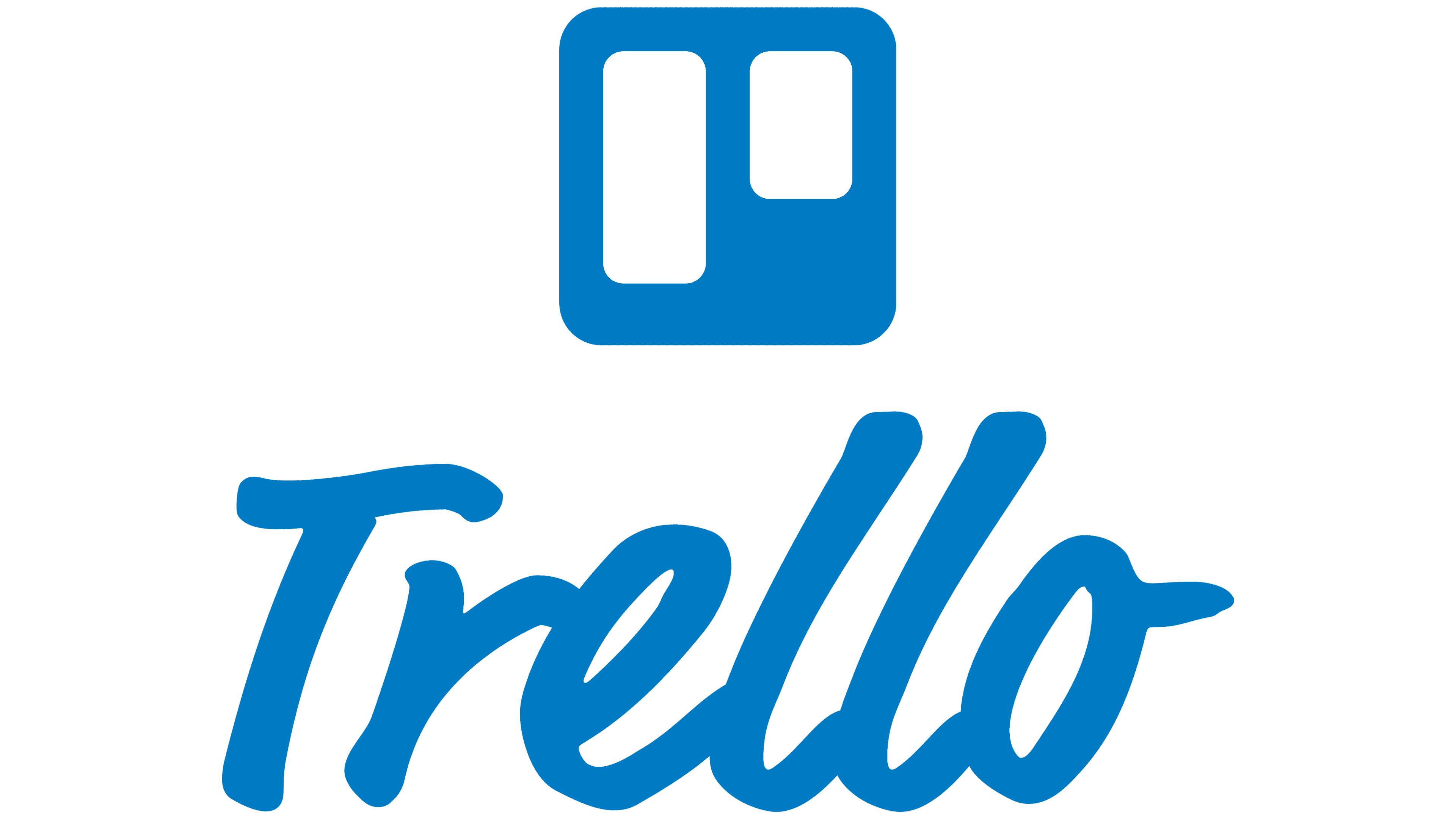
![]() Trello Logo PNG
Trello Logo PNG
The Trello logo is like an elevator going up to customer prosperity. It is enough to “load” all the participants in the process into it, and a common goal and interests will unite them. The emblem promises to solve important problems through teamwork.
Trello’s origins are tied to Joel Spolsky, who worked on Microsoft Excel from 1991 to 1994. In 2000, he and Michael Pryor founded Fog Creek Software in New York, building developer tools and gaining visibility through the “Joel on Software” blog. In 2008, Spolsky partnered with Jeff Atwood to launch Stack Overflow. At Fog Creek, internal “Creek Weeks” in 2010 encouraged new product ideas. One prototype, presented in January 2011 as Trellis, focused on visual task management using boards, lists, and cards.
After testing names like Cardvark and Planatee, the team settled on Trello. The product launched publicly on September 13, 2011, at TechCrunch Disrupt with web and iPhone versions. Its drag-and-drop interface attracted rapid adoption, reaching 500,000 users within a year. An Android version followed in 2012.
In 2014, Trello spun out as an independent company and raised $10.3 million from Spark Capital and Index Ventures. Michael Pryor became CEO, while Spolsky moved to the role of chairman. Paid tiers, such as Business Class and Trello Gold, were introduced, maintaining a freemium model unlike Asana’s. By 2017, Trello had 19 million users and about 100 employees. Atlassian, known for Jira and Confluence, acquired it on January 9, 2017, for $425 million. The deal became Atlassian’s largest at the time.
By 2019, Trello reached 50 million users. In 2021, the Butler feature added automation tools within boards. Meanwhile, Fog Creek Software continued operations under new leadership and was later renamed Glitch.
Meaning and History
![]()
The Trello app was first launched on TechCrunch as part of Fog Creek. This event is dated the 2011th year. In September of that year, Wired named it one of the seven coolest startups, and Lifehacker noted that it makes collaboration enjoyable and easy.
A few years later (in 2014), the web board raised funding from Spark Capital and Index Ventures. In 2016, the program announced that it already had 14 million registrations. In January 2017, the digital industrial giant Atlassian bought it for $425 million.
In late 2018, Trello announced that it was acquiring Butler, the firm that developed Power-Up to automate its process. Her career continued to grow rapidly, and in October 2019, she had 50 million users.
The web application’s visual identity has evolved alongside it and has received two branding variants. Although the logos are not much different from each other, they appeared significant to the company.
What is Trello?
Trello is a comprehensive system that allows you to collaboratively manage large projects, including collaborating on documents, communicating, allocating resources, managing the budget, and scheduling tasks. This is a Fog Creek Software project based on the Kanban method. It assumes an even workload distribution among all team members.
2011 – 2016
![]()
This period belongs to the debut version, approved immediately at the start of the project. The developers have made the logo highly detailed to emphasize the program’s ease of use, openness, comprehensibility, and practicality. This is the tersest version, consisting of only two elements: the number of logo parts.
There is an impromptu “window” on the left side. It indicates the location of graphs and other useful information for collaboration. It has a wide border that sometimes fills the lower-right zone. The corners of the square are rounded. Inside it, there are two white rectangles of different sizes. To the right of the graphic is the word “Trello.” It is set in a sleek, minimalist font with a harmonious combination of crisp, smooth lines.
2016 – 2021
![]()
The current version was released during the rebranding process, carried out in connection with the transfer of the Atlassian application. After updating the logo, the graphic element remained the same: a notice board. Only the textual part has changed. The printed signs became written, semi-connected, and set in italics, with a minimum rightward tilt. The color changed: instead of dark blue, it turned light blue.
The service’s personal identity symbol has undergone at least one correction. Mostly, they touched the inscription. The image in both versions looks the same: a blue square with white rectangles inside. But the name’s spelling changed, from strictly geometric to oblique handwritten text. None of the elements has a background as such, unless, of course, you count the white space.
Initially, the logo used the Helvetica Neue typeface. The program developers liked it for its simplicity, readability, lack of serifs, and other design elements. But then the application’s owners realized there are many such font options. As a result, they decided to redesign and implement something new, which would allow them to remember the service the first time. The experiments were carried out in Font Swap. The result is an oblique typeface with elongated lowercase letters, except for the first. The emblem’s color scheme is simple: light blue and white.
2021 – today
![]()
After the modernization, the web board’s logo adopted a different style for the name. In the winter of 2021, the company returned to its debut version, adding boldness to the letters. Therefore, the text is set in a strict, wide-spaced font, which greatly strengthened the visual identity and made it feel serious. On the other hand, the icon on the left is smaller. More precisely, the vertical stripes in it have become smaller: visually, they are narrower than before, although the size of the square remains the same.
Font and Colors
The developers returned the Helvetica Neue font to the updated logo, but only in bold. Wide letters add seriousness and practicality to the emblem. But the designers have retained the color palette: the logo, as before, is dominated by light blue (a board with columns) and graphite (the service name).
FAQ
What is Trello mainly used for?
This is a visual tool for teams to manage projects and tasks. It uses boards, lists, and cards to organize and track work.
Boards represent individual projects or workflows. Each board contains lists that show different stages of a project, such as “To Do,” “In Progress,” and “Done.” Cards represent tasks to be completed and can be customized with descriptions, due dates, attachments, and checklists. Team members can add comments, assign tasks, and move cards between lists as they progress.
It supports adding files, creating checklists, and setting up automation to streamline workflows. This customization allows teams to work in ways that suit their needs.
What are the features of Trello?
Trello has several key features that make it great for project management:
- Boards, Lists, and Cards: Trello uses boards to represent projects or workflows.
- Checklists: Within each card, you can create checklists to break down tasks into smaller steps.
- Task Assignment: Tasks can be assigned to multiple team members.
- Attachments: You can attach files, images, and links to cards to centralize all relevant information.
- Labels: add color-coded labels to cards for better organization and categorization, enabling quick identification of task types or statuses.
- Due Dates: You can set due dates on cards to manage deadlines.
- Comments and Collaboration: Team members can add comments to cards to discuss, provide feedback, or share updates, promoting communication and collaboration.
- Power-Ups and Integrations: Trello offers Power-Ups and integrations with other apps and tools, such as Google Drive, Slack, and Jira.
- Automation with Butler: has an automation feature called Butler.
- Notifications: Provide real-time alerts to keep team members informed about changes, updates, and deadlines.
- Mobile and Desktop Apps: Available in web browsers, on mobile devices, and on desktops, ensuring team members can stay connected and manage tasks from anywhere.
When did Trello come out?
Trello launched in September 2011 at TechCrunch Disrupt after a closed beta phase. At launch, it had apps for both the web and iPhone. The name “Trello” was chosen over other potential names, such as “Cardvark” and “Planatee.”
In the summer of 2012, Joel Spolsky, co-founder of Fog Creek Software, introduced his dog Taco as the official Trello spokes-husky, adding a fun element to the brand. The brand quickly became popular for its easy-to-use interface and effective project management features, making it a favorite tool for teams and individuals to organize their tasks and projects.
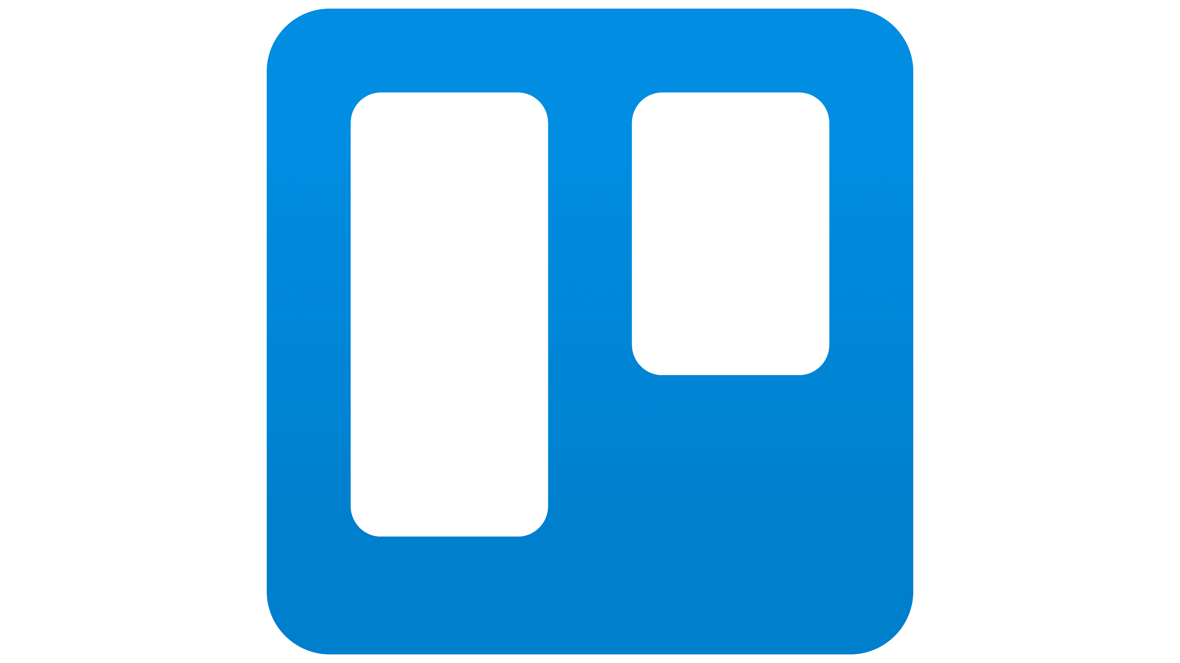
What does the Trello logo mean?
The logo represents the Kanban method, a popular approach to managing software development and project tasks. It features a large blue square with rounded corners, symbolizing the board where projects and tasks are organized. Inside this square are two white rectangles representing the lists of tasks managed by team members.
The blue square signifies the overall workspace where projects are tracked, while the white rectangles illustrate the stages or categories of tasks, such as “To Do,” “In Progress,” and “Done.” This design conveys Trello’s functionality, which focuses on organizing tasks and workflows in a structured manner.
What is the font of the Trello logo?
The logo likely uses a modified version of Charlie Sans Text, a sans-serif font that blends geometric and humanistic styles. This font is owned by Atlassian, the company that owns Trello.
The choice of Charlie Sans Text enhances the logo’s readability and modern look. Its geometric elements give it a clean and structured appearance, while the humanistic touches make it friendly and approachable. This combination reflects a user-friendly design, making the logo distinctive and easy to recognize.