This American film company is known not only for its films but also for its unusual emblem. The Tristar Pictures logo is literally inspiring. It symbolizes the boundless flight of fantasy, the search for inspiration, daydreaming, and purposefulness.
Tristar Pictures: Brand overview
| Founded: | March 2, 1982 |
| Founder: | Victor Kaufman |
| Headquarters: | Culver City, California, U.S. |
| Website: | sonypictures.com |
Meaning and History
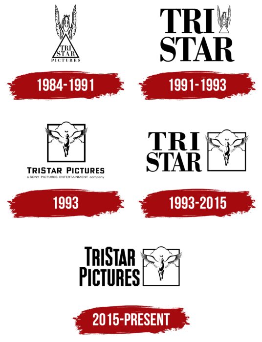
During the company’s activity in the film industry, five variants of the logo were presented. Changes, in general, were minimal, but the main element remained indispensable, namely a pegasus that flies above the clouds.
The company’s history is quite interesting because initially, it was called not Tristar Pictures but Nova Films. The name familiar to millions of movie fans was received only in 1984 when the first logo appeared. It was considered the most promising in the nineties when many popular films were released under the brand. Subsequently, Tristar Pictures’ activity has been significantly reduced. A new stage in the film studio development is associated with the year 2015, when it became a subsidiary of Sony Pictures.
What is Tristar Pictures?
One of the largest operating television companies, whose projects are popular far beyond the borders of the United States. Most of Tristar Pictures’ projects gross hundreds of millions of dollars at the box office and become cult favorites over time.
1984 – 1991
The first version of the logo was presented sometime after the company’s founding. It was created in black and white. Despite the monotony of the image, the brand’s visual recognition was at a high level. It consisted of several elements. Pegasus, familiar to many, is at the top of the logo. Under the image of the mythical horse, there is a triangle in which the name of the company “Tristar” is written in two lines.
Moreover, the first three letters are located at the top and the rest at the bottom. Outside the triangle, at the bottom, is the word “Pictures.” The word inscription is made in a classic bold sans-serif font using black capital letters.
1991 – 1993
The first major redesign of the logo came in the year when the iconic sequel to The Terminator was released.
Significant changes were made to the first version, even though the color palette was still black and white. The key element is the name of the brand “Tristar,” which is located in two lines in capital letters in bold with thick lines. They were no longer inside the triangle. The emblem of Pegasus, which was located above the geometric figure, was also transferred. Now it was above the last letter, “R.” Thus, each line contained four elements. On the top are “Tri” and the emblem, and on the bottom is “Star.”
1993
The new logo lasted less than a year. Moreover, in its specificity, it differed significantly from the previous versions. At a minimum, Pegasus becomes the main element again, now inside a square frame. Clouds appear for the first time as a symbol that he moves in the sky. The verbal inscription is located in two lines. On the top is “Tristar Pictures.” The san-geometric style was used at this stage, which looks confident and progressive. Moreover, at the bottom is the inscription “a SONY PICTURES ENTERTAINMENT company,” indicating that “Tristar Pictures” is a subsidiary.
1993 – 2015
The longest-lived logo is the variant introduced after the 1993 redesign. It lasted for 22 years. The emblem with Pegasus, a square frame, and clouds remained unchanged and moved to the logo’s right side. On the left was the name “Tristar,” which again was located in two lines. The writing style of the logo is identical to the 1991-1993 version.
2015 – today
The latest logo update to date came in the new era of Tristar Pictures. Overall, the redesign was minimal. As in the previous version, the emblem remained unchanged and was on the right side. The name “Tristar Pictures” was on the left side in two lines. The font was again changed to san-geometric.
Font and Colors
For word inscriptions, two font options were used. Classic serif and san-geometric sans-serif. With the new redesign, they changed and supplemented and therefore did not bother fans of the film studio’s creativity.
At all stages of the company’s development, a monotonous black and white color scheme were used. Even though such a palette should not evoke positive emotions, the concept presented by Tristar Pictures looks harmonious and progressive.
Tristar Pictures color codes
| Black | Hex color: | #000000 |
|---|---|---|
| RGB: | 0 0 0 | |
| CMYK: | 0 0 0 100 | |
| Pantone: | PMS Process Black C |


