The Trivago logo proves that travel can be fun and exciting. It is only necessary to properly prepare for the trip, for which the tourist metasearch engine was created. The emblem symbolizes the lightness and festive atmosphere that accompanies service users who are not burdened with organizational issues.
Trivago: Brand overview
| Founded: | January 2005 |
| Founder: | Rolf Schrömgens, Stephan Stubner, Peter Vinnemeier, Malte Siewert |
| Headquarters: | Düsseldorf, Germany |
| Website: | trivago.com |
Meaning and History
As one of the fastest-growing German companies, Trivago attracts millions of customers every month. In doing so, it earns money from hotels that are willing to pay to advertise on the site. Nevertheless, even after becoming popular, the online platform does not give a clear answer to the question of what its name means. There are rumors that it was allegedly formed from the phrase “TRIp VAcation GO,” but this version has no confirmation.
Many users are inclined to believe that the neologism “Trivago” consists of several words in different languages. “Tri” translates from French as “sorting,” “va” means “to go,” and the English “go” expresses forward motion. This amalgamation alludes to the main function of the metasearch system. Despite its unusual sound, neologism has served as the basis for all past and present brand logos.
What is Trivago?
Trivago is a metasearch engine for travel that allows you to compare prices for hotel rooms on different booking platforms. Trivago is owned by the Düsseldorf-based company and operated by the Expedia Group, Inc. of America.
2005 – 2007
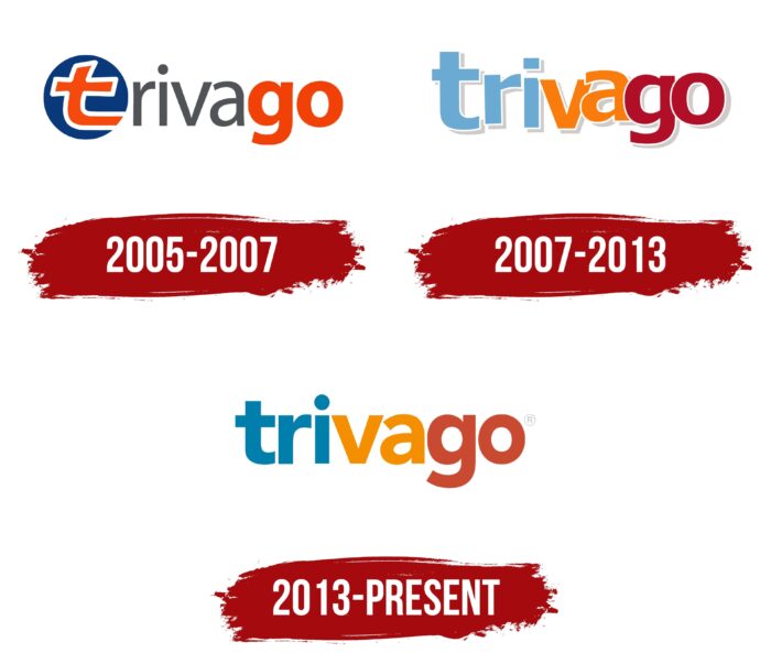
The online platform Trivago came into being in 2005, becoming the first hotel price comparison site in Germany. At the time, it used a colorful wordmark visually divided into three color blocks. This concept has not changed to this day. In the first version, the letter “t” was lowercase and jagged as if drawn by hand. The designers made it bright orange, with a white line around the edge, and placed it inside a dark blue circle, thus separating it from the rest of the text.
The middle of the word – “riva” – was dark gray. The developers chose a sans serif font similar to Adobe’s Myriad Pro Regular, Myriad Arabic Regular, or Myriad Hebrew Regular. The last piece with the letters “g” and “o” resembled Adobe’s Myriad Arabic Bold. It was as orange as the first “t.”
2007 – 2013
Trivago decided in 2008 to experiment with television advertising to strengthen its brand. And the year before, it revamped its identity by changing the palette and font of the logo. The designers regrouped the color blocks, making the “t” no longer a separate element. The first fragment (“tri”) was sky blue, the second (“va”) was orange, and the third (“go”) was dark red, almost burgundy. At the same time, each letter had thin white outlines and cast a light gray shadow that was depicted shifted to the right.
The lettering seemed airy because the “r,” “a,” “g,” and “o” rose slightly above the line and seemed to hang in space. This asymmetrical arrangement created a sense of lightness, flight, optimism, and dynamism. At the same time, the letters crept on each other, which was especially evident near the end of the word. Judging by their shape, the authors of the logo used a modified version of a font from the Avenir family, making the dot over the “i” not round but square.
2013 – today
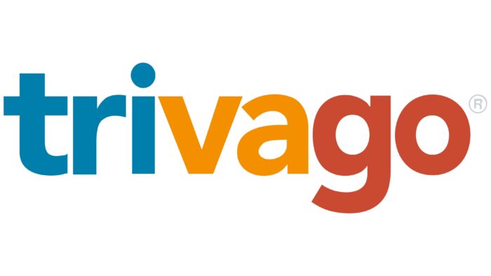
In 2013 Expedia Group, Inc. bought a majority stake in Trivago. Meanwhile, the online travel platform updated its wordmark, retaining its constituent elements and the traditional division into three color blocks. But now the blue is darker, the orange is brighter, and the red is lighter and paler than before. In addition, the designers abandoned three-dimensionality: they removed white outlines and gray shadows so that in the current version, the letters are flat.
The word is horizontally aligned and no longer feels airy. The font is still similar to the modified Avenir, although the developers have transformed the shape of the glyphs. The most important change (compared to the previous version) has to do with the fact that the square dot over the “i” has turned into a round one.
Corporate logo
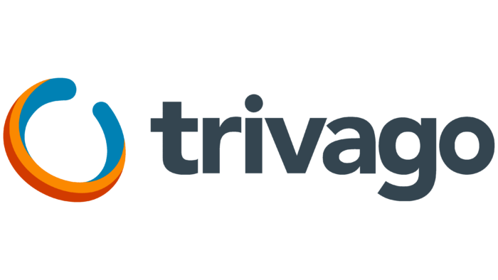
In 2018, Trivago got another logo, which the company’s designers created. It does not replace the iconic tricolor sign but is used separately, exclusively for corporate purposes. The brand name is written in dark gray and shifted to the right side. On the left is a new graphic element in the form of an open ring. According to the brand conception, it is “Wabi” – the symbol of the circumnavigation of the globe, constant development, and movement.
The ring has the shape of an open oval and traditionally contains three colorful fragments: orange, blue, and red. They are arranged so that the image seems to be three-dimensional. The colors seem to flow from one to the other without gradients or shadows.
The iconic wordmark of the online platform Trivago contains its name, which is unique and recognizable. It is associated with only one site, so the designers made it the star of the main logo and painted it in three optimistic colors. Nevertheless, the company has its own “Wabi” symbol in the form of a ring. It shows the authenticity of the metasearch system, its flexibility, and its ability to focus on details. And it is the visual embodiment of a round-the-world trip.
Font and Colors
The name of the brand is written in a simple font without serifs. Designers created it on the base of the Avenir family, which is considered the recognized classic in typography. They reworked the glyph structure, so the resulting typeface is roughly similar to Bw Modelica Extra Bold by Branding With Type, Stem Text Bold by ParaType, and Usual Bold by Rui Abreu. All the letters are in lower case. Notably, the curved parts of the “t,” “r,” “a,” and “g” are the same shape.
The color palette of the Trivago wordmark is well developed: it features slightly darkened shades of blue, orange, and red. It’s a recognizable combination that’s associated with the online travel platform. As for the corporate logo, its palette additionally contains a dark gray color.
Trivago color codes
| Cerulean | Hex color: | #007fad |
|---|---|---|
| RGB: | 0 127 173 | |
| CMYK: | 100 27 0 32 | |
| Pantone: | PMS 7704 C |
| Carrot Orange | Hex color: | #f48f00 |
|---|---|---|
| RGB: | 244 143 0 | |
| CMYK: | 0 41 100 4 | |
| Pantone: | PMS 151 C |
| Dark Pastel Red | Hex color: | #c94a30 |
|---|---|---|
| RGB: | 201 74 48 | |
| CMYK: | 0 63 76 21 | |
| Pantone: | PMS 7597 C |
