The Truist logo depicts a safe path to financial well-being for its clients. The emblem is filled with protection and support that the bank provides in the cooperation process due to its scale and amount of capital.
Truist: Brand overview
| Founded: | 1872 |
| Founder: | Truist Center |
| Headquarters: | Charlotte, North Carolina, U.S. |
| Website: | truist.com |
Meaning and History
The agreement to merge SunTrust and BB&T was concluded in 2019, although its preparations were carried out a very long time ago. The companies closed the $28 billion deal with little to no price discussion. The combined bank’s assets amounted to $440 billion. The owners entrusted the choice of the name to the leading consulting firm Interbrand. The task of the specialists was to find an option that would suit both parties: a short and unique word that does not favor either SunTrust or BB&T.
A compromise solution was the name Truist. Although it evokes several associations with positive overtones, it is fictitious and does not mean anything. A careful observer will notice the connection with the words “true” and “trust,” which was the ultimate goal of the Interbrand employees. Desperate to find the perfect combination of the SunTrust and BB&T names, the developers took a trusted term and added the letter “i” to it.
Social media users criticized the new name, but the company did not deviate from its intentions and finally approved it in December 2019. At that time, bank customers did not yet know what the logo would look like: it was introduced in January 2020 along with the website. Integration was planned to be completed by the end of 2021.
What is Truist?
Truist is one of the largest American banking holdings. It was established in 2019 when SunTrust Banks, Inc. and BB&T Corporation merged into one company with headquarters in Charlotte, North Carolina. The resulting organization offers various services, including mortgage lending, insurance, and investments.
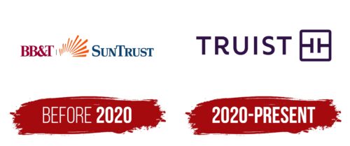
before 2020
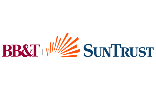
The merger of SunTrust Banks, Inc. and BB&T Corporation began in February 2019 and concluded in December. The official logo of the newly formed holding was unveiled in January 2020. During the transition period, the combined emblems of the two predecessor companies of Truist were used.
On the left side was the BB&T wordmark, typed in Times New Roman Bold font and colored in burgundy (#8A0025). On the right was the blue SunTrust name. It consisted of uppercase letters with thick serifs. Between the two inscriptions was a stylized sun: twelve asymmetrical orange rays of varying lengths, with sharp ends pointing inward. They visually connected the two companies and symbolized their energy and growth.
2020 – today
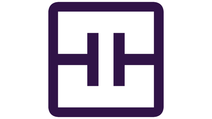
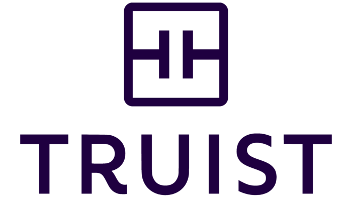
The Truist brand was gradually introduced into the surrounding space so that people could get used to it. So the logo began to appear on SunTrust and BB&T affiliates, on digital platforms, in advertisements, and on signs at SunTrust Park. Like the name of the financial institution, it was invented by Interbrand specialists. They paired a minimalist “TRUIST” lettering with a square featuring two 90-degree rotated ‘T’s. Reaction to the symbol has been mixed. Someone liked it, claiming that the pattern looked like a belt buckle or an electrical circuit.
The bank’s bold branding pays homage to the heritage of BB&T and SunTrust. The new-look is very symbolic, despite its apparent simplicity. The two mirrored “Ts” within a square frame represent the merger of two giants in the financial sector. The fact that the letters are the same size speaks to the importance and equality of the two combined companies. At the same time, the square reflects security and trust, and its rounded corners hint at accessibility. The monogram, in turn, is a reference to the Touch + technology and represents an individual approach to each client.
Font and Colors
The word “TRUIST” is to the left of the square emblem. Interbrand’s designers created a custom sans-serif typeface for it, entrusting the bulk of the work to a master typographer. Wide letter-spacing symbolizes the openness and honesty of the bank its willingness to cooperate. The curve at the bottom of the “R” creates the illusion of moving forward towards new achievements. All letters are capital, bold and non-contrasting. They do not have unnecessary details that may prevent the logo from displaying adequately on a mobile device or when greatly reduced.
The choice of color was decisive in the merger of the two banks. The specialists took a rich blue tint from the SunTrust identity and combined it with the burgundy BB&T. They got a dark purple-purple tone, the so-called Truist Purple.
Truist color codes
| Russian Violet | Hex color: | #2d1a47 |
|---|---|---|
| RGB: | 45 26 71 | |
| CMYK: | 36 63 0 72 | |
| Pantone: | PMS 2695 C |
