TRW: Brand overview
TRW, originally known as Thompson Ramo Wooldridge, was a leading American company that played a key role in the auto parts and aerospace industries until its acquisition by Northrop Grumman in 2002. The company was born in 1958 from the merger of Thompson Products and Ramo-Wooldridge, and its roots date back to the early 1900s.
Known as a supplier of critical components and systems, TRW has served both the automotive and aerospace industries. The automotive product line includes steering wheels, airbags, seat belts, braking systems, engine and chassis parts – everything automakers need. The company’s presence in the aerospace sector was also significant, where it was a leading supplier of components for spacecraft and satellites, propulsion systems, and various military aerospace technologies.
In its heyday, TRW had more than 200 facilities in 30 countries around the world, with a workforce of approximately 70,000 employees by the late 1990s. The company made significant strides in introducing key safety systems, including airbags, anti-lock brakes, and revolutionary space technologies.
The early 2000s were a period of financial instability for TRW: rising costs and debts led to the sale or spin-off of many divisions. Northrop Grumman stepped in and acquired the remaining aerospace and auto parts divisions. Another TRW division, the automotive division, was sold to The Blackstone Group and continues to operate independently.
Although the TRW name is fading, the legacy of its significant contributions to the automotive and aerospace industries lives on through successor companies.
Meaning and History
What is TRW?
TRW Automotive Holdings Corp was founded in 1901. by David Kurtz, has been a significant player in the automotive industry for over a century. Originally headquartered in Livonia, Michigan, the company went through a period of transformation in 2002 when Northrop Grumman sold its automotive division to the Blackstone Group. Known for its exceptional service to original equipment manufacturers (OEMs) and aftermarket customers, TRW continues to be a leader in creating innovative automotive systems, modules, and components worldwide.
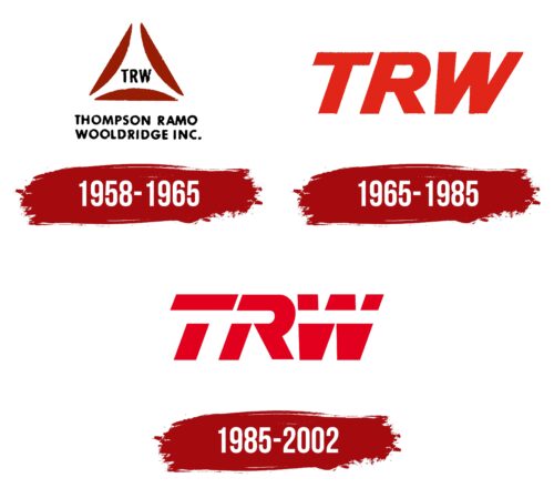
1958 – 1965
1965 – 1985
1985 – 2002
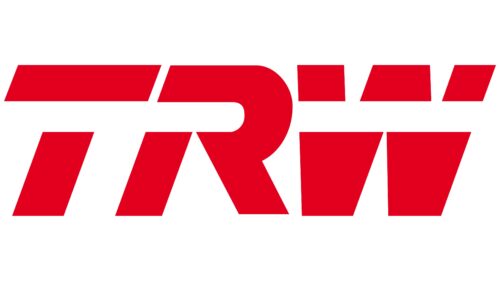
The abbreviation “TRW” is filled with dynamism, which is noticeable even by its red color, which is associated with passion, energy, and bright emotions. A wide white stripe runs through the letters, reinforcing the sense of movement. This stripe visually ties all parts of the logo together, even as it breaks the letters “T” and “W” apart. The slanted bold font also symbolizes speed. It all fits well with what the company does – making parts for automobiles.
The white stripe is reminiscent of a fast-moving car rushing down the highway, creating a sense of live and intense action. The broken letters “T” and “W” make you think of a car being made up of different parts that work together. The red color is reminiscent of the red color on a sports car, making people turn around and look. The logo itself is a small car, wound up and ready to go.
TRW color codes
| Cadmium Red | Hex color: | #e3001e |
|---|---|---|
| RGB: | 227 0 30 | |
| CMYK: | 0 100 87 11 | |
| Pantone: | PMS Bright C |
