


![]() TSM Logo PNG
TSM Logo PNG
The TSM logo is primarily associated with League of Legends by fans of the organization because it embodies the mid-lane, which the team can use to reach the enemy base. Presumably, this is the meaning embedded in the long line separating the letters “S” and “M.”
Meaning and History
![]()
As one of the most successful esports organizations in North America, TSM has consistently earned top placements in various championships, particularly in the League Championship Series. As a result, its logo is well-known to many online gaming fans who follow professional competitions. The logo is simple, adaptable, and memorable because its main element, the monogram, consists of only three stylized letters.
The main advantage of the graphic symbol is its universality, as Team SoloMid is no longer tied to League of Legends as it was initially. The logo represents at least ten different subdivisions of the organization, which owns its teams for Dota 2, Minecraft, and other popular video games. The TSM emblem is composed of straight and curved lines shaped like letters. This makes it ideal for use as a favicon, a small image representing a website.
What is TSM?
TSM is an esports team association, also known as Team SoloMid. It is officially called TSM FTX because the Bahamian cryptocurrency exchange FTX bought the naming rights in 2021. The agreement was signed for a 10-year term – until 2031. The organization was founded in 2009 and remains owned by its founder, American entrepreneur Andy Dinh. Initially, it only included one team that participated in League of Legends competitions, but the list of games has since expanded.
2009 – 2011
![]()
In its early years, SoloMid was a website that Andy Dinh used to publish information about his team, All or Nothing, and League of Legends. This project was directly related to the recently launched multiplayer game. Even its logo, in style and color scheme, was very reminiscent of LoL’s debut wordmark from 2009. It contained the name SoloMid, and the designers deliberately divided the inscription by increasing the distance between the last “O” and the following “M.”
A thin, high-contrast font with long serifs was used for the letters. They appeared voluminous due to the golden gradient. All glyphs were uppercase, but the creators increased the “S” and “M” by almost one and a half times. Two thin horizontal lines were drawn above the other letters, one on each side. The base for the inscription was a gray polygon with symmetrical ornamental protrusions. Due to its color and texture, it resembled a processed stone slab set in a metal frame. The developers achieved a shine using gold and silver speckles.
2011 – 2021; 2022 – today
![]()
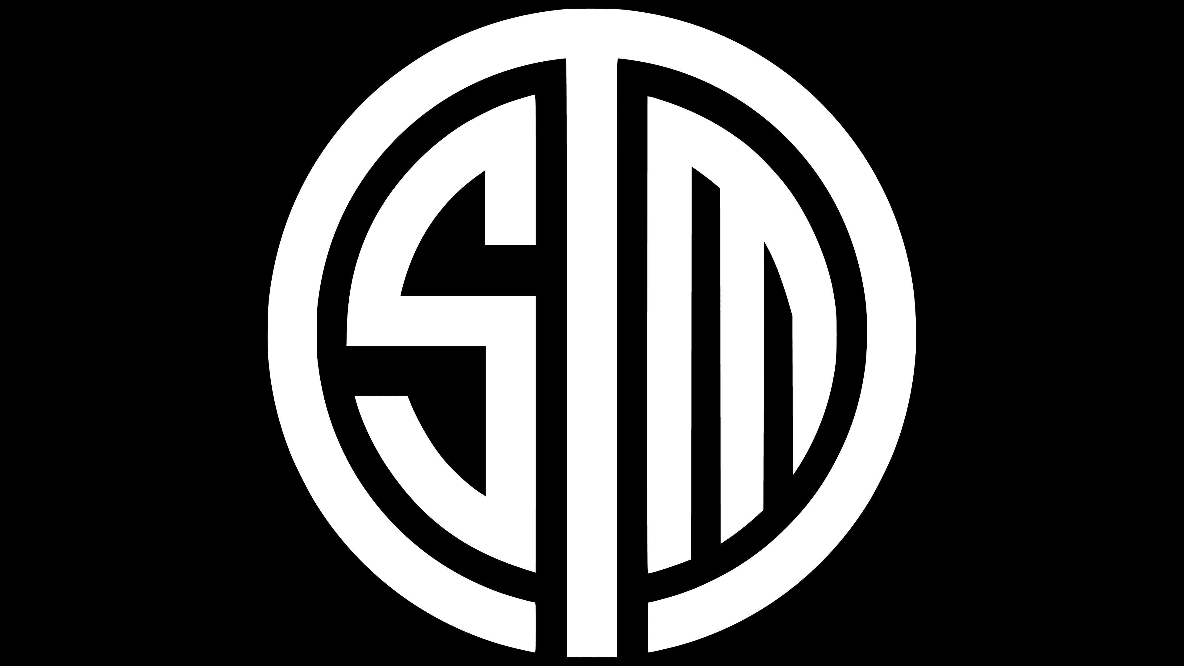
In 2011, Team SoloMid emerged to replace the disbanded All or Nothing team. Its first logo proved very successful, as the designers presented the letters “TSM” as a simple yet stylish monogram. The vertical part of the “T” was positioned in the middle, and its sidelines curved widely, forming two arches; thus, the emblem had the shape of a circle divided into two halves. On the left side was the “S,” which resembled a fragment of a Greek ornament. The space on the right was occupied by the “M,” similar to a hair comb with uneven teeth. All the stripes were roughly the same thickness. The space between the elements was white.
2021 – 2022
![]()
In 2021, TSM granted the cryptocurrency exchange FTX the right to use its name in exchange for $210 million. According to the terms of the ten-year contract, the team officially became known as Team SoloMid FTX; however, due to sponsorship restrictions in VALORANT and League of Legends, the old name is still in use. As a result of the subsequent changes, the inscription “TSM FTX” was added to the esports organization’s emblem. All letters are uppercase and bold, with the first three in black and the last three in blue-green. The classic brand monogram is on the left side.
The symbol consisting of three stylized letters corresponds to the team’s name. The words “Solo” and “Mid” refer to the tactic in the game League of Legends, where one person attacks from the middle lane. In the TSM monogram, the vertical stripe of the “T,” located in the center, represents that very Mid Lane.
Font and Colors

The logo created for the esports organization in 2021 features the inscription “TSM FTX” in a bold sans-serif font, which is roughly similar to Neology Bold from Shinntype and JT Leonor Bold from JAM Type. However, the letters in the round emblem were custom-designed. They can be recreated using fragments of circles, straight stripes, and zigzags.
Black dominates the color scheme, with only three glyphs (“FTX”) in a blue-green shade. In the main version, the background is white, but it can change depending on the visual context.