


![]() Tubi Logo PNG
Tubi Logo PNG
The Tubi logo looks bright and fresh on the screen. Its massive letters and color convey lightness of perception and expressiveness. The emblem’s design is an image of transformation, a constant change process, where new and popular shows and films replace the previous ones.
Tubi’s history began with AdRise, an advertising technology company founded in San Francisco in 2010 by Farhad Massoudi, a UC Berkeley graduate in electrical engineering and computer science. Working with Thomas Ahn Hicks, he saw a gap in online video, where many viewers wanted free films and series without monthly subscriptions.
In 2014, with AdRise technology and $4 million in funding from Foundation Capital, SGH Capital, and Streamlined Ventures, the company launched Tubi TV. Its model differed from Netflix and Hulu, with free access funded by advertising. In its first 18 months, Tubi built a library of over 50,000 titles through deals with Lionsgate, MGM, and Paramount Pictures.
In November 2015, Tubi entered the Canadian market in partnership with Blue Ant Media and expanded into Australia. In May 2017, it raised $20 million from Jump Capital, Danhua Capital, Cota Capital, and Foundation Capital. A 2019 deal with NBCUniversal added 400 films and series, and by June 2019 the platform had over 20 million monthly active users.
On March 17, 2020, Fox Corporation agreed to buy Tubi for $440 million, closing the deal on April 20, after 21st Century Fox sold major assets to Disney. Fox also sold its 5% stake in Roku for about $400 million. Tubi later surpassed 33 million users, acquired MarVista Entertainment, signed content from Warner Bros. Discovery, formed Tubi Media Group in 2023, appointed former Vimeo CEO Anjali Sud, streamed Super Bowl LIX in February 2025, surpassed 100 million monthly users, and became profitable in Q4 2024.
Meaning and History
![]()
Farhad Massoudi’s startup’s emblem changes depending on audience growth and the site’s revenue. The sign is formed based on ease of memorization and corresponds to the domain. Users recognize the page thanks to the four letters that are audibly reminiscent of the well-known phrase. In rebranding, the entourage, font, and letter size change, not the meaning.
What is Tubi?
An American free service for watching digital TV shows and movies online. They have been owned by Fox Corporation since 2020. It earns money through advertising. The service’s audience is 74 million viewers per month, and the number of users continues to grow.
2014 – 2017
![]()
The first emblem of the service consists of a black square, symbolizing a monitor screen. The figure evokes a movie and shows icons on the platform’s main screen. The square, due to the equality of its sides, is considered a harmonious construction and symbolizes:
- Equal rights for Tubi users,
- The diversity of content can satisfy users with different interests.
The cube is a mystery, a box containing interesting movies and shows.
Inside the square on the logo, the service’s name and the addition of TV are placed. The white and orange colors of the letters help distinguish the brand and the platform’s theme.
The name resembles the sound of the phrase “to be.” The choice indicates contemporary content and live broadcasts of many shows and hints at “to be continued,” the continuation of favorite programs and series tomorrow.
2017 – 2024
![]()
In 2017, the company attracted 20 million in investments, allowing it to expand the range of licensed content. The involvement of investors led to a change in the brand’s identity.
The black inscription of flexible letters, seemingly rushing forward, represented the development theme, moving into the future. The service constantly replenishes its media library with new releases and shows, and the number of users is growing exponentially.
Removing the black background freed the emblem from gloom and added more air and freedom. Just as the financial infusions “untied” the owners’ hands, allowing them to improve the quality of services.
The change underscored the site’s primary mission to provide people with free access to quality content, which, like other services, was previously locked and only available through a paid subscription.
The decoding of “TV” is no longer used, as the service’s name is well-known.
2024 – today
![]()
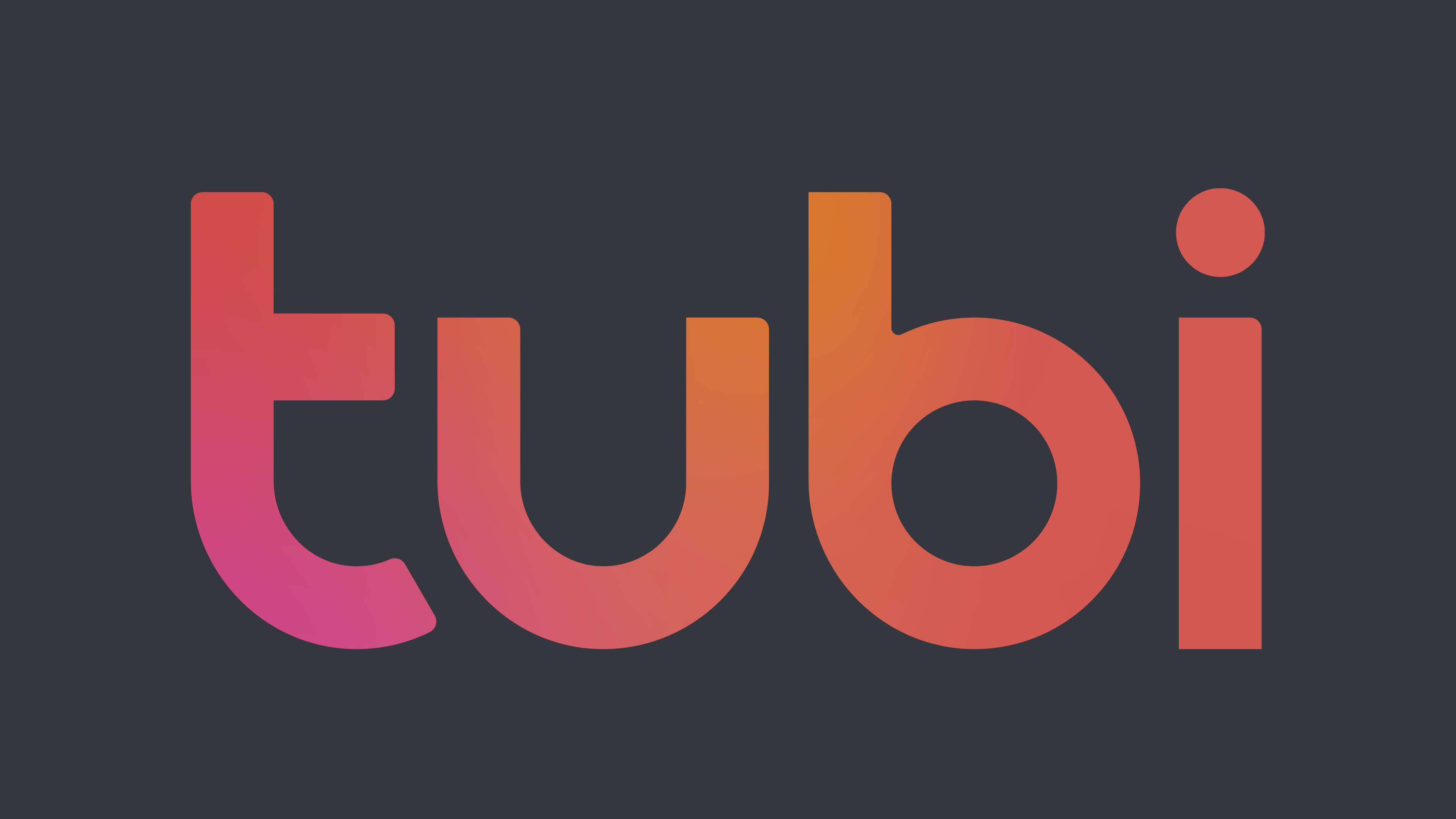
The Tubi logo changed again in 2024 and now looks bolder and brighter. The DixonBaxi agency completely redesigned the brand identity, giving it massiveness and density. The entire inscription is in lowercase letters, but the font has become bolder.
The main detail in the new design is the letter “t.” It is no longer a solid symbol but consists of two elements. As before, the letter’s upper horizontal line does not cut through it; it is present only on the left, while on the right, its continuation has become a large round dot. The dot adds a distinctive feature to the logo, creating a sense of play with shapes.
The color palette can take on several shades, but the primary one remains bright yellow. This color adds energy and a positive mood, making the logo as noticeable as possible. Yellow is associated with activity, optimism, and dynamism.
The shape of the letters remains rounded and smooth, without sharp angles. The inscription appears friendly and modern. The style blends perfectly with the brand’s entertainment theme.
The new Tubi logo now looks more powerful and confident, matching the spirit of a growing media platform.
Font and Colors
Black is one of the leading colors in the media theme. It is associated with the black font for titles and descriptions, and with the black screen at the beginning and end of movies and shows. This shade is unobtrusive and not distracting. It is neutral in terms of preferences. It shows that the site merely provides access, and viewers choose programs based on their tastes.
The font of the logo resembles Black Crow Medium. The letters of the inscription seem to flow into each other like a pliable substance. This choice speaks to the personalization of the viewing program. The founders developed a special content personalization mechanism based on machine learning and complemented it with the TubiChannels service. Therefore, finding someone you like has become very easy.
The line forming the letters also hints at the possibility of watching live broadcasts in real time.
A rich yellow, a shade of energy, movement, and liveliness, dominates the new logo color palette. A single color sets Tubi apart from competitors and adds dynamism to the overall style.
The font in the new Tubi logo has become stronger and denser. The letter lines are simple, without any serifs or decorative curls. The design is based on the custom Tubi Sans typeface developed by Central Type. Its foundation resembles commercial fonts like Boring Sans B Heavy or Heading Now 87 Extra Bold. However, the letter “t” has undergone an original and unusual redesign.