The Tumblr logo looks as though it has come straight off the pages of a newspaper. The emblem attracts masters of words who can articulate thoughts clearly and tastefully. The blog service’s goal is to offer a space; what to put on these pages is up to the writer.
Tumblr: Brand overview
| Founded: | February 2007 |
| Founder: | David Karp |
| Headquarters: | New York City, U.S. |
| Website: | tumblr.com |
Meaning and History
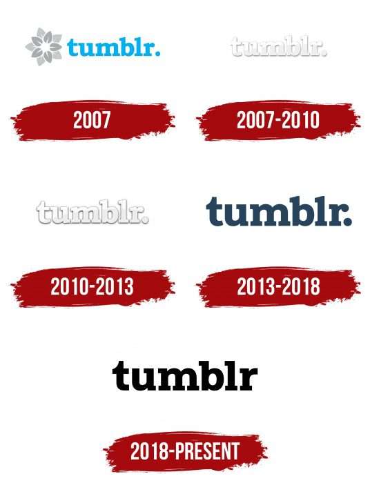
The original sign of the social network appeared in the year of its opening – in 2007. It consisted of two elements – a graphic (flower) and text (name). In this form (except for color), the logo lasted until mid-2013, when Yahoo acquired the microblogging platform and left the logo unchanged.
The changes were so insignificant that they were perceived not as a redesign but as an adjustment. The new owner entrusted the redesign of the logo to a group of its designers. They made very interesting changes because if you look at the word, it seems that it remained the same, but if you consider each letter separately, the changes are noticeable.
Thus, the symbols became wider, so the name took up more space on the logo. The most radical transformation occurred with the letter “u” – its left serif was removed. It, along with “m,” received streamlined and smooth bends. As a result, the logo acquired an attractive design. Over the years, the logo has undergone four changes.
What is Tumblr?
It is an American social network in the form of a personal microblog, where articles, videos, GIFs, photos, pictures, etc., are published. After subscribing to other users, their content appears in your feed.
2007 – 2010
The debut version contained a flower with ten petals and an inscription consisting of the name of the social network. Initially, it was blue, but then it was made gray, originally combining light with dark. The gradient transition is uneven: “t” is whiter, and “r,” on the contrary, is ashy. This technique creates the impression of the close presence of sunlight – as if the rays pass through the window and unevenly illuminate the word “Tumblr.” By the way, it is written in lowercase letters and has a large dot at the end.
2010 – 2013
The feeling of a play of shadows and sun remained in the name, but it acquired a light, muted tone as if it became pastel and not so bright. No other changes followed.
2013 – 2018
In 2013, the blogging web environment was bought by Yahoo!, which decided not to change the logo radically. The main reason is that it had already become familiar and traditionally associated with this social network so that changes could lead to a sharp outflow of users.
The developers changed the color of the logo, making it blue, and added a couple of proprietary icons. They represent a resource about the Internet, advertising, and digital media in a modern format. This was the initial letter “t,” played using dark blue and white colors: dark on light (2015-2016) and light on dark (2016-2018). In the first case, shadows appear on the letter, giving it a 3D effect.
2018 – today
In the modern version, the serifs of “b” and “l” are aligned, and the right upper part of “r” is cut off. The dot at the end of the word disappeared, and the word itself became black. The icons have been redesigned; they are adapted for iOS and Android systems. All of them contain one letter “t”:
- Dark on a light background
- Light on a square with rounded corners
- Light in a circle
Tumblr: Interesting Facts
Tumblr is a place on the internet where people can share all sorts of things like pictures, videos, and thoughts.
- Starting Up: David Karp started Tumblr in 2007 in New York. It became popular quickly because it was easy to use and let people share many different things.
- Inspiration: Tumblr’s idea came from “tumblelogs,” which are like mini-blogs. David Karp created Tumblr to help people share stuff easily.
- Growing Fast: Just two weeks after its launch, 75,000 people were using Tumblr. Its ease of use helped it grow fast.
- Bought by Yahoo: In 2013, a company called Yahoo bought Tumblr for about $1.1 billion. They wanted to make Yahoo cooler and bring in younger people. David Karp stayed as the boss of Tumblr even after this.
- A Place for Fans: Many fans and groups who like certain TV shows, movies, or hobbies use Tumblr to share their fan art and ideas.
- Sharing Made Easy: Tumblr allows people to easily re-share others’ posts, which helps funny pictures and quotes spread.
- No More Adult Stuff: In 2018, Tumblr decided to stop allowing adult content. This decision upset many people, and some stopped using Tumblr.
- New Owner: In 2019, Automattic, which owns WordPress.com, bought Tumblr. They promised to keep the website fun and creative.
- Founder’s Comeback: In 2022, David Karp returned to Tumblr as an advisor, which made people hopeful about the Site’s future.
- Trying New Things: In 2022, Tumblr also started exploring NFTs, letting creators showcase their digital art and possibly earn money.
Despite its ups and downs, Tumblr is still a special place for people to share creative things and connect with others who share their interests.
Font and Colors
Initially, next to Tumblr was a ten-petaled flower. It was borrowed from the Davidville project. However, when the company was working on the design of v3, they decided to remove it to reduce the brand name. Now, the Tumblr logo only has an inscription that repeats the original version.
The textual part of the logo is based on a very ancient font, which appeared in 1860. It is called Bookman Old Style and was created by Alexander Phemister for the Miller & Richard foundry. This variety is reminiscent of the Caslon font, differing from it in its even and regular structure—the colors of the emblem are white, blue, and gray.
Tumblr color codes
| Black | Hex color: | #000000 |
|---|---|---|
| RGB: | 0 0 0 | |
| CMYK: | 0 0 0 100 | |
| Pantone: | PMS Process Black C |
FAQ
Why Did Tumblr Change Its Logo?
The Tumblr logo was changed in 2018 as part of an update related to the purchase of the service by Automattic. Its new design is the strictest of all: the dot was removed from the emblem, and the name was repainted in black.
How to Register on Tumblr?
You need to open the site, click on the “Register” button, and enter your email and password. Then, specify the desired nickname. If it is already in use, choose another name from the list. After filling in all the fields, click on the “Register” button again.
Why is the Tumblr Logo Black?
The logo uses black to emphasize the simplicity of using the service and its seriousness, as it unites people in large communities by interests and allows for creative self-expression.
How to Log into Tumblr?
To do this, open the site, click on the “Login” line, enter your email address and password, and then click on the “Login” button again.


