


![]() Tupperware Logo PNG
Tupperware Logo PNG
The desire to serve and benefit is evident in the visual sign. The Tupperware logo demonstrates the reliability, durability, and ease of use of the packaging that the company manufactures. Every homemaker will need such help in the kitchen.
Earl Silas Tupper was born in New Hampshire in 1907. In the late 1930s, while working at DuPont, he studied polyethylene, which was then seen as too oily and unpleasant for consumer goods. By 1942, he had developed a way to purify it into a flexible, clear, almost unbreakable material. He founded E.S. Tupper Company in Leominster, Massachusetts.
The first Tupperware containers reached stores in 1946. Their key feature was an airtight lid, inspired by a paint can, which was patented in 1947. It released excess air when closed and helped food last longer than in glass jars or metal tins. The problem was retail. Shoppers did not understand how to use the lid on a store shelf, so the product needed a demonstration.
That gap was filled by Brownie Wise, a divorced mother from Detroit who sold products at home parties in the late 1940s. Her demonstrations turned Tupperware into a social sales event. In May 1951, Tupper made her general manager of Tupperware Home Parties, Inc. That same year, he pulled Tupperware from stores and made home parties the only sales channel. By the late 1950s, the network had about 9,000 independent consultants, and sales had grown 25 times in three years.
In 1958, Tupper fired Wise and sold Tupperware to Rexall Drug and Chemical for $ 16 million. Rexall later became Dart Industries, merged with Premark International in 1989, and Tupperware became a public company in 1996. The brand expanded abroad starting in the 1960s, with Germany and, later, Indonesia as major markets. In 2006, it became Tupperware Brands Corporation. Pressure from Rubbermaid, Lock&Lock, debt, and changing habits led to Chapter 11 bankruptcy in September 2024.
Meaning and History
![]()
For more than 70 years of the brand’s existence, its logo, in all its interpretations, was rendered in a monochrome color palette. Only black was used, prioritizing brevity over unnecessary elements. The history of brand development in corporate identity can be divided into two stages: the 20th century and the current one.
What is Tupperware?
First and foremost, it is a company with a presence in more than 100 countries worldwide. One of the first major companies in the American market abandoned retail sales, opting instead for direct sales. The number of employees worldwide exceeds 13,000, of whom 900 work directly in the United States. The headquarters is located in Orlando, Florida.
1946 – 1951
![]()
The first variant of the logo was introduced in 1946 and featured only the brand name, handwritten in black letters on a white background. The lettering on the logo was done in a non-standard style. The basis for the characters was a bold sans-serif font. Of the letters, the author paid special attention to the “T” and “W.” Even though all the letters in the name were capitalized, the “T” looks somewhat enlarged. At the same time, the horizontal line is considerably enlarged in both directions. The “W” appears as if it were not a stand-alone symbol but rather composed of two “V’s” s superimposed on each other.
1951 – 1958
![]()
The next variation of the logo is almost identical to the original in style and spelling of the name. However, in addition to the main inscription, the author added the organization’s slogan below it: “An airtight case for freshness.” The slogan used uppercase letters written in a classic sans-serif font. Additionally, the ® copyright mark was added to the logo to indicate trademark registration.
1958 – 1974
![]()
The 1958 redesign returned the company logo to the original version, with a few exceptions. All lines and contours in the symbols were retained, but the author made them brighter and bolder to convey a sense of power and confidence to customers. All additional elements have been removed. This is not only about the ® sign but also the slogan.
1974 – 2007
![]()
Significant changes were made to the previous version in 1974. That’s when Tupperware had an outlined logo. The outlines in the letters were not solid. The author used white outlines with rounded lines and smooth shapes. When studying the logo, the black outlines and white fill created a labyrinthine feeling. This version lasted more than 30 years and was not replaced until the beginning of the 21st century. Also, the ® symbol returned, confirming the company’s copyright on this logo.
2007 – today
![]()
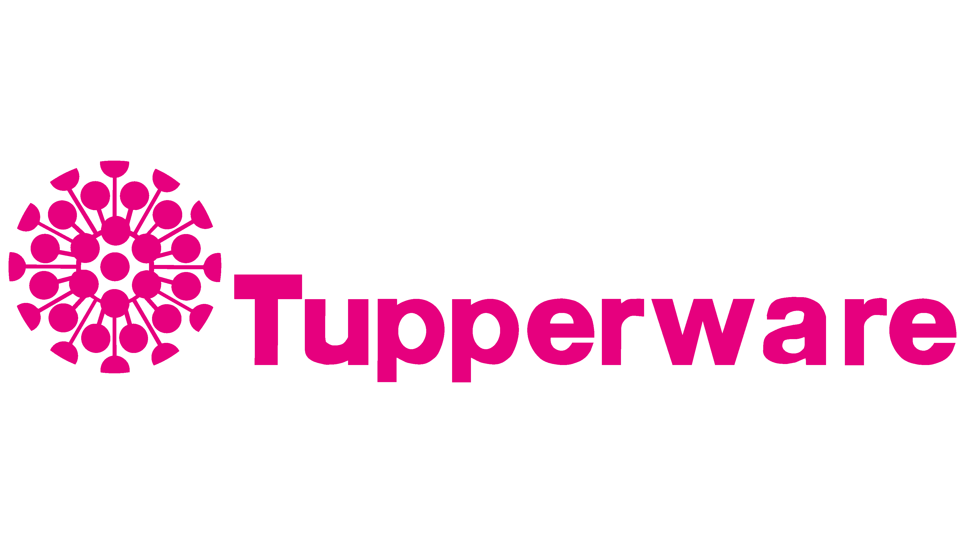
The last current version of the Tupperware logo was introduced in 2007. Interestingly, two-color palettes are current. The brand name can be displayed in black or pink (fuchsia). In both variants, the name is depicted on a white background. Sometimes an emblem is added to its left. It can also be pink or black, depending on the case. It is an abstract image with lines that radiate outward from the center. There are circles on each line. Thus, visually, the emblem resembles a dandelion. On first reading, the logo should evoke a sense of strength and confidence. The trademark registration mark was retained on the logo.
Font and Colors
The font of the current Tupperware brand logo is as close as possible to Europa Grotesk SH. The characters in the name are in bold sans-serif font. The classic company font and balanced lettering make the brand recognizable far beyond the U.S.

The color palette used was typically black-on-white. However, a variant of the logo, in use since 2007, can also be presented in pink.