The Turo logo shows the direction in which to move. And since this is a car rental service, you can move anywhere – the main thing is not to stand still. The emblem has a hidden dynamic designed for lovers of speed, adventure, and far-flung wanderings.
Turo: Brand overview
| Founded: | June 2010 |
| Founder: | Shelby Clark |
| Headquarters: | San Francisco, California, U.S. |
| Website: | turo.com |
Meaning and History
A pioneer in the sharing industry, Turo entered the market in 2010. Its founder, Shelby Clark, was somehow convinced that people would agree to rent out their cars to strangers. Despite the insanity of such an idea, he was not mistaken: car owners happily jumped at the opportunity to earn extra money. Travelers, in turn, were eager to rent vehicles not from fleets but directly from individuals.
The original company name (RelayRides) and its original logo in the form of a steering wheel placed inside a ring of two arrows, as in the recycling symbol, underlined the unusual concept. At first, rentals were short-term: drivers booked a car for just a few hours, then returned it to the owner or passed it on to the next renter. But after two years, the carsharing service switched to long-term rentals and literally “grew out” of its old name, which was associated with ridesharing, shared rides. It is worth noting that when RelayRides appeared, such a concept as ridesharing did not yet exist – it was introduced later by Lyft and Uber.
After a rebranding in 2015, the company became known as Turo. This word is a neologism in the English language. It was invented by the Lexicon naming studio, the same one that gave rise to the Swiffer and Blackberry brands. The new name is associated with exciting adventures and great speed because it is in tune with “Gran Turismo” and “Turbo.” The designers reflected it in the new logo, placing it inside the road sign in the form of an arrow.
What is Turo?
The American company Turo allows drivers to rent out their vehicles and travelers to rent cars. It came into being in 2010car-sharingcar-sharing and pioneered the carsharing industry. The service used to be called RelayRides, but it was renamed because of inappropriate associations with ridesharing.
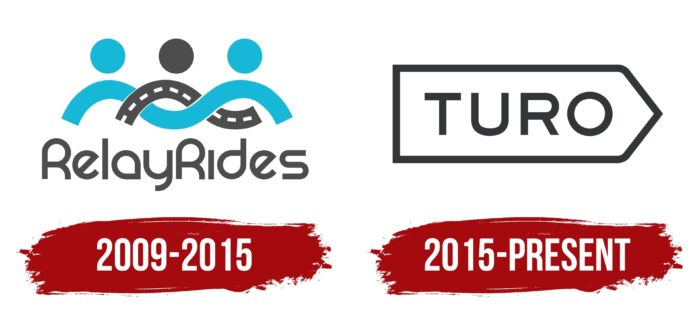
2009 – 2015
In the beginning, RelayRides used a logo in the form of a steering wheel inside a ring of two semicircular arrows, but that option was temporary. A few years later, it had a new graphic, unofficially nicknamed “The Human Centipede. At least, that’s what some employees of the carsharing service called it.
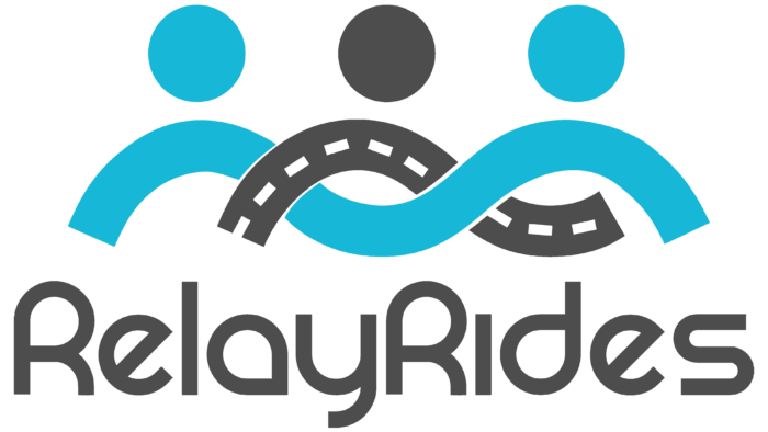
It consisted of two wavy lines intertwined with each other in the form of a chain. One line was gray, like a road. Inside it was white dotted lines that mimicked the roadway markings. The second wavy element was light blue. On top were three circles: two blue at the edges and one gray in the middle. They looked like human heads, while the intertwined stripes resembled shoulders and arms.
Underneath the emblem, depicting three people embracing was the brand name with two capital letters “R.” The designers made it gray and designed it in a custom sans serif font. The closest counterpart to the chosen typeface is the REZ Regular by Fraser Davidson. The rounded glyphs with a minimum of protrusions look like tiny racing tracks.
2015 – today
Due to the expansion of RelayRides, the owners decided to rename the service and completely change its concept. It took the company several months to contact investors and clients, hire a naming agency, Lexicon, and negotiate a collaboration with DesignStudio. During the joint work, they defined the vector of brand development, found a new name for it, created a typographic system, and picked up the corporate colors. All this was done on the eve of Turo’s entrance into the international market.
The rebranding project itself lasted for nine months. The designers rented a few dozen cars and even leased their vehicles to immerse themselves in the atmosphere fully. They realized that Turo was an ambitious and adventurous car rental service. Still, it needed a simple logo that could symbolize the trip’s starting point and encourage them to start a new adventure.
So the car rental service got a modern wordmark – a minimalistic “TURO” inscription placed inside a white road sign with a black outline. The base is rectangular, but the right side is pointed as a triangular arrow. Remarkably, the presentation of the new design took place at the GoKart track in San Francisco.
Font and Colors
The company’s graphic sign does not accidentally look like a road sign. It says that all roads are open and sets the direction to the future, towards the adventures. It is a call not to sit still but to move forward, travel and change cars. He also presents Turo as a confident and reliable brand with an innovative approach to car sharing.
The staff of DesignStudio developed a whole system of fonts for Turo to distinguish the company from its competitors. The wordmark, in particular, is a simple geometric grotesque font that has a lot in common with Graphie SemiBold by Dharma Type, Ridley Grotesk Semi Bold by Radomir Tinkov, Nutmeg Regular by W Foundry, and Stem Medium by ParaType.
The color scheme is similarly minimalistic, with only black and white. The former is used for the brand name and the outline, while the latter is used for the base. This is in line with the “starting point” concept, where there shouldn’t be anything superfluous and distracting.
Turo color codes
| Jet Black | Hex color: | #343537 |
|---|---|---|
| RGB: | 52 53 55 | |
| CMYK: | 5 4 0 78 | |
| Pantone: | PMS 426 C |
