


![]() TVOkids Logo PNG
TVOkids Logo PNG
The designers sought to align the TVOkids logo with the target audience’s interests: schoolchildren and preschoolers. They painted the lettering in bright colors to give it a cartoonish look.
TVOkids has aired since 1994 as a children’s programming block on TVO, the educational television network of Ontario. The brand belongs to TVOntario, which is owned by the Government of Ontario and operates under the Ontario Educational Communications Authority. Its daily schedule runs from 6:00 a.m. to 7:00 p.m. and focuses on English-language educational and documentary series.
The block was launched in 1994 to meet growing demand for children’s educational television in Ontario. Early programming included nationally acquired shows such as Arthur and Sesame Street, while TVO later moved toward original production. In 1998, it premiered Gisèle’s Big Backyard, a preschool series that became the first major original program in the block’s history.
In the 2000s, TVOkids expanded its educational model across digital platforms. In 2003, it launched a website with learning materials and interactive games connected to television content. In 2006, programming was divided into two age groups, with Gisèle’s Big Backyard serving preschool viewers and The Space aimed at children aged 6 to 11. In 2010, Odd Squad debuted in cooperation with PBS Kids, using comedy and math concepts as its core format.
The online presence grew again in 2011 with a mobile app for parents and children. In 2015, Homework Help added free support for elementary school students. In 2017, the block introduced a new visual brand and an updated website focused on STEM education. In 2019, The Learning Hour combined a daily television block with online activities tied to the Ontario curriculum.
Meaning and History
![]()
TVOkids is called TVOntarioKids after the television network TVOntario, which serves the Canadian province of Ontario. The prefix “kids” means that all programs of the block are designed for preschool and primary school viewers. The designers created a logo with multi-colored letters to emphasize this in the brand’s visual identity. But if “k,” “i,” “d,” and “s” are colored in different rainbow hues, then “t,” “v,” and “o” have the same red hue and look the same as on the TVOntario logo. So, the developers showed the connection between the trademark and the media organization to which it belongs.
What are TV Okids?
It is an abbreviation for TVOntarioKids, a daily daytime television block aimed at preschoolers and primary school children. The brand is owned by the Canadian media organization TVOntario, which uses it to broadcast children’s programming. The broadcast language is English.
1991 – 1994
![]()
Shortly before the advent of TVOkids, there was a TVO Children’s programming block on television. The logo and its name consisted of letters originally designed in different colors. At the same time, the word “TVO” appeared in the upper-left corner and was set in a strict cursive serif font. A little to the right was a dark beige symbol of a crawling man, apparently referencing children who had not yet learned to walk. This is exactly what the TVOntario logo designed by Dick Derhodge in 1975 looked like.
The second part of the inscription was located at the bottom. The red “C” looked like Pac-Man, the blue “H” was split in half, the pink “I” was wavy, the olive “L” had a square inside, half of the teal “N” was shaded, and the bright green “S” looked like a slice of avocado cut in half.
1994 – 2009
![]()
In 1994, TVO Children’s became TVOkids. The designers introduced the new brand name in lowercase. They made the glyphs jagged and jumpy and, for better readability, used a bold sans-serif typeface that looked like bubblegum. The letters all had wide black outlines, but “t”, “v”, and “o” were red, while “k”, “i”, “d”, and “s” were green. To give them visual volume, the developers used a smooth gradient from dark to light.
2009 – 2015
![]()
In the new version, the TV block title was white and set inside a red, rounded-corner rectangle resembling a TV screen. The designers separated “tvo” and “kids” into two levels. At the same time, both lines were the same width, so the top three letters had to be slightly increased. The font also changed, but it was still bold and grotesque. A red man held a sign with an inscription. The artists did not detail it; they depicted only protruding parts: a head, legs, and finger fragments.
2015 – 2019
![]()
After another redesign, the program block’s name appeared on a blank background and again occupied one line, as in the 1994 logo. All letters were multi-colored: “t” light blue, “v” light green, “o” dark green, “k” orange, “i” violet, “d” turquoise, “s” magenta. The first three glyphs were written in the original font, with rounded, thickened ends, and a bold geometric sans serif was used for the rest.
2019 – 2022
![]()
The designers recolored the inscription, so now the logo has a completely different color scheme. The first three letters have the same pink hue. Then comes the light blue “k,” the purple “i,” the orange “d,” and the light green “s.” The font has not changed much.
2022 – today
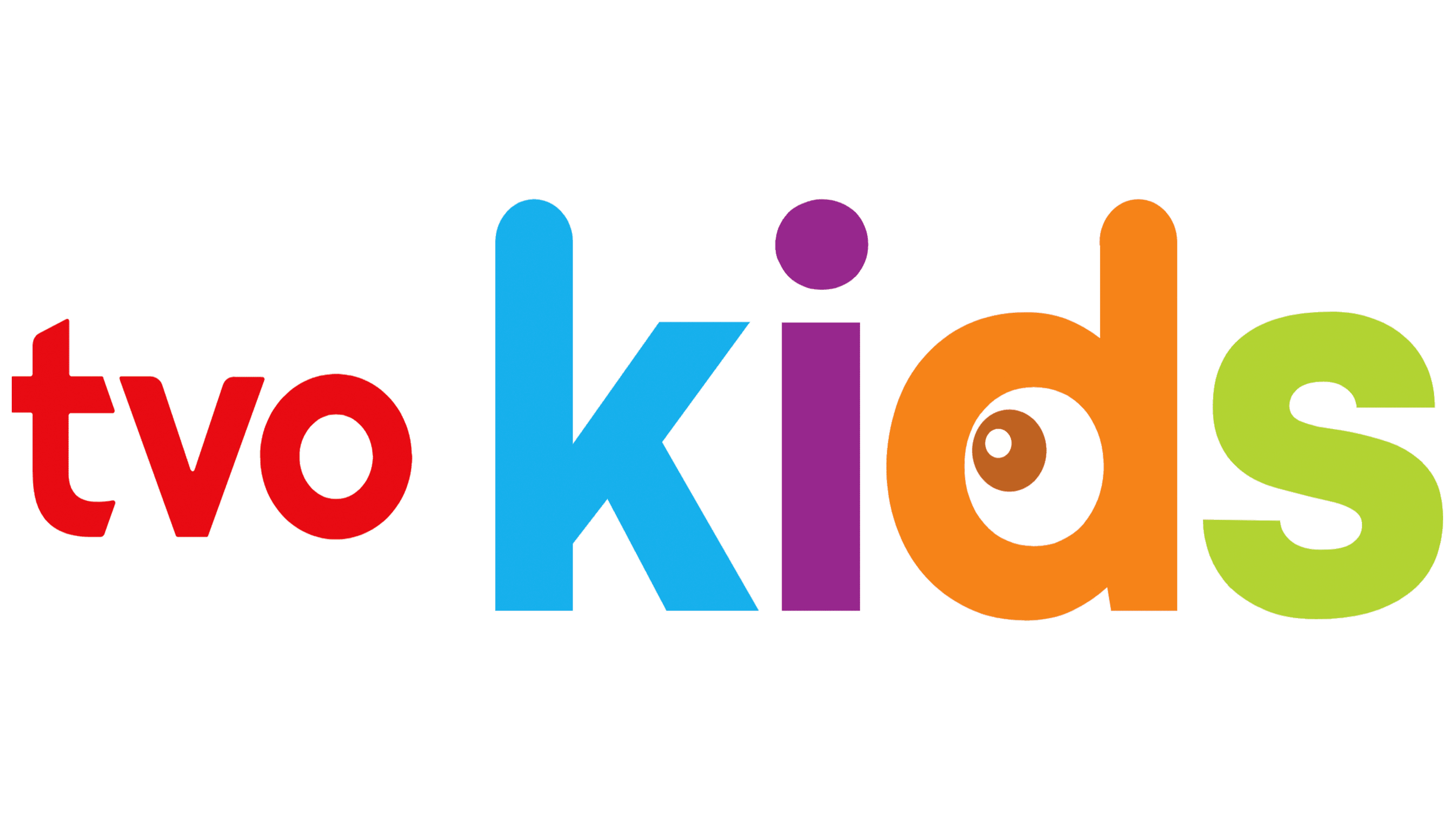
![]()
The TVOKids logo is designed in a bright and modern style. It consists of two parts. The left side features lowercase red letters spelling “tvo.” This emblem portion is smaller than the right part, emphasizing the word “kids.” Each letter in the word “kids” is colored differently, symbolizing the diversity and joy inherent in the world of children. The letter “k” is highlighted in blue, associated with trust and calmness; “i” in purple, representing creativity and imagination; “d” in orange, conveying energy and enthusiasm; and “s” in green, symbolizing freshness and growth.
An interesting detail is the eye embedded in the letter “d,” which adds an element of curiosity and openness to new experiences, important qualities for children’s development. This feature underscores the brand’s educational focus, as the channel is known for its children’s educational programs.
The sans-serif font is rounded and friendly, making it readable and appealing to children. This reflects the channel’s primary mission to provide educational and developmental programs in an accessible, engaging format.
The color palette and font choice align with the current needs and goals of a children’s program, making learning fun and accessible to all kids. The logo’s visual style highlights the channel’s positive, inclusive direction, aiming to be a reliable friend and guide as children take their first steps into exploring the world.
Font and Colors
The inscription’s outward playfulness, evident in its varied letterforms and bright colors, suggests that the emblem belongs to the block of children’s TV shows. Designers tried to convey lightness, ease, and a cheerful mood in TVOkids symbols.
The first three letters use the same font as the TVOntario logo. This is most likely the American Typewriter Medium, designed by Tony Stan and Joel Kaden. But for the second part of the name, the designers chose a bold sans serif, which has several analogs, including Sequel Sans Head Semi Bold by OGJ Type Design, GGX88 Regular by Typodermic Fonts Inc., Nimbus Sans L Bold by URW++, and FreeSans Bold by GNU FreeFont. To attract children’s attention, the TVOkids logo uses bright colors: pink, light blue, purple, orange, and light green.