Books and films dedicated to the romantic story about a girl and a vampire are tied together by common visual identification. The Twilight logo symbolizes mysticism, magic, and secrets, reflecting the allure and intrigue that are characteristic of the franchise. It conveys an atmosphere of tension because the main characters are constantly in danger.
Twilight: Brand overview
| Founded: | 2008 |
| Founder: | Catherine Hardwicke |
| Headquarters: | United States |
When the Twilight novel (2005) was published, it made Stephenie Meyer world-famous and sold millions of copies. The next three parts also became bestsellers. In 2008, Summit Entertainment released a film adaptation of the first book, and it grossed an enormous box office. Four more equally popular films followed. The Twilight franchise is often compared to Harry Potter because they have the same cultural impact on an entire generation of viewers and readers. But while the tale of wizards teaches teenagers bravery, the story about the love between a girl and a vampire has been criticized for promoting abusive relationships. Nevertheless, it has a huge fan base, especially among young girls.
Meaning and History
The title Twilight is the main element of the logo. It refers to the franchise’s theme, which is associated with the transition between light and dark, and also symbolizes magic and mystery. The logo of the movie, released in 2008, was inspired by the inscription on the cover of the first novel. They have similar twisted letters “g” and similarly bent “l,” reminiscent of sharp fangs. The design for the book was created by two graphic artists: Ben Dale and his wife Karen (nee Stoehr). The atmospheric covers of the novels relied on the traditions of horror movie poster design, so the font looked gothically gloomy.
What is Twilight?
Twilight is a literary and cinematic franchise based on the series of young adult books by Stephenie Meyer. The first four novels, published from 2005 to 2008, are interconnected in their plot: they narrate the complicated relationships between a girl and a vampire. The subsequent two parts (2015 and 2020) retell the same story with certain nuances. The books were incredibly successful, and as a result, movies were released based on them, featuring Robert Pattinson and Kristen Stewart in the lead roles.
2006
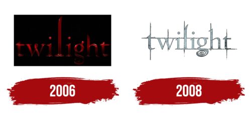
This is one of the many 3D logos created for the Twilight movie (2008) by artist Thom Schillinger. It was developed in the summer of 2006 at the request of the poster design company, The Cimarron Group, which was hired by the American film studio Summit Entertainment. The art directors of the project were Chris A. Hawkins, Joseph Stamper, and Calvin Sumler.
Thom Schillinger used the book Emblem as a reference. He rendered the inscription in 3D using shadows and gradients. The graphic designer presented several versions with different color schemes. The most symbolic is the red wordmark because it is associated with blood and, therefore, with vampires. The letters appear almost as they do on the cover of the first novel: there’s a loop in the middle of the “w,” the tops of “l” and “h” are bent, and the lower part of “g” forms a spiral. The “t” on both sides are slightly blurred, focusing attention in the center.
2008
The official logo of the Twilight movie (2008) includes its title against a backdrop of vertical and horizontal stripes. Thin lines drawn behind the letters give the inscription dynamism. They symbolize tension and conflict present in the dramatic love story between a human and a vampire.
The tail of “g” traditionally forms a spiral. This detail reflects the mystical and fantasy aspect of the story. In the context of the Twilight franchise, the spiral can represent a whirlwind of emotions and attraction between the main characters. The sharp, slightly bent “l” is shaped like a vampire’s fang. Its design is complemented harmoniously by the triangular tops of “t” and the pointed serifs of the other letters.
Font and Colors
The logo’s inscription has a unique design, but fan fonts were created based on it: LD Twylight by Illustration Ink and Twilight Saga by Alphabet & Type. The silvery color of the emblem underscores the connection to vampires, who are afraid of sunlight, and silver is considered a lunar metal. Small black dots and gradients mimic uneven texture.
Twilight color codes
| cfe5e9 | Hex color: | #cfe5e9 |
|---|---|---|
| RGB: | 207 229 233 | |
| CMYK: | 11 2 0 9 | |
| Pantone: | PMS 628 C |
| Eerie Black | Hex color: | #272523 |
|---|---|---|
| RGB: | 39 37 35 | |
| CMYK: | 0 5 10 85 | |
| Pantone: | PMS Neutral Black C |


