


![]() Ubisoft Logo PNG
Ubisoft Logo PNG
In the company’s history, the Ubisoft logo changed quite often until it became a whirlwind. Now it’s a black-and-white spiral with a minimalistic and monochrome look, keeping with the traditions of flat design. It symbolizes curiosity, enthusiasm, and madness, of course, in a good way.
Ubisoft traces its roots to the Guillemot family business in Brittany, where five brothers, Christian, Claude, Gérard, Michel, and Yves, worked with sales, distribution, accounting, and management. In 1984, they founded Guillemot Informatique, a mail-order software company. A year later, Guillemot Corporation was founded to trade in computer hardware.
On March 28, 1986, Ubi Soft Entertainment S.A. was registered in Carentoir. The name came from “ubiquitous,” reflecting the company’s international ambitions. Its first office opened in Paris and moved to Créteil in June 1986. Early game development took place in the family château in Brittany, where young creators were recruited, including 17-year-old animator Michel Ancel.
Ubisoft’s first internally developed game, Zombi for Amstrad CPC, was released in 1989. In 1994, Ancel created Rayman, and in 1995, the platformer Rayman launched on PlayStation. By 1997, it had sold 900,000 copies worldwide and topped PlayStation sales in the UK. In 1996, Ubisoft went public on the Paris Stock Exchange, raising about $80 million for expansion.
The company opened studios in Shanghai and Montreal, with Ubisoft Montreal starting on April 25, 1997. In 2000, Ubisoft bought Red Storm Entertainment, gaining access to the Tom Clancy brand and later developing Rainbow Six, Ghost Recon, and Splinter Cell. In 2003, Ubi Soft became Ubisoft and released Prince of Persia: The Sands of Time. Electronic Arts bought almost 20% of Ubisoft in 2004, then sold its stake in 2010. Vivendi’s 2015 takeover attempt ended in 2018 with support from Tencent and the Ontario Teachers’ Pension Plan.
Meaning and History
![]()
The Guillemot family named the company Ubi Soft, taking the first three letters from the word “ubiquity.” This term refers to the ability to be everywhere simultaneously, which accurately characterizes a game developer who has achieved success not only in France but also worldwide. What is the adventure platformer Rayman Legends, famous in Japan and the USA? So all attempts by fans to associate the Ubisoft name with the Union of Independent Bretons were unsuccessful.
The company logo has long been bright and colorful, but in 2017, everything changed. The spiral, which previously had a blue gradient, was stripped of its color and turned black-and-white. A sharp transition to flat design is associated with the emergence of a fashion for minimalism. It didn’t become popular until the top tech companies started using it: first Microsoft with Windows Mobile, then Apple with iOS. The monochrome Ubisoft logo looks elegant, and the negative space makes it unusual.
What is Ubisoft?
Ubisoft Entertainment SA is the developer of iconic video games such as Rayman, Prince of Persia, Far Cry, and Assassin’s Creed. This is a French company founded in 1986, originally called Ubi Soft Entertainment SA. She changed her name in 2003 as part of a global rebrand.
1986 – 1989
![]()
The first logo of a video game developer impressed with its retro style. The letters “U,” “B,” and “I” were large and pink, with wide blue edges. To dilute the bright color scheme, the designers made the word “Soft” white and outlined it with a thin black line. It was located diagonally across from the “I.” A large three-dimensional sans-serif font was used for the first part of the name, and the second part was handwritten with elongated horizontal strokes. The cartoonish design of the inscription hinted that Ubisoft specializes in entertainment.
1989 – 1993
![]()
In 1989, the logo’s relaxed style gave way to a conservative, strict design. The developers placed the phrase “UBI SOFT” at the top in ITC Lubalin Graph bold, and at the bottom, in the same font but italics, they wrote “Entertainment Software.” The text was black and center-aligned.
1993 – 1994
![]()
During this period, the company was represented by an emblem of many geometric shapes. The basis was a red square with a black inscription “SOFT.” It was executed in a vertically elongated serif font. In the upper half were two small squares (green and blue), and between them was a yellow rhombus. These three figures had lowercase but large “u”, “b”, and “i” in black.
1994 – 2003
![]()
When the company released the game Rayman, it marked the occasion by updating its identity. So the name “Ubi Soft” ended up on the same line again. It was black, so the pale green ENTERTAINMENT at the bottom was lost against it. On top was a thin arch with an iridescent gradient.
2003 – 2017
![]()
In 2003, the company became known as Ubisoft, with no space between the two parts. At the same time, the blue-violet whirlwind logo appeared, delighting gamers as it began to rotate in game intros. It was a futuristic design, especially for the time. The authors of the emblem used a gradient, darkening the upper coils and brightening the center. The spiral pattern added depth to the image, making it appear three-dimensional. The company’s name was written at the bottom in a modified Microgramma Bold font, which is characterized by letters with unusually sharp corners.
2017 – today
![]()
In 2017, the purple swirl turned black and white, and the familiar gradient was replaced with a flat design. The publisher explained that its new logo aligns with the latest trends that are driving many global brands toward monochrome and minimalism. At the same time, the letter “O” and the swirl at its center are intentionally made uneven so they look as if drawn by hand, without the use of computer graphics. So the company wanted to show that everything human is not alien to it – first of all, curiosity, enthusiasm, and “grain de folie,” that is, “a touch of madness.”
Font and Colors
The Ubisoft symbol may have been simplified to better display in different media. But its shape has not changed much: it is a uniformly balanced vortex with a shifted center, violating the golden ratio principle. So the designers expressed disdain for the spirals’ perfect symmetry.
The logo uses the so-called Ubisoft Sans, created by Colophon Foundry specifically for the French video game developer. It looks like a modified Gilroy Extra Bold. The black sans-serif letters look simple, except for the “O,” which resembles a round chain link and follows the shape of the hand-drawn logo’s central element.
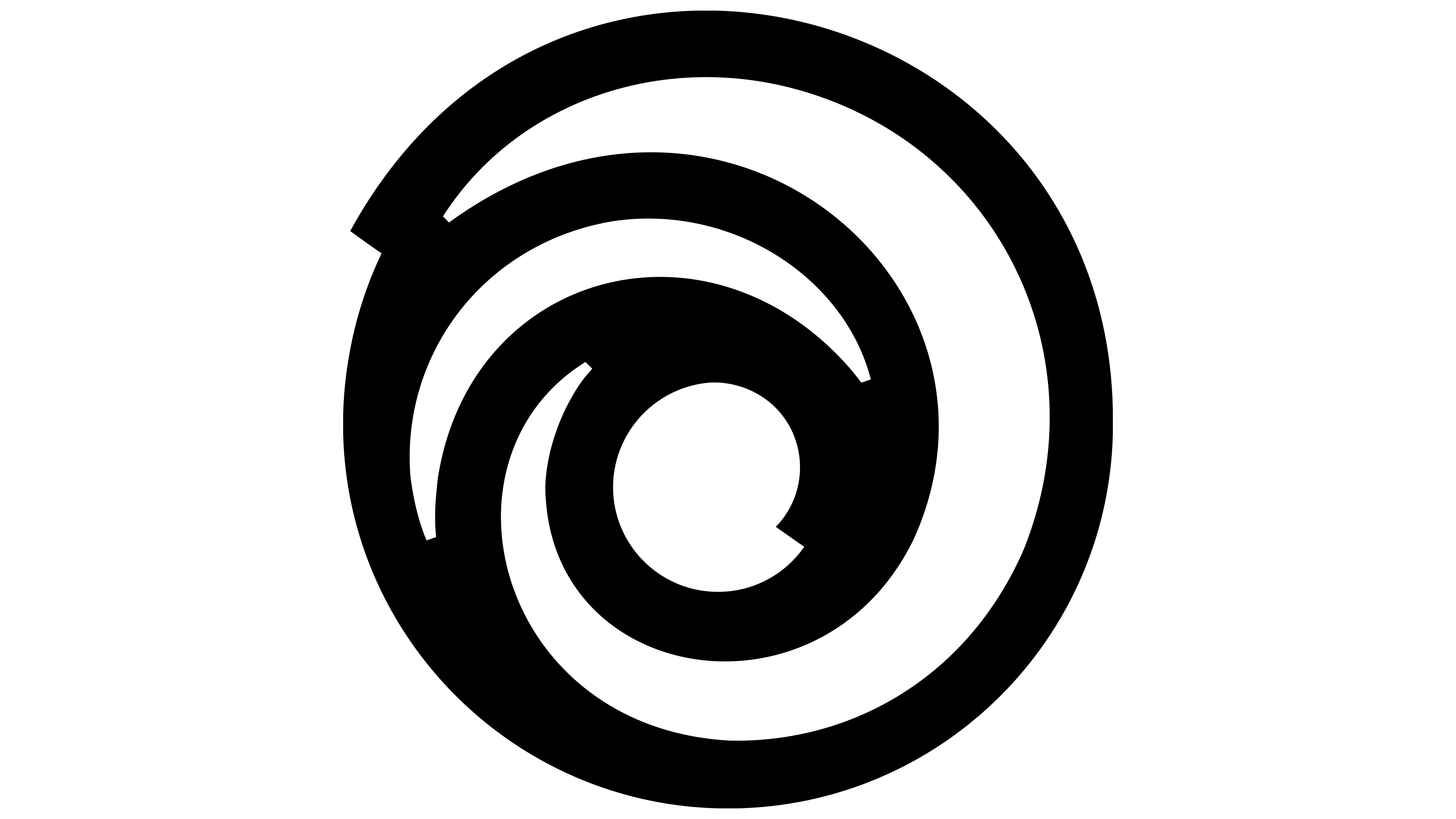
The color scheme is also very simple. Designers turned to traditional black-and-white monochrome to create a flat image that matches the trendy minimalism. In this case, the vortex’s inscription and contours are black, and the background and gaps are white.