Uncle Ben’s logo symbolizes the brand’s dedication to high-quality rice products, embodying reliability and trust in cooking essentials. Named after a Texas rice farmer renowned for his superior crop, the brand became a byword for consistency and exceptional taste. Introduced in the 1940s, the logo aimed to convey tradition and authenticity, consistent with the company’s goal of providing excellent rice that cooks perfectly every time. This focus on quality and reliability demonstrated the company’s commitment to simplifying cooking and making it more accessible globally, a noteworthy innovation when the brand gained prominence.
Uncle Ben’s: Brand overview
In the 1940s, Gordon L. Harwell and partners started Converted Rice, Inc., in Houston, Texas. They invented a new way to steam rice that made it taste better and last longer. This was how Uncle Ben’s got its start.
The brand got its name and logo from a story about a rice farmer named Ben, known for his quality rice. While there’s debate over whether Uncle Ben was real, the brand aimed to represent quality from the start.
By the 1950s and 1960s, Uncle Ben’s rice had become popular for its easy cooking and consistent taste. In 1959, Mars, Incorporated saw the brand’s potential and bought it. Under Mars, Uncle Ben’s expanded to include various quick-cooking rice products and flavor mixes to meet changing tastes.
In the shift toward healthier eating, Uncle Ben’s introduced fiber-rich and nutrient-dense products in the 1970s and 1980s, such as brown rice and rice with vegetables, recognizing the shift toward healthier eating. The brand also embraced global flavors to cater to a widening palate.
The use of the Uncle Ben character faced criticism for perpetuating racial stereotypes. Mars responded by updating the character’s image on the packaging to a more respectful portrayal.
With the growing demand for convenient and nutritious foods, Uncle Ben’s released Ready Rice in 2007. This pre-cooked, microwaveable rice packet line could be prepared in 90 seconds. The brand also moved towards cleaner ingredients by removing artificial flavors and preservatives.
In 2020, amid a broader discussion on racial equity, Mars announced a rebranding from Uncle Ben’s to Ben’s Original. The rebranding removed Uncle Ben’s image from the packaging and aimed to promote inclusivity and equality.
Meaning and History
What is Uncle Ben’s?
It is a well-known brand specializing in rice and rice products. The brand offers a variety of options, including quick-cooking and long-grain rice, as well as various flavored rice dishes. These products are designed for consumer convenience and time-saving in meal preparation.
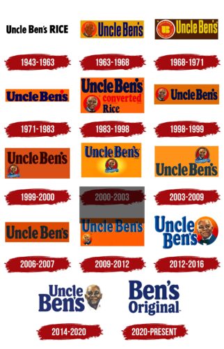
1943 – 1963
Uncle Ben’s brand started in 1943 and quickly established a strong foundation for lasting success. The initial logo simply displayed “Uncle Ben’s rice,” helping to create a distinctive brand identity. “Uncle Ben” was chosen to honor a well-respected Texas farmer renowned for his rice, linking the brand to a legacy of quality and appealing to American consumers.
Using human images in food advertising was common during the 1940s. Uncle Ben’s capitalized on this trend by introducing Uncle Ben as a credible and authoritative figure. Frank Brown, a maitre d’, inspired this character, whose professional appearance and demeanor greatly influenced the founders. This portrayal positioned their rice as a convenient and quality meal solution, emphasizing that Uncle Ben endorsed only the finest rice.
In 1947, Uncle Ben’s image was trademarked, becoming a core aspect of the brand. The logo carefully emphasized “Rice,” underlining the brand’s focus on this staple. Uncle Ben’s featured parboiled rice that was cooked quickly and maintained freshness longer due to a specialized processing technique. This innovation caught the attention of Forrest Mars Sr., who acquired the patent. Combined with these innovative methods, Uncle Ben’s image helped cement the brand’s status in the American market as a trusted symbol of quality.
1963 – 1968
In 1963, Uncle Ben’s brand introduced a significant new element to its identity by featuring the fictional character Uncle Ben on the company logo. The image showed an elderly man dressed in an elegant suit with a bow tie, highlighting his status as a culinary expert. The outfit symbolized respect and authority, and the bow tie charmed his character.
The logo’s background included a red circle representing the Sun, crucial for growing and maturing rice. This symbolized the energy and vitality necessary for producing top-quality rice. Additionally, an orange rectangle in the background suggested warmth, friendliness, and the joy of social meals, creating an inviting atmosphere of hospitality.
The logo featured blue letters stretched upward in a large font, symbolizing the long-grain rice Uncle Ben’s is known for. This font choice emphasized the brand’s commitment to high quality and unique taste, reminding consumers of Uncle Ben’s careful selection of rice varieties.
1968 – 1971
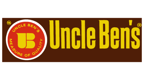
Introducing brown rice to their product line was a significant move for the company, leading to a logo redesign to showcase this new addition. The logo features a rectangular background that matches brown rice, emphasizing its natural quality and uniqueness.
The design includes yellow letters spelling out the brand name, which complements the overall color scheme and adds warmth. This choice suggests that the company’s products make nutritious and enjoyable meals.
At the logo’s center is a white circle with a red core, resembling a pot with a lid, symbolizing home cooking and traditional food preparation. The handle of the pot, styled like the letter “B” from the brand name, adds a distinctive touch. This logo communicates to consumers that the company’s products are essential for creating delicious, healthy home-cooked meals, providing the ingredients and the inspiration needed for cooking.
1971 – 1983
In 1971, Uncle Ben’s logo was updated to showcase the company’s expansion and introduction of richer flavors. The logo featured an orange background, chosen for its warmth and richness, reflecting the exciting variety of new products, like sauces. This color conveys positivity, energy, and joy, aligning well with the expanded product line.
The logo highlighted key ingredients from the new products, such as curry, tomatoes, and spicy peppers. These ingredients added new textures and flavors to the range, enhancing consumers’ meals and making them unique and memorable. This visual emphasis underscored the company’s innovative approach to product development, elevating everyday cooking to culinary art.
A distinct element in the revised emblem was a map marker replacing the apostrophe in the brand’s name. This symbol emphasizes Uncle Ben’s commitment to unique and high-quality offerings, suggesting that using Uncle Ben’s products brings exclusive, global ingredients to every dish, transforming them into culinary masterpieces.
1983 – 1998
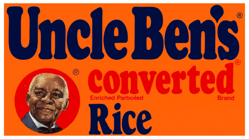
The recent change to Uncle Ben’s logo shows how the brand has grown. The new logo uses a rich orange background representing the cooking spices. It also suggests the variety of flavors Uncle Ben’s offers, giving a feeling of warmth like home-cooked food.
The logo has blue text, which shows the modern and innovative ways the company makes its products. Blue means reliability and professionalism, which fits with the high-quality, technologically advanced processes used for Uncle Ben’s rice. This update reminds customers of the brand’s promise always to improve and use the latest technologies for the best taste and nutrition.
The words “parboiled,” “enriched,” and “fortified” on the logo tell us about Uncle Ben’s special rice processing techniques. These methods make the rice delicious and healthy, showing the company’s focus on quality and new ideas in making its products.
The logo now includes an image of Uncle Ben, which had been removed for some time. Bringing back his image connects to the brand’s deep history and shows respect for its past.
1998 – 1999
Uncle Ben’s logo has been updated to keep the founder’s picture and the brand name, highlighting the brand’s long history and wide recognition. This update aligns with the expansion of Uncle Ben’s product range, showing the company’s commitment to adapt and meet the diverse needs of its customers.
The logo now features a gentle orange, replacing the previous bright hues. This new shade suggests friendliness and approachability, representing the warmth and hospitality of the brand. Uncle Ben’s aims to make products that bring people together and make mealtime more enjoyable. This orange color symbolizes comfort and the idea that food is an opportunity for bonding and creating warm memories.
1999 – 2000
In the late 1990s, Uncle Ben’s logo used brown lettering, a central part of its design. Brown, associated with the earth and nature, emphasized the natural quality of the company’s products, including their main product, rice. This color choice aimed to remind consumers of their food products’ natural origins and environmental friendliness.
During this period, the logo changed by moving the small image of the African American known as Uncle Ben to the lower left part. This adjustment in the logo’s design was criticized, as it was seen as unusual and less harmonious. The shift of such an important brand symbol to a less visible area raised concerns about the brand’s respect for its heritage.
2000 – 2003
The latest update to Uncle Ben’s logo significantly enhanced its visual appeal and brand image. A central change was placing the founder’s photograph at the center, correcting previous design imbalances, and creating a more appealing look. This adjustment emphasizes the importance of Uncle Ben’s history to the brand.
The logo’s letters changed to blue and were given a three-dimensional appearance, improving the brand name’s readability and linking it with quality and reliability. The three-dimensional letters make the brand more engaging and memorable.
Additionally, the logo now includes lighting effects, such as spotlighting on the center, which draws attention to Uncle Ben’s image. These effects spotlight him as the main figure and highlight the brand’s market success, emphasizing the premium quality of Uncle Ben’s products and its leadership in sales.
2003 – 2009
The latest Uncle Bens logo update positions the brand persona’s portrait in the top right corner. This unusual choice could make the brand feel unbalanced compared to traditional designs that place key elements where they quickly catch the eye.
In this redesign, the brand name’s letters are duller, making them appear less vibrant and luxurious. This could diminish the brand’s visual appeal and its connection with high quality, a hallmark of Uncle Ben’s in the past.
These changes are part of a new strategy by Mars Corporation, the owner of Uncle Ben’s, to shift its focus towards Dolmio, a more affordable and popular brand. This move aims to optimize the company’s brand portfolio and focus on products with more growth potential in current market conditions.
2006 – 2007
Uncle Ben’s recently updated its logo with a red background and black text to make a bold impression and refresh its brand image. However, this choice was unsuitable as black can be associated with spoilage in food, which contradicts Uncle Ben’s reputation for high-quality, natural rice. This discrepancy likely affected consumer perceptions since visual cues are important in food branding.
Despite the goal of creating a distinctive and innovative design, the logo was discontinued after just a year. This decision highlights the importance of ensuring a brand’s visual identity aligns with the expectations and preferences of its audience, especially in the food industry, where colors play a key role in influencing perceptions of quality and freshness.
2009 – 2012
Over the years, Uncle Ben’s has experimented with different placements for the portrait of its fictional founder, Uncle Ben, in its logo. In 2009, moving the image to the bottom left corner led to confusion and mixed reactions because it disrupted the design’s visual unity.
During that time, the logo had bold blue letters on an orange background, reminiscent of designs from 2000, aimed at evoking nostalgia while trying to make the logo stand out. However, relocating Uncle Ben’s figure raised concerns about the brand’s consistency and strategic direction.
2012 – 2016
In 2012, Uncle Ben’s unveiled a redesigned logo that stood out for its fresh and harmonious design. At the center was a prominent portrait resembling a globe, symbolizing the brand’s global reach and connection to people worldwide.
The blue letters around this central image seemed to rotate around it, giving a vibe similar to a news program intro, which suggests reliability and importance on a global scale. This design highlighted Uncle Ben’s worldwide ambitions and its commitment to offering products that adhere to high international quality and safety standards.
2014 – 2020
In 2014, Uncle Ben’s introduced a new visually appealing and thoughtful logo. The logo update featured a more natural and human depiction of Uncle Ben, moving away from the previous red sun halo around his portrait. This change made Uncle Ben appear more personal and relatable, establishing a trustworthy connection with consumers. His direct gaze and friendly smile created a welcoming image, transforming him into the true face of the company and its ambassador.
This design aimed to symbolize the brand’s commitment to quality and its efforts to build trust with consumers. It reflected a broader trend in marketing where personalization and humanizing brands are essential for connecting deeply with customers.
The logo’s letters were colored a dark blue, adding a sense of confidence and professionalism. This choice, different from the brighter colors used before, is linked with reliability and stability, supporting the company’s professional image. The letters’ correct proportions and smooth curves also improved the logo’s overall visual communication, making it more effective in engaging consumers.
2020 – today
In 2020, Mars updated Uncle Ben’s brand to Ben’s Original to eliminate names and images seen as old-fashioned or potentially offensive. The old brand featured a smiling Black man, which some people linked to when Black individuals were in lower social positions. The term “uncle” was used instead of “mister,” which some saw as disrespectful.
The new name, “Ben’s Original,” avoids these issues. It represents the brand’s modern values, focusing on inclusiveness and respect for everyone. Mars also removed the African American image from the logo, showing their commitment to avoiding stereotypes and promoting equality. These changes underline Mars’s dedication to supporting global equality and fairness principles.
Font and Colors
The logo features a bold serif font that conveys reliability and tradition, qualities associated with serif typefaces. The large font size makes the logo easily recognizable, even from a distance. The characters are designed to be commanding and fill the space authoritatively.
A unique aspect of the logo is the apostrophe in “Ben’s,” styled like a superscript comma, adding a distinctive twist and character to the design. This small detail helps set the brand apart.
The logo’s deep, dark blue color symbolizes professionalism, trust, and reliability, aiming to instill confidence in the brand—essential for a food product where trust is key.
The layout is straightforward, with a horizontal orientation that enhances legibility and brand recall. The words “Ben’s” and “Original” are spaced closely yet clearly, ensuring easy readability and avoiding visual confusion.
The logo’s font, color, and layout combination communicate a classic, reliable product. It aims to connect with consumers and emphasize the brand’s commitment to quality and trust.
Racism criticism
The brand Uncle Ben’s, known for its rice products, faced criticism for using a stereotypical image of an African-American man as its logo. Originating in the southern United States, where adults of color were often called “uncle” and “aunt” instead of “Mr.” or “Mrs.,” this naming was similar to the Aunt Jemima brand. The logo previously included a bow tie, symbolizing servants and Pullman porters, which was phased out by 2016. During the civil rights movement, such imagery was greatly reduced in advertising and limited to packaging.
In 2007, the brand radically transformed Ben’s image through a Masterfoods and TBWA/Chiat/Day campaign, promoting him to a successful board chairman with the slogan “Ben knows best.” This change was criticized for being unrealistic and simplistic, highlighting the lack of a last name and the improbable rapid promotion from servant to chairman.
The portrayal of an elderly African American man in Uncle Ben’s brand was seen by many as a relic of racist attitudes that have historically portrayed black people in demeaning or subordinate roles.
Following widespread anti-racism movements, especially after George Floyd died in 2020, the company renamed the brand Ben’s Original. It removed the controversial image from its packaging, reflecting modern views on cultural representation and equality.
Mars, the brand’s owner, expressed its commitment to greater inclusiveness and attention to the importance of equality within the community.
FAQ
What’s the meaning of Uncle Ben?
The character “Uncle Ben” on the rice products from 1946 to 2020 was more than a picture of an older African-American man in a bow tie. He was part of the brand’s story, showing its commitment to quality, reliability, and tradition.
The idea for Uncle Ben’s image came from Frank Brown, a well-known maître d’hôtel in Chicago. His image aimed to make people think of warmth, good service, and high-quality food. The name “Ben” was chosen because a skilled rice farmer from Houston highlighted the brand’s expertise in making good rice. This mix of ideas was meant to show the brand’s dedication to top-notch rice.
However, using “Uncle” before Ben’s name and showing him a certain way was problematic. These choices are connected to old racial stereotypes from the times of slavery and segregation in the Southern United States. Over time, people became more aware of these issues and started questioning Uncle Ben’s image use. Many said it kept up old, hurtful stereotypes. This feedback made Mars, Incorporated, the company behind Uncle Ben’s, change the brand to Ben’s Original in 2020. They removed Uncle Ben’s image to make the brand more welcoming and fair to everyone.
What is the slogan for Uncle Ben’s rice?
In 2007, Uncle Ben’s Rice got a new slogan, “Ben Knows Best,” as part of a campaign by Mars Food. This move aimed to improve the brand’s image, which had faced criticism for using racially stereotyped pictures. Mars Food tried to change how people saw Uncle Ben, turning him from a servant into the company’s chairman. They showed Uncle Ben as a busy, respected figure with an office, trying to move away from any negative past images. The “Ben Knows Best” slogan was meant to show Uncle Ben as wise and knowledgeable about rice, highlighting his leadership and expertise as a symbol and a character with real depth.
Why is Uncle Ben’s called Ben’s now?
The brand known as Uncle Ben’s is now called Ben’s Original. This change, announced by Mars, Incorporated, aimed to tackle the issue of racial stereotypes. The previous name and images, which had racial undertones, were seen by many as old-fashioned and disrespectful.
“Uncle” was a term historically used in the Southern United States for older African-American men without using respectful titles like “Mr.” The image of Uncle Ben, depicting an older African-American man, symbolized a period when Black individuals were not given the respect they deserved.
In 2020, amid calls for greater social justice and reevaluation of how ethnic minorities are represented, Mars made a significant move. They changed the brand’s name to Ben’s Original and removed the Uncle Ben image from their packaging, aiming for greater respect and inclusion.
Who is the man on Uncle Ben’s rice?
Two real-life people inspired the character on Uncle Ben’s rice packaging. This character combined the stories of a skilled Black rice farmer from Texas and a chef named Frank Brown from Chicago. The farmer was known for his excellent rice, showing Uncle Ben’s deep farming knowledge and connection to rice cultivation. Frank Brown’s image was used on the packaging, chosen for his association with warmth and great food service, helping to make the brand more relatable and appealing.
The idea was to make Uncle Ben a symbol of trust and quality in rice, using these backgrounds to assure customers of the product’s authenticity and excellence. Uncle Ben represented both the hard work of farming and the care in cooking and serving food.
However, as times changed, the use of “Uncle” and the imagery started to be seen as outdated and insensitive because they reminded people of racial stereotypes. So, the company decided to update the brand to Ben’s Original. This move aimed to be more respectful and to show a commitment to equality and including everyone.
