The Uno logo is friendly and welcoming. The emblem speaks of the players’ unity, forming a team that welcomes any participant, regardless of appearance, health, or personality. The game aims to bring people closer and bring them joy.
Uno: Brand overview
| Founded: | 1971 |
| Founder: | Merle Robbins |
| Headquarters: | United States |
| Website: | letsplayuno.com |
Meaning and History
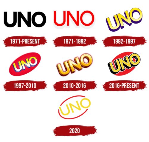
Uno logos consist of the game’s name, written in various styles. In the rebrandings, the color, position of the word, and the volume of the letters changed. Each transformation showed the expansion of boundaries, selling in other countries. Starting with America, by 1990, Uno was played in 30 countries. Every new owner changed the Uno objectives, reflected in the logo. Barber Robbins envisioned the game as simple and home-based, expressed in ordinary black. Robert Tezak presented Uno as a mass entertaining pastime; hence he transitioned to a bright logo for active sales. The voluminous symbols proposed by Mattel showed the growth from ordinary entertainment to a process with a high mission – to unite and socialize people.
What is Uno?
Uno is a tabletop card game played in a group. It’s designed for a company of up to 10 people and is based on the concept of games like American Crazy Eights, German Mau-Mau, and Irish Switch. Suitable for children aged seven and older. The player’s task is to get rid of all their cards and earn points for the cards left with opponents. A win is achieved at 500 points. Each round lasts up to 15 minutes.
1971 – today
The first emblem consisted of three black letters. The game’s name comes from the Italian word Uno, which means “one.” When a player finishes a round and puts the last card on the table, they should shout “Uno” to confirm the finish.
The brevity of the name speaks to the simplicity and speed of the game. Each round lasts only 10-15 minutes. The number three is related to the rules. The player puts a card on the table that matches the previous one by number or color. The third option is a special symbol that allows you to set desired data, skip a turn, or force a player to draw two extra cards.
1971 – 1992
Merle Robbins, not possessing business skills, did not dare to promote the game himself, as he could not ensure its mass production. Therefore, he sold the rights to his friend Robert Tezak, who owned a funeral home and had the experience and means to conduct business. Tezak created a company that, for many years, promoted Uno and paid Robbins 10 cents for each box.
For large-scale sales, the game developed a more attractive logo. The red letters of the sign are lifted above the surface. A slight coarse shadow is visible under the symbols.
The color indicates excitement, gripping battles, and the speed with which you need to get rid of unnecessary cards. Each player holds a set in their hands, leaving only a shadow on the table. Therefore, the sign’s letters are as if suspended much higher than the surface.
1992 – 1997
In 1992, the world-renowned toy manufacturer Mattel acquired the owner and distributor of Uno – International Games, Inc (Robert Tezak’s company). Changes were reflected in the game’s logo.
The letters of the name are placed obliquely, highlighting the great future that opens up before Uno with a large patron. The position of the symbols goes in rhythm with the drawing of the cards, in which the central number is placed in a diagonally twisted oval. The rotation indicates:
- The desire to score more points.
- The excitement of the game.
- Speed.
The bright yellow color conveys joy, fun, and communication among friends. This is exactly how Mattel planned to position Uno. The volume of the letters spoke of popularity—the best game of the genre for a company.
1997 – 2010
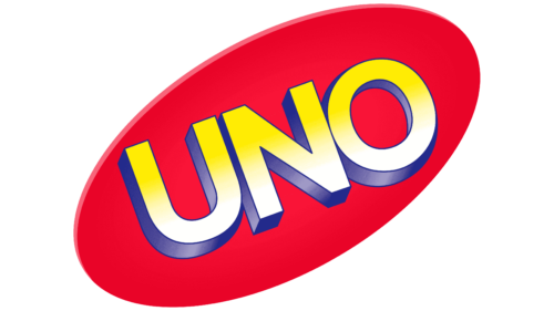
In 1997, the game moved to a digital format and became available for PC, PlayStation, and Nintendo. With the expansion, the logo was changed. The letters of the previous emblem were placed on a red oval, stretched obliquely, following the inscription. The background corresponded to the drawing on the cards. The color conveyed the growth and development of Uno.
2010 – 2016
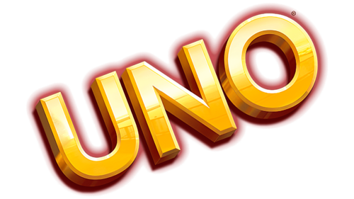
In 2010, Mattel decided to refresh the cards and released the Uno Mod deck, which featured special symbols instead of numbers, as a novelty for the game’s 40th anniversary. The logo of the new version received golden 3D letters, highlighting the venerable age and constant popularity of Uno. They talked about universality – the best game for people of all ages. After all, the symbols on the cards are understandable even to children who cannot read.
2016 – today
By 2016, the company expanded the game’s mission even further. In addition to universality, tolerance and the inclusion of diverse population groups were added. The new Uno will unite people with certain disabilities and healthy individuals at the same table.
To reflect modern values, the company changed the logo and released a unique Uno ColorAdd deck, which allowed color-blind people to play the board game.
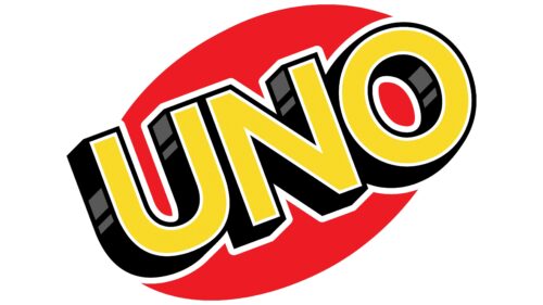
The red oval and bright 3D yellow letters with black ends made the emblem majestic. The sheen of the ends created the impression that the symbols were made of granite. The logo conveyed scale, representing a global game played in different countries.
The white outline of the letters created an association with card shirts with a white border.
2020
At the end of 2019, the company followed the chosen path and developed a deck with Braille font for the visually impaired. The universality and unification of people were expressed in a new bright symbol.
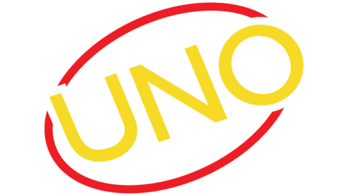
A red line in the form of an oval represented the idea of unity. The figure personifies players sitting around the table—the continuity of the line talks about a joint activity that brings people together.
Bright yellow letters convey joy, warm relations, and a great mood that Uno gives.
In the latest sets, four additional cards called “wild” (Shuffle Hands and Customizable) appeared, which increased the total number of cards to 112. It’s bright colors and hoop logo showed that the game has expanded its boundaries and become even more interesting.
Font and Colors
Two colors consistently accompany the game: red and yellow.
- Red represents Uno as an interesting, engaging activity. Games provide a celebration, strengthening family and friendly bonds of love. When there’s a happy event in the house, and people gather together – it’s the perfect time to play Uno.
- Yellow – conveys the theme of communication. The color of the sun’s warmth indicates the warm feelings that the game evokes. It is associated with joy and fun.
The name with simple straight letters fits many fonts. The style conveys simple, understandable rules. The flat two-dimensional inscription with a white border matches the cards’ look.
Uno color codes
| Sedona Red | Hex color: | #ee1c24 |
|---|---|---|
| RGB: | 238 28 36 | |
| CMYK: | 0 88 85 7 | |
| Pantone: | PMS Bright Red C |
| Banana Yellow | Hex color: | #f7da26 |
|---|---|---|
| RGB: | 247 218 38 | |
| CMYK: | 0 12 85 3 | |
| Pantone: | PMS 108 C |
| Black | Hex color: | #000000 |
|---|---|---|
| RGB: | 0 0 0 | |
| CMYK: | 0 0 0 100 | |
| Pantone: | PMS Process Black C |
| Davy’s Gray | Hex color: | #59595a |
|---|---|---|
| RGB: | 89 89 90 | |
| CMYK: | 1 1 0 65 | |
| Pantone: | PMS 425 C |
