Created in 2008 by Ryan Holmes from Canada, Hootsuite, a platform that recently introduced its new identity, provides a convenient way to manage social networks. Its development became the basis for the formation of the company of the same name, whose task was to support and develop the service, which has become, in fact, a new category that distinguishes the brand from many companies. The resource offers the best solutions for quickly and easily launching social enterprises, providing services, and simplifying contact management. The platform opens up wide opportunities for all business groups, not only for small and medium, large and corporate. The design provides ease of integrating the service into the accounts of such resources as Facebook, Instagram, Twitter, LinkedIn, Pinterest, and YouTube. This provides convenience and time savings by consolidating records in one place. The idea turned out to be successful and in demand. The supply-demand is constantly growing, expanding the number of users, of which there are already more than 18 million, and the coverage area – today, the resource is used in more than 200 countries around the world. Such broad goals and a powerful development strategy are reflected in the new brand identity of Prophet.
Hootsuite’s field of activity is saturated with competitors, which requires finding revolutionary solutions to advance in this market successfully. To create a completely different new voice in the overall landscape, in an effort to regain its leading position, the resource has significantly expanded its scope, adding marketing, commercial direction, and service. These items put the offer at the highest level in their environment, becoming distinctive features. At the same time, a way was found to positively impact the psychological level, demonstrating the best ways to move forward. The new identity has effectively reflected such important changes at all levels.
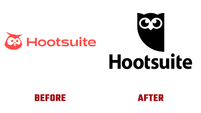
The new identity added an uplifting atmosphere, enhancing the impact of the reimagined visualization and delighting users. This was facilitated by changes in the graphic design of the well-known talisman – the owl Owly, which is now an emotional flock, demonstrating a reaction and empathy. Her playfulness, harmoniously combined with the quirkiness of the text block of the logo, combined with a bold color scheme, made the brand especially memorable and recognizable. The text is set in the original Adieu font from Good Type Foundry. The design colors were inspired by Nature itself.
Identity has acquired humanity, warmth, and tactility of sensations, as opposed to the shiny and artificial gloss and soulless pastel shades that are popular today.


