The Upwork logo symbolizes the connection between a freelancer and an employer and new projects that will grow out of this community. The emblem is like a sprout of fresh greenery rising from the ground—a symbol of novelty, development, and profit.
Upwork: Brand overview
| Founded: | 2015 |
| Headquarters: | California, U.S. |
| Website: | upwork.com |
Upwork (full name of Upwork Global Inc.) is an American platform for freelancers worldwide, where various job offers are published. It is the link between organizations and individuals: the former are interested in hiring a qualified employee to perform a specific task (usually short-term), while the latter offer them their services. The Internet site appeared in 1999. Its founders are Beerud Sheth, Srini Anumolu, Sanjay Noronha, Odysseas Tsatalos and Stratis Karamanlakis. Head offices are located in California, in the cities of San Francisco and Santa Clara.
The firm had several bases. The very first is Elance. That is what she was named by Beerud Sheth, an MIT alumnus, and Srini Anumolu. At first, the company did not even have its own office – it existed in a private two-room apartment. In December 1999, she moved to Sunnyvale, in the heart of Silicon Valley, where she developed her first product, the Elance Small Business Marketplace.
The second base is oDesk, created in 2003 by two friends – Odysseas Tsatalos and Stratis Karamanlakis, who were not only in different cities but even in different countries. One of them lived in Greece, the other in the United States. At first, it was a platform on which those who were looking for remote employees concluded working deals.
At the end of 2013, both structures announced the merger. At first, they did not deviate far from their previous names and called the joint project Elance-oDesk. Two years later, the freelance platform received the name Upwork and the original identity. This happened in September 2015. Now users from all over the world know her. The site has 5 million registered employers and 18 million specialists who find vacancies and complete tasks online.
In 2020, the startup underwent major changes. The new management introduced a rigid system for assessing the level of skills, knowledge, and experience. Therefore, many freelancers were disqualified after checking, greatly reducing the number of registered users.
Meaning and History
For Upwork, the logo is a way of expressing themselves because this company knows a lot about marketing. It helps some people find jobs, and others hire freelancers who can get the job done. That is, in this online platform, everything is not only tailored for business cooperation but also designed to ensure that visitors pay attention to details. No less important are the details in the Upwork logo: everything is symbolic in it – from the shape of the letters to the soft green color. Particularly noteworthy is the loop that “p” forms. It looks like a schematic representation of a complex race track and a fragment of roller coaster rails simultaneously.
What is Upwork?
Upwork is a meeting place for clients and freelancers from around the world. This online platform simplifies the interaction between employers and specialists, allowing posting projects, submitting applications, publishing resumes, searching for suitable jobs, communicating, and more. The site was created in 2015 and is owned by Upwork Global Inc., which emerged after the merger of Elance and oDesk.
before 2015
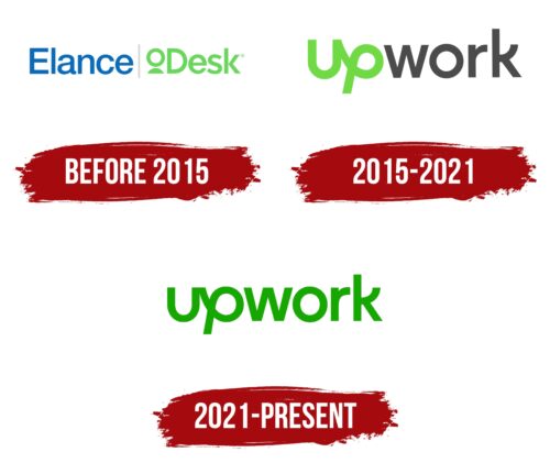
Until 2015, a company called Upwork did not exist – its place was taken by the startup Elance-oDesk, created in 2013 as a result of the merger of Elance Small Business Marketplace and oDesk. The logo of this project contained an inscription in bold geometric sans-serif. The left half of the wordmark was blue, while the right half was light green. A vertical stripe of gray separated them. Under the lowercase “o” was a small semi-oval, due to which the letter was slightly raised above the line.
2015 – 2021
In 2015, the global job search marketplace was named Upwork, and a new logo with the appropriate inscription. The designers made it so that all the letters appeared to be lowercase and balanced in size, but the first “U” was capitalized. It merged with the “p” that followed it, which looked like a loop tilted to the right. All other glyphs had a standard design; only the “k” had an unusual element: the upper stroke on the right side was sharply bent upwards and resembled a ring fragment. The first two letters were deep green, while the ‘w,’ ‘o’, ‘r,’ and ‘k’ were dark grey.
2021 – today
After redesigning in 2021, the wordmark is completely green and has a nice grassy hue. But the changes didn’t end there. Now, all the letters in the inscription are lowercase: the developers of the Upwork logo specially translated the “u” into the lower case so that it matches the “p” in height and is more convenient to connect with it. The looped “p” also looks new: its intra-letter clearance is increased and does not resemble a drop as much as in the previous version. It is a symbol of dynamics, development, search, and striving for progress.
Upwork: Interesting Facts
Upwork, a top site for freelancers and those looking to hire them has changed how people work together in today’s job market.
- How It Started: Upwork began in 2015 when Elance and oDesk, two leading freelance sites, joined forces. This merger united their strengths, making a stronger platform for people worldwide.
- Worldwide Connections: Upwork lets freelancers from everywhere find jobs and helps companies find talent from anywhere. You can find work or hire for many jobs, such as writing, designing, coding, and marketing.
- Going Public: In October 2018, Upwork started trading on the Nasdaq stock exchange, showing how big and important the freelance market has become.
- Big Impact: Billions of dollars worth of work happen on Upwork every year. The platform also studies freelancing trends, showing how freelancing is a big part of the economy.
- Direct Contracts: Upwork has a feature that lets freelancers manage work and get paid through Upwork, even with clients who don’t use the site. This makes it easier for freelancers to keep all their work in one place.
- Work Marketplace: In 2021, Upwork updated its system to match freelancers’ skills with the right projects. This made it easier for everyone to find the right fit for their needs.
- Help for Big Companies: Upwork also offers services for big companies to find and manage freelance talent, showing that the platform is useful for small jobs and big projects and companies.
- Learning and Growing: Upwork Academy offers freelancers resources, training, and tips to improve their skills and succeed on the platform.
- Adapting to Change: The COVID-19 pandemic made remote work much more common, and Upwork was key in helping many workers and businesses make this shift.
- Promoting Diversity: Upwork is working on making its community more diverse and inclusive, supporting people from underrepresented groups in tech and business.
From its beginnings as a merger between two big names to becoming a major player in the global economy, Upwork keeps evolving, helping businesses connect with freelancers worldwide.
Font and Colors
The logo is based on the current name of the freelance platform – “Upwork.” To visually differentiate the two words included in it and indicate the direction of work, the designers used different colors. As a result, “up” is colored light green, and “work” is colored dark graphite. The background is just white space.
They also have different typography styles. The first word is made in an individual font, simultaneously representing an ampersand, a paper clip, and a personal signature. The second is austere because all the letters are ranked and written in a sans serif typeface. Both stems are fused together to form a coherent textual structure. So the authors conveyed the connection between the two sides of a single creative process – performers and employers.
In addition to the expanded version of the logo, there is an abbreviated one. It looks like a rectangular icon. The square is green, in the color of the first two letters on the base logo. It contains the inscription “up,” stylized as a graphic element. In this case, it is white so that the letters look clearly against the pale light green background.
For their logo, the Upwork Global Inc. I chose a contrasting style, so on one side of the lettering, there is an individual element; on the other – a classic one. The second part is executed in pure grotesque, which unites both bases of the name.
The signature palette includes a powdered green spectrum. He is calm and bright. Also available in black and white. The company’s administration recommends combining these three colors together, so the icon is found in different design options.
Upwork color codes
| Kelly Green | Hex color: | #0caa00 |
|---|---|---|
| RGB: | 12 170 0 | |
| CMYK: | 92 0 100 33 | |
| Pantone: | PMS 354 C |
