


![]() USA Network Logo PNG
USA Network Logo PNG
The USA Network logo conveys the channel’s focus on showing movies and series. The emblem emphasizes individuality, reflecting its users’ tastes and preferences.
USA Network began in 1977, when Madison Square Garden Sports launched the Madison Square Garden Network as a small cable channel focused mainly on sporting events. In 1979, the channel was renamed USA Network and began adding entertainment programming, moving it away from a narrow sports format. That year is usually treated as the official start of the channel in its familiar form.
During the 1980s, the ownership structure changed, and Paramount Pictures and Universal Pictures became major co-owners. Their film libraries helped USA Network fill much of its schedule with movies at a time when many cable rivals were still shaping their programming models. The channel also aired World Wrestling Federation content, giving it a separate audience tied to wrestling.
In 1992, Viacom took control of USA Network after buying the stakes of earlier shareholders. The next change came in 1998, when Universal Studios and Barry Diller’s USA Networks Inc. acquired the channel from Viacom. After a restructuring, USA Network became part of NBCUniversal in 2004, following the merger of NBC and Universal.
Under NBCUniversal, the channel invested more in original series. Monk, launched in 2002, ran until 2009 and became one of its first major scripted hits. Psych followed in 2006, and White Collar arrived in 2009, keeping the focus on crime stories, light drama, and adventure formats. In 2015, Mr. Robot brought a darker tone and won a Golden Globe in 2016. Across U.S. cable television, USA Network competed with TNT and FX for viewers, advertising, films, sports, and original scripted shows.
Meaning and History
![]()
The company started in 1977 as a sports television channel and gradually expanded its broadcasting. Today, it broadcasts reruns of series, other network channels, movies, and sports programs throughout the day.
The numerous logo changes are tied to changes in the network’s ownership. The network was resold at least seven times, and each new owner reviewed the channel’s concept and program list.
What is USA Network?
It’s one of the cable channels in American television, popular for airing series and movies.
1977 – 1980
![]()
The first logo is very massive and noticeable.
At the center of the composition is a schematic image of a sports arena in New York. In reality, the building’s exterior design consists of strips; however, they form a cylinder rather than a ribbed surface. The blades are open in the picture, allowing viewers to peek inside the arena. The image shows the channel is dedicated to its listeners during major sports events, revealing the unfolding mystery on the field.
The logo and name choices reflect Madison Square Garden’s active role in creating the network. The main broadcasts came from its walls.
A large black inscription with the channel’s name, placed in four lines, makes the logo too massive. Capital letters demonstrate the importance of sports news and coverage of the central, most popular games. The logo also indicates importance, as this was the first cable sports channel in the US.
1980 – 1981
![]()
The program list was expanded. In addition to sports events, children’s shows, program blocks, and films were added. Therefore, the channel’s name was changed to a more general one: USA Network. Accordingly, the logo was updated.
The new emblem was letter-based and lacked graphic elements. The inscription was arranged in two levels. A smaller inscription of Network balanced the large abbreviation. The size of the letters “USA” emphasized coverage of most of the country’s territory, and the word “Network” indicated distribution through the cable network.
National colors were used for the logo: red and blue, which emphasized love for their country.
1981 – 1996
![]()
In 1981, the changes that had begun a year earlier continued. The network changed ownership, with the shares distributed equally among the three companies. This led to an even greater change in content: the addition of cartoons and women’s shows, the production of its series, and the broadcast of popular films from other networks.
The visual symbol underwent minimal changes. Its colors became more muted. The inscription was set in a uniform font, demonstrating the new owners’ aim to develop a common style and to shape a memorable “face” for the channel.
1996 – 1999
![]()
The channel’s ownership initially shifted from Paramount Network to Viacom, then to Seagram, which purchased both Viacom’s and MCA’s shares, owning 2/3. These were resold to businessman Barry Diller, the owner and founder of several companies. He merged his networks with the new acquisition and completely revamped the airtime, leaving only original programs made in the USA. The logo was also changed.
The font of the name was altered. The squat black letters were stretched into an inscription, indicating broad viewership and expansion into new channels. A blue star was hidden behind the first letter U. It alludes to the national symbol of the USA and conveys the new direction of broadcasting and the choice of television shows.
The star’s three protruding rays resonate with the three notes that sounded in the air when the emblem appeared.
1999 – 2002
![]()
The network’s new logo is very patriotic. In addition to the familiar abbreviation, it features the American flag unfurling. Underneath the composition is the inscription “Network,” which clarifies which US enterprise is being discussed.
The thin letters give the image lightness and airiness, demonstrating coverage across the entire territory of America and a selective approach to programming.
2002 – 2005
![]()
The channel’s ownership transitioned to Vivendi, which made it part of the Universal Television Group. Now, the airtime preference was given to the in-house series.
The new owners retained Diller’s identity, only slightly modifying it. The emblem retained its concept, but the colors became more vibrant and the letters of the inscription thicker. The flag was reduced in size, with five red stripes instead of the standard seven. Overall, the sign conveyed the variety of programs and the network’s stability, with a preference for American-produced content.
2005 – today
![]()
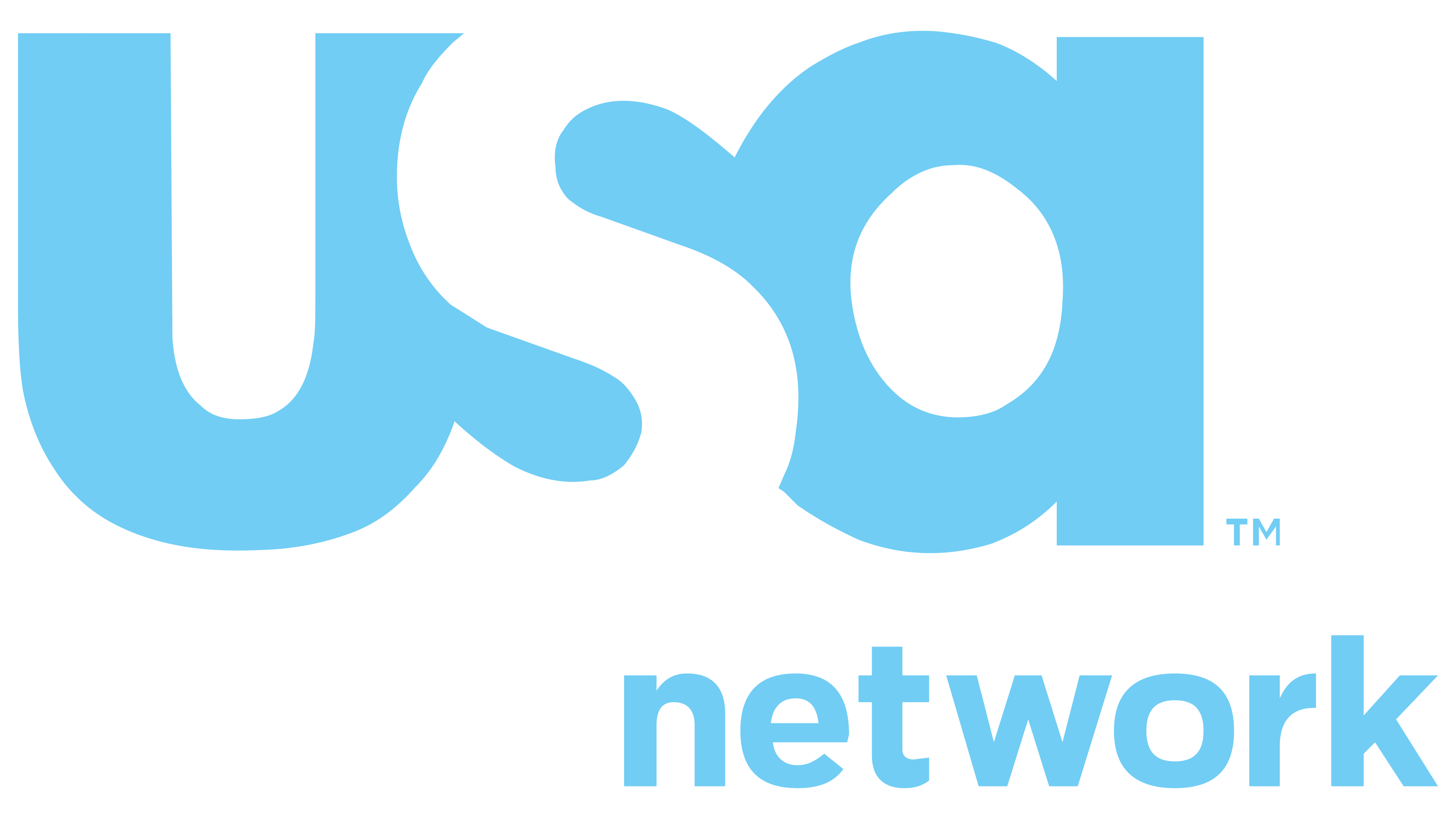
In 2004, NBC Universal acquired the company, and a year later, an advertising campaign emphasizing comedy and drama series was launched.
The new logo turned out to be the most impressive and unusual. The company Imaginary Forces developed this version of the symbol. The first three letters of the abbreviation USA are closely intertwined. At the same time, each is visible through the interplay of black and white. The black U and A are in beautiful contrast with the white S overlaid on a black circle. Sometimes, red is used instead of black to add expression and fire to the sign, or blue is used to represent a wide range of programs.
The interlacing of white and black elements in the center resembles the yin-yang symbol, representing the unity of opposites and feminine and masculine principles. This demonstrates that the channel focuses on individuals and characters from beloved series and movies.
Font and Colors
The primary colors of the logo are patriotic blue and red, along with black and white.
- Blue represents a business approach, partnership development, and digital networks.
- Red signifies engaging, exciting shows and a careful approach to viewers.
- Black symbolizes stability and reliability.
- White indicates regular updates to the network’s concept and its content.
The combination of white and black also suggests broadcasting during both day and night.

The font of the inscription resembles Dolcissimo Regular. Using lowercase letters indicates that the channel is unrelated to the country’s name. Moreover, the lowercase approach makes the network appear more approachable to viewers.