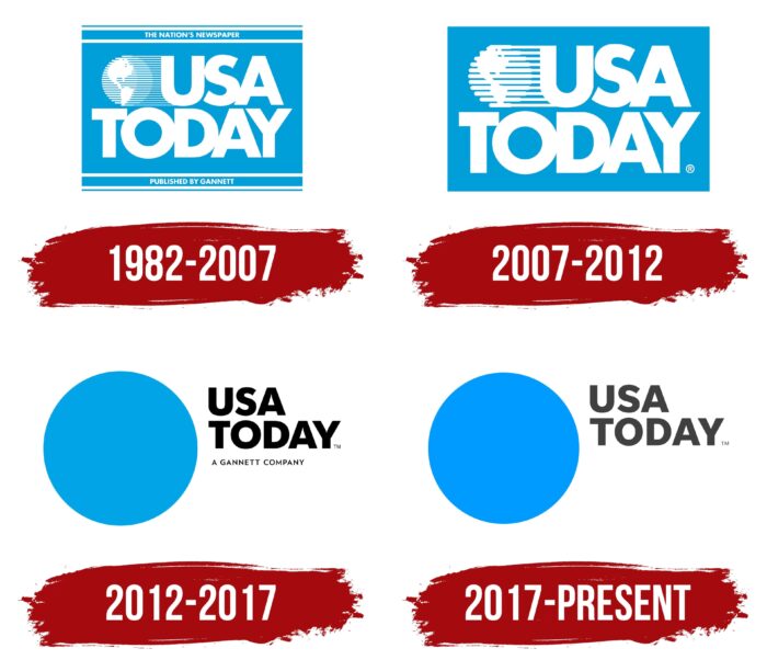
Much information about the country’s life is placed on the USA Today logo. The newspaper can cover only a small amount of this stream. The emblem helps to see in the printed edition the way to obtain the necessary information.
USA Today: Brand overview
| Founded: | September 15, 1982 |
| Founder: | Al Neuharth |
| Headquarters: | McLean, Virginia, United States |
| Website: | usatoday.com |
Meaning and History
The idea for USA Today was first announced in 1980 by a working group called Project NN in a meeting with Gannett Al Neuharth, head of the printing press. The talks took place in Cocoa Beach, Florida, where the proposal was to create a national newspaper for all segments of the American population. Early prototypes were based on East Bay Today, the morning issue of the Oakland Tribune. A trial publication appeared in the summer of 1981 in two designs and was sent out to prominent journalists, leading experts, and newsmakers. This was needed for an analytical review from the outside and for feedback on suggestions, clarifications, and corrections.
In December of that year, the media holding company’s board of directors approved the publication of a national newspaper, appointing Neuharth, the head of Gannett’s executive committee, as its manager and publisher. The official launch of the media novelty took place in the spring of 1982, and the first edition was printed in the fall. Each issue cost 25 cents at the time. The publication’s popularity grew very quickly, and in December, the print run was already double what had been planned.
The design of USA Today was innovative at the time, as the editors reworked existing standards. The new newspaper prioritized short notes, pithy blocks, charts, diagrams, concise analysis, color graphics, and photographs. At the same time, all other periodicals favored long articles, long columns, and columns with detailed information. The news presentation in short columns was in keeping with the television format and made the periodicals much more up-to-date.
Naturally, the internal style and content were reflected in the external design of the front pages and the emblem because, as a rule, every periodical has its distinctive mark. A key feature of USA Today’s symbolism is dynamism. It shows up in bold and solid letters, long and jerky lines, in a shortened and simple name. The newspaper has changed four logos over the years.
1982 – 2007
The first version of the visual identity of this media outlet had the hand of the mastermind of the concept himself. The logo is rectangular, with a double stripe at the top and bottom, wherein small grotesque letters like “THE NATION’S NEWSPAPER” and “PUBLISHED BY GANNETT” are written. The central place is given to the title of the periodical. It is grouped on two lines and is not aligned on either side: the upper end of the “Y” appears on the right and the “T” on the left.
The designers added a globe to the left of the word “USA,” from which thin bars extend to the first letter to balance the text visually. It depicts two continents – North and South America. All of the symbols in the inscription are large, bold, and wide. The first row has straight connection points; in the second, they are only partially combined, as the “Y” is located at some distance from the other characters.
2007 – 2012
Designers have made minor changes. They increased the width of the fine lines connecting the globe to the “U,” lightened the blue color by a few tones and removed the top and bottom bars.
2012 – 2017
This is the first major modification undertaken by USA Today. Designer Wolff Olins was involved. With his input, the focus shifted from the name of the national newspaper to a graphic depiction of the globe. The experimenter removed all unnecessary elements and left only the blue circle. It denotes several concepts: the globe, the point of view of what is happening around, the dial indicating the completed daily cycle, and the final point of each day. On the right side is the title, aligned on the left edge and colored in black.
2017 – today
The current emblem has been simplified even further because the authors have removed the faintly visible phrase “A Gannett Company,” which was previously under the periodical title. They also lightened the remaining lettering, making it graphite, and added an emerald hue to the circle.
USA Today: Interesting Facts
USA Today is recognized for its bright and straightforward style and has influenced the newspaper world since it first appeared.
- Start: It launched on September 15, 1982, and was created by Al Neuharth of Gannett Company. It aimed to be a national paper for the rising professional class.
- Unique Style: Right from the start, USA Today used color photos and graphics, brief news stories, and color-coded sections for easier reading. This fresh approach also changed how news is displayed in other papers.
- National Reach: It was among the first U.S. papers with a national focus, offering the same look and content nationwide, unlike most newspapers, which focus on local news.
- “McPaper” Nickname: Some first called it “McPaper,” comparing its quick, easy-to-digest news to fast food. Yet, its popularity showed people liked this news style.
- Online Early On: USA Today quickly moved online, launching USAToday.com in 1995 to share its news worldwide.
- Wide Circulation: For a long time, it was the top-printed newspaper in the U.S. Despite a drop in print readership, it’s still among the most distributed.
- Awards: Even with some saying it lacked depth, USA Today’s reporters have won Pulitzer Prizes for their in-depth investigations.
- Snapshot Graphics: The paper is famous for its “snapshot” graphics, small infographics summarizing various topics, a style many others have started using.
- Super Bowl Ads: Its Super Bowl Ad Meter, where readers rank Super Bowl ads, is a popular feature many look forward to each year.
- Headquarters: Its home base is McLean, Virginia, close to Washington, D.C., emphasizing national news.
USA Today combines detailed news, a fresh way of presenting it, and a focus on accessibility, keeping it a major force in the news world as it evolves with how people get their news.
Font and Colors
The evolution of the USA Today newspaper logo has to do with simplification, which is evident at every stage. If it consisted of many stripes in the beginning, now there is no trace of them left. This modification was caused by the concept of the print edition and the transition to an electronic format. The designers had to make the media remain recognizable, keeping the style, but at the same time, it was compatible with any digital media operating on Apple and Android systems.
The lettering in the emblem is in Futura Pro Bold sans serif typeface. The font was created by designer Paul Renner, who first introduced it in 1971. The color scheme includes several shades of blue, from sky blue to emerald. In addition, the classic combination of black (text) and white (background) is now used.
USA Today color codes
| Dodger Blue | Hex color: | #009bff |
|---|---|---|
| RGB: | 0 155 255 | |
| CMYK: | 100 39 0 0 | |
| Pantone: | PMS 3005 C |
| Onyx | Hex color: | #404040 |
|---|---|---|
| RGB: | 64 64 64 | |
| CMYK: | 0 0 0 75 | |
| Pantone: | PMS 447 C |


