![]() UTSA Roadrunners Logo PNG
UTSA Roadrunners Logo PNG
The UTSA Roadrunners logo boasts unique individuality. It symbolizes high speed, essential for athletes to win competitions and earn outstanding awards. This emblem is filled with energy, even in the colors and shapes. It embodies students’ potential, activity, and will to win.
UTSA Roadrunners began before the university played its first official games. In 1976, UTSA hired Rudy Davalos as its first athletic director to prepare the program for NCAA Division I. A year later, students voted on a mascot from more than fifty proposals. The final choice came down to the armadillo and the roadrunner, with the Texas desert bird winning. Navy blue, orange, and white became the school colors.
Rowdy appeared in public on November 24, 1981, at HemisFair Arena before the first basketball game. Student Antonio Gonzalez III emerged from a giant egg in a dark arena while music from 2001: A Space Odyssey played. On November 30, 1981, the men’s basketball team played its first official game against the University of Arkansas, marking the beginning of UTSA athletics as an independent program.
The Roadrunners joined the Trans America Athletic Conference in 1982 and later competed in the Southland Conference. Men’s basketball reached the NCAA tournament in 1988, 1999, 2004, and 2011. Baseball became another marker of the program’s rise, reaching the NCAA tournament in 2004 and setting an NCAA record in 2007 with 105 home runs in 51 games.
Football changed UTSA’s national profile. The program was announced in 2009, with Larry Coker as the first head coach. The team began play in 2011, moved to FBS in 2012, and joined Conference USA in 2013, establishing the I-35 rivalry with the Texas State Bobcats. Under Jeff Traylor, UTSA won Conference USA titles in 2021 and 2022. On July 1, 2023, the Roadrunners joined the American Athletic Conference. In 2025, baseball won the league title and reached the NCAA Super Regionals after eliminating Texas.
Meaning and History
![]()
The name “Roadrunners” for UTSA was predetermined in 1977 when the university chose its mascot. Initially, it was supposed to be an armadillo, but the Student Representative Assembly declared the poll results invalid. After a re-vote, the California Roadrunner won. Eventually, this bird ended up on the sports teams’ logos, which were introduced to the institution only in 1981.
Since then, the emblem has undergone multiple changes, acquiring new elements and increasingly resembling its modern version. Yet, it has retained its signature blue and orange colors, along with the image of the Greater Roadrunner. This bird can reach up to 20 miles per hour, making it an apt symbol for athletes. This bird is also known for its remarkable stubbornness and bravery, as it can eat a live rattlesnake.
What is UTSA Roadrunners?
UTSA Roadrunners are the athletic teams of The University of Texas at San Antonio. They emerged in the early 1980s and were named after their mascot, the Roadrunner, a swift bird. The educational institution competes in the American Athletic Conference at the NCAA Division I level and is the only Football Bowl Subdivision player in the entire City of San Antonio.
1980 – 1988
![]()
The original logo for the UTSA Roadrunners debuted in 1981. It features a blue silhouette of the bird, after which the sports teams are named. The bird has strong legs, an elongated body, a large tail, a curved beak, and a signature crest on its head. The drawing is not detailed, yet it has a realistic shape akin to an illustration from an ornithological guidebook. This emblem, known as Flat Roadrunner, was never official.
1988 – 2008
![]()
Rick Nixon, Sports Information Director, and Bobby Thompson, Athletics Director, enlisted Tom Palmer to create a new logo suitable for all the athletic teams. The old image of the running bird didn’t work universally; for instance, it lacked the power and strength needed for baseball players.
In place of the flat drawing came a vibrant cartoonish character. His stride is springy, his movements confident, his muscular arms clenched into fists, and his gaze is bold and haughty. The mascot is traditionally colored in dark blue, yet now his legs, tail, beak, and feathers near the eyes are orange. The anthropomorphic animal wears white shorts and a tank top with the inscription “UTSA.”
2008 – 2022
![]()
Upon becoming the Athletic Director, Lynn Hickey reformed the UTSA Roadrunners to create a football team. Changing the logo was one of the primary steps, as this graphic symbol is used in public spaces, sports uniforms, official stationery, souvenirs, advertising, and many other applications. By then, the previous version had aged and was not in line with modern design trends.
The new emblem was unveiled on March 1, 2008. It was created by employees of Rickabaugh Graphics, who had arrived on campus as early as 2006 to study the team’s traditions and survey athletes. Eric Rickabaugh personally conceived several visual identity concepts. All options were presented to the university’s alumni, students, and staff for evaluation.
Designers aimed to create a sufficiently “rugged” logo without crossing into aggression. The issue is that the California roadrunner itself doesn’t look intimidating; it’s small and delicate, and some people find it weak. Yet, artists managed to counteract these flaws by endowing the bird with confidence, determination, fierceness, and assertiveness, visible in the sharp angles and clear lines.
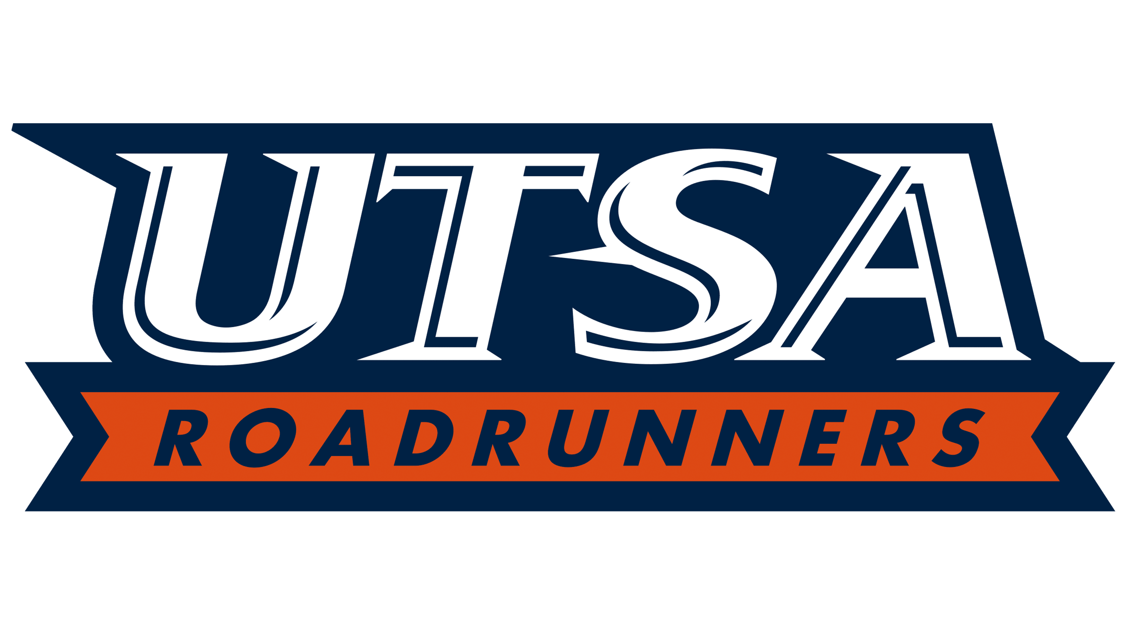
The emblem features a dark blue bird’s head with a large crest, a robust beak, and an orange feather pattern. Below is the inscription “UTSA ROADRUNNERS,” split into two lines. Both words are in bold italics, but the acronym has long triangular serifs. The letters in the first line are mostly white, with blue lines inside them, creating a sense of depth. The second part of the name is solely in blue and set against an orange polygonal background.
2022 – today
![]()
Before joining the American Athletic Conference, sports teams updated their logo, removing text clutter. The remaining bird’s head is strongly associated with UTSA Roadrunners and still uses the university’s official colors. This emblem isn’t new; it has been used as a secondary emblem since 2008.
Font and Colors
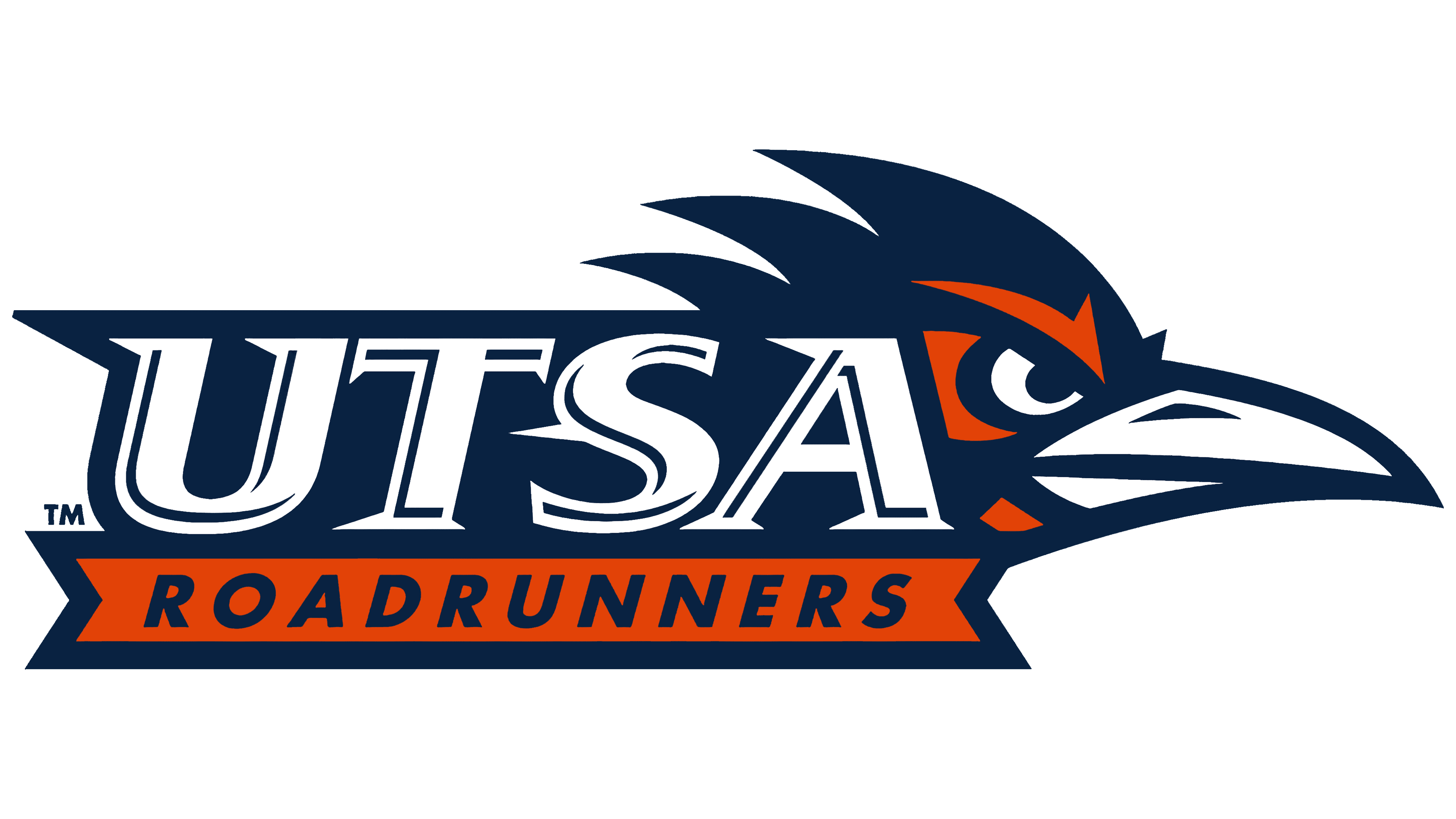
The sports teams representing The University of Texas at San Antonio use various individual fonts, yet the 2022 logo includes no inscriptions. Full focus is on the institution’s mascot and its official colors: orange (#F15A22), dark blue (#0C2340), and white.