


 Valvoline Logo PNG
The Valvoline logo is colorful and bright, reflecting the brand’s growth across various directions. The emblem encodes the chemical processes that lead to the birth of the company’s new products.
Valvoline’s history began outside the car industry. In the mid-19th century, Dr. John William Ellis, a physician in New York State, studied crude oil from Pennsylvania wells in search of medical uses. The idea failed, yet distilled oil proved useful as a lubricant under high heat, unlike animal fat, which was then used in machinery and steam engines.
On September 6, 1866, Ellis and a relative by marriage founded the Continuous Oil Refining Company in Binghamton. Its first product was Binghamton Cylinder Oil, later renamed Valvoline after the engine valves it often lubricated. In 1873, the Valvoline trademark was registered in the United States, becoming the first patented motor oil brand in American history.
In 1895, a car lubricated with Valvoline won the first automobile race in North America, held in Chicago. In the early 20th century, Ford recommended Valvoline for the Model T, placing a notice on the dashboard. In 1910, the company began producing one of the first aviation engine oils. In 1939, X-18 replaced 18 specialized gear oils, and during World War II, Valvoline products were used in Allied vehicles.
Ashland Oil Inc. acquired Freedom-Valvoline Oil Company in 1950. In 1954, Valvoline introduced All-Climate Motor Oil, ending the need for seasonal oil changes. In 1986, the first Valvoline Instant Oil Change opened in Ohio, competing with Jiffy Lube in the quick-service maintenance market. MaxLife followed in 2000 for engines over 120,000 kilometers. Valvoline went public on the New York Stock Exchange in 2016. In 2023, Saudi Aramco bought its global lubricants business for $2.65 billion, while Valvoline Inc. focused on quick-service locations.
Meaning and History
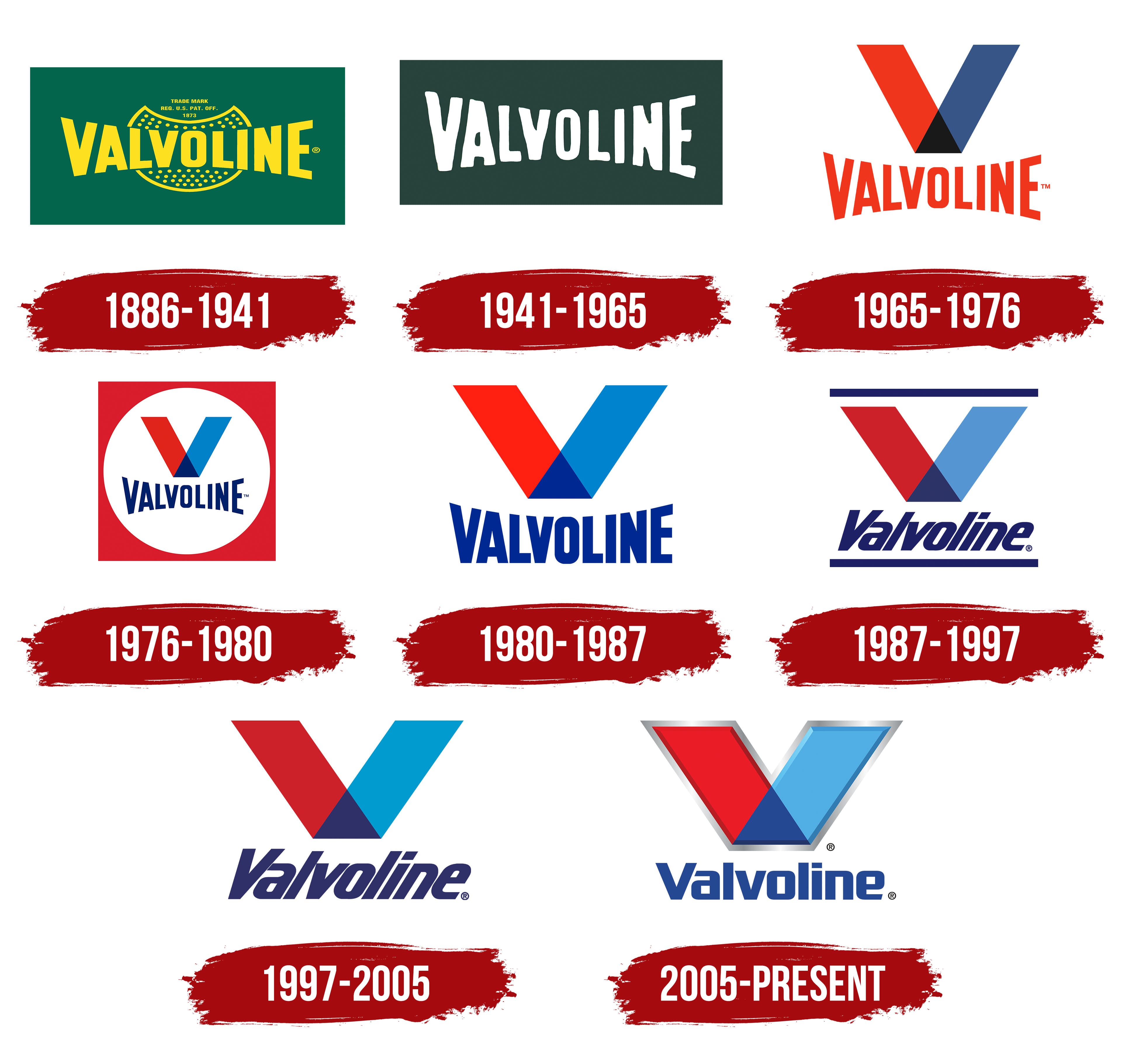
The oil-producing company was founded in 1866; the name Valvoline was born in 1868 and registered in 1873. Therefore, it is likely that the first brand logo was created by the time of registration. Since then, the visual symbol has been updated many times. However, the main idea of the composite letter V, invented in 1965 by the brand’s new owners, has been preserved throughout the brand’s ownership history, through 2016 and beyond. In recent years, Valvoline has gone “freelance” and then found a new owner, so updates to its identity can be expected.
What is Valvoline?
An American brand that produces lubricants, oils, brake fluids, car care products, automotive chemicals, and engine additives. Sales volume exceeds $2 billion. Production facilities are located in several US states, Latin America, Asia, and Australia. Seven thousand five hundred employees work at the plants. The headquarters are in Lexington.
1886 – 1941
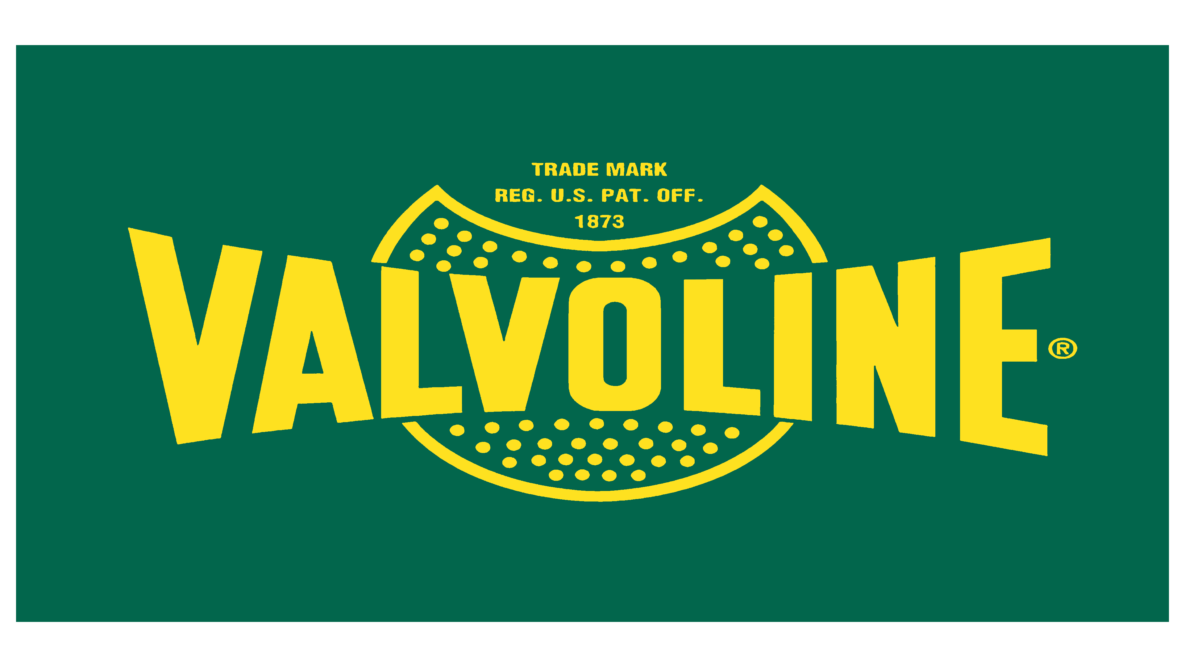
The first logo featured a panoramic semi-circular inscription with an oval oil container in the background. The dots inside the oval symbolize molecules or droplets of oil that do not mix with the liquid. This technique indicated the refining process, during which light liquid oil fractions evaporate, leaving oily droplets. The dots also resemble air bubbles that form when oil is poured into bottles.
The container’s opening indicated that it was a trademark registered in 1873.
The semi-circular placement of the inscription conveyed the company’s scope, scale, and distribution of branded products across the American continent. Green is the color of chemical reactions, the shade of growth, and the establishment of a new corporation.
1941 – 1965
1965 – 1976
1976 – 1980
1980 – 1987
1987 – 1997
1997 – 2005
2005 – today
The modern company logo consists of a large letter V and the brand name below it.
Each glyph of the letter has its color, and the triangle at the bottom represents its connection. The elements symbolize the two directions in which the conglomerate has developed: gas stations and lubricants. Together, they help provide first-class service to customers who receive new products and their installation, pouring, application, etc.
The second interpretation of the multicolored element in the logo indicates the chemical processes underlying the production of vehicle fluids.
The multicolored details also represent the diversity of the company’s products.
Font and Colors
The brand’s visual sign is a combination of three colors: red, blue, and green.
- Red symbolizes fuel. Liquids and agents for engines and machines in general. Oil, from which most products are made.
- Blue hints at lubricants that ensure smoothness. Antifreeze.
- Green represents technologies and chemical processes used to create progressive means.
The gray outline of the visual sign indicates metal, machinery, and vehicles.
The font resembles Cybertron. Strictly vertical letters of the inscription without inclination indicate stability. The company has reached its peak and strives to maintain a confident position. The square glyphs with rounded corners resemble cans, containers for storing oils, antifreeze, and brake fluids.