


![]() Vanguard Logo PNG
Vanguard Logo PNG
The Vanguard logo invites you to sail the turbulent financial sea. Making money is an adventure that involves risk. The skill of a trained team is highly important. Partnering with Vanguard is a 100% win, says the logo.
John C. “Jack” Bogle founded The Vanguard Group in 1975 after being pushed out of Wellington Management Company following a failed merger. That setback shaped his next idea: a fund company owned by its investors and run with low costs. Bogle named Vanguard after Admiral Nelson’s flagship at the Battle of the Nile. The company was based in Malvern, Pennsylvania, and later added offices in Charlotte, Scottsdale, Europe, Asia, Australia, and Canada.
In 1975, Vanguard launched the First Index Investment Trust, later renamed the 500 Index Fund. It tracked the S&P 500 and became the first index fund broadly available to ordinary investors. Wall Street initially dismissed the idea. Index investing seemed too passive for an industry built on stock picking. Still, Bogle kept the focus on low fees and long-term market exposure.
In 1977, Vanguard began selling directly to investors, removing intermediaries and lowering costs. In the 1980s, it added bond funds, international index funds, and a money market fund. Vanguard launched its website in 1995, becoming an early online player in asset management. Bogle stepped down as CEO in 1999 and remained chairman until 2000.
During the 2008 financial crisis, Vanguard’s low-cost model drew new clients. In the 2010s, assets under management grew fast. In 2018, Vanguard launched Digital Advisor, and in 2019, it added Global Credit Bond Fund. By the 2020s, Vanguard had become one of the world’s largest asset managers.
Meaning and History
![]()
This is the original structure, formed as a protest gesture by John C. Bogle, who was fired from his former job for a failed merger he oversaw. With impressive experience (previously, the financier served as chairman of the investment fund of the management company Wellington Management Company LLP), he created a unique organization.
Its originality lies in that it belongs to the funds it includes and, therefore, is the clients’ property. The corporation currently has 370 funds: 180 American and 190 foreign. The total number of investors has exceeded 20 million. This position has allowed Vanguard to become one of America’s major Big Three index funds.
What is Vanguard?
It is a private equity firm founded in 1975 by American business tycoon John C. Bogle. She is engaged in mutual investment and exchange-traded funds, provides brokerage and trust services, and specializes in financial planning and asset management. It has one main office (in the city of Malvern) and several subsidiary offices in the United States and overseas.
1975 – 2020
![]()
The emblem reflects the financial structure’s conceptual position and is associated with the name. It was received in honor of the flagship HMS Vanguard, Admiral Horatio Nelson. The founder settled on this option after a dealer in antique engravings gave him a book on Great Britain’s naval prowess, in which this ship appeared.
At first, everyone opposed this choice of name for an investment organization. But they agreed after a weighty argument. Bogle said that Vanguard funds would be alphabetically next to Wellington funds. Then, a brilliant career began, marked by several successful projects, partnerships, and expansions at home and abroad. The company’s founder resigned from the management post of his own free will upon retirement. He ceded his position to John J. (“Jack”) Brennan in 1999.
2020 – today
![]()
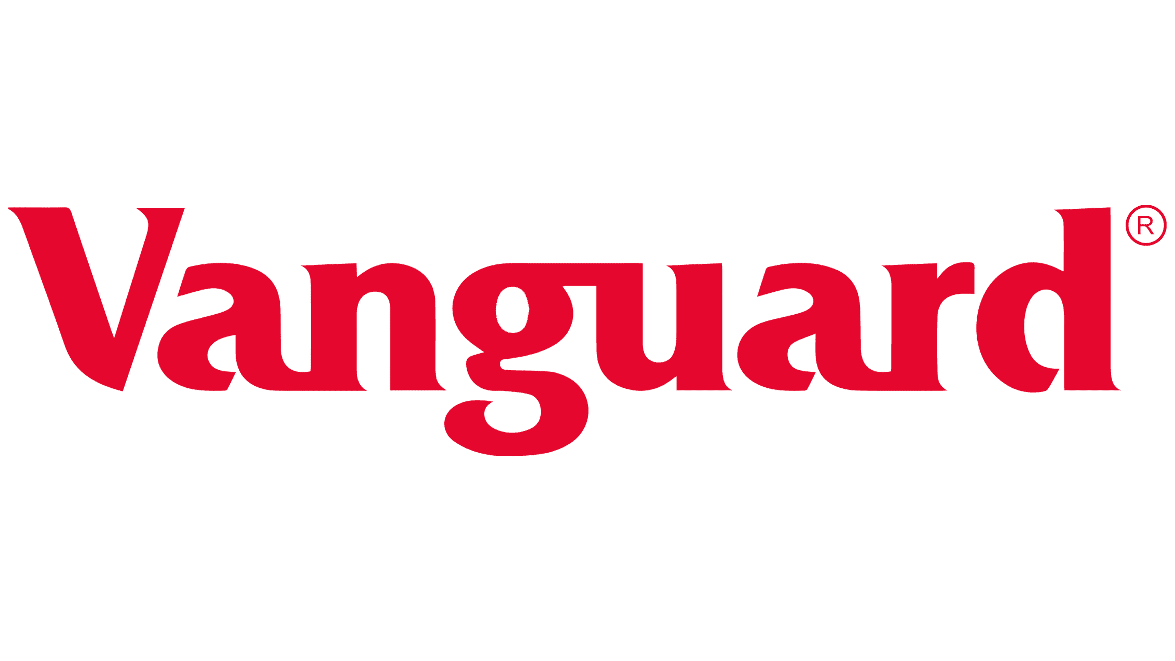
The new Vanguard logo features a minimalist design emphasizing the brand’s solidity and professionalism. In this updated version, the company has removed the ship imagery previously associated with the brand. This change signals Vanguard’s move toward modernity and a more understated visual language, reflecting its market status and experience.
The font on the emblem remains the same, with subtle serifs that lend the text a classic, elegant appearance, underscoring the brand’s continuity and longevity. However, the font color has slightly darkened, making it more subdued. This deeper shade of red enhances the perception of importance, reliability, and expertise that the company aims to convey to its clients.
This logo style focuses entirely on the brand name, enhancing its recognizability and making it the central element of the company’s visual identity.
Font and Colors
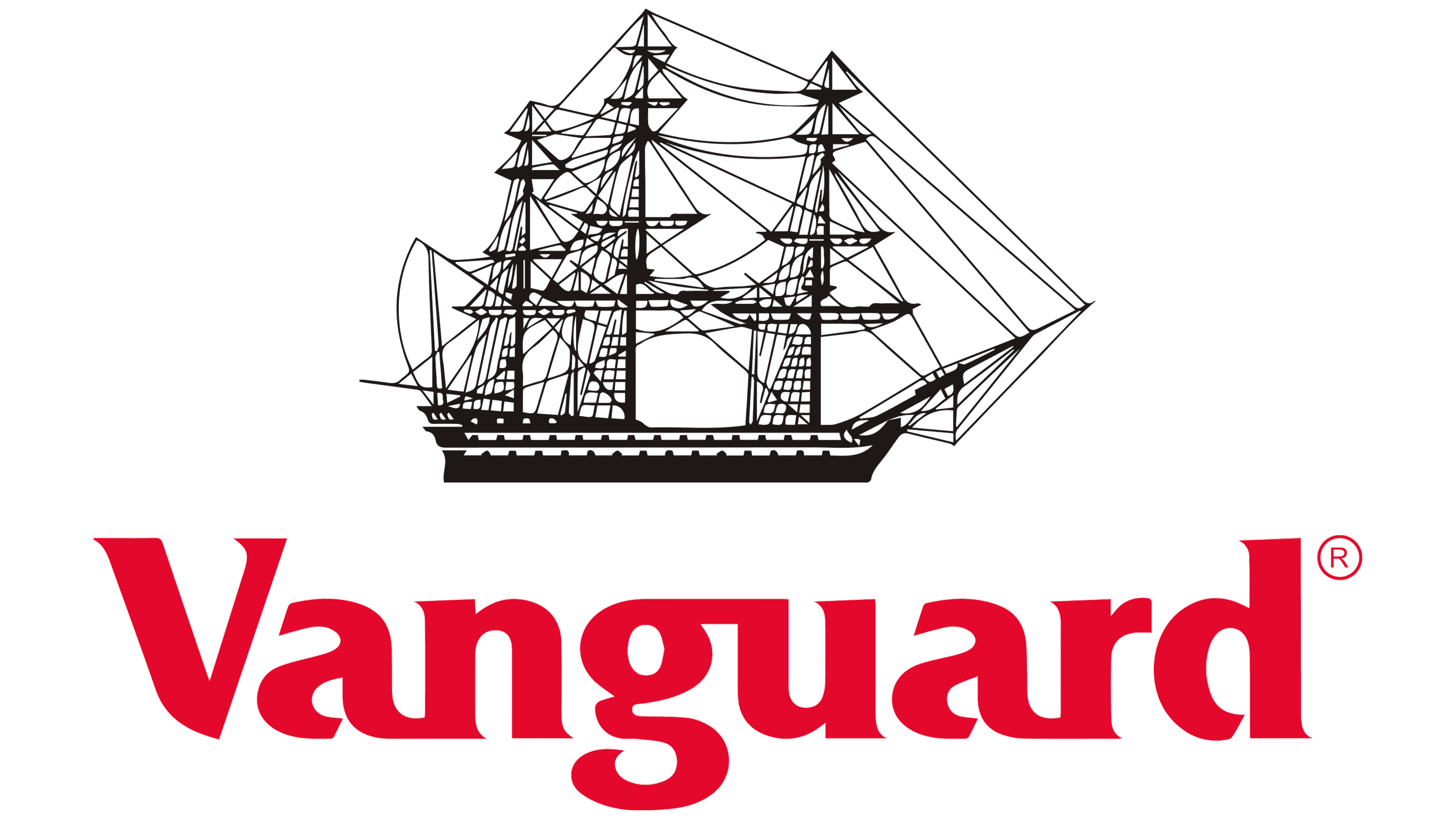
The investment fund’s logo, named after the naval navigator Nelson’s legendary ship, features the ship itself. It has a visually simplified design, with few details and characteristic elements. The three-masted structure stands out grandly against the backdrop of personal signs from other financial institutions. It inspires confidence and decisiveness and testifies to the enterprise’s unsinkability and ability to stay afloat despite difficulties. On the right is the name of the fund, written in large letters.
The developers chose the Fremont Bold typeface from FontSite Inc. To give it a touch of originality, they slightly reworked it, adding an upper join between “g” and “u,” a lower one between “a” and “r,” and “a” and “n.” The rest of the characters are the same as the base font: light, sharp, almost invisible serifs, and letter breaks at the bottom. All characters are lowercase, except for “V” (it is uppercase).
The logo’s color scheme is monochrome, so nothing distracts attention from the main thing, finances. The palette includes black (ship) and marsala (text).
FAQ
Why is Vanguard so famous?
The brand is well known for many reasons, making it a leading name in the investment world.
Vanguard was founded by John C. Bogle in 1975. Its mission is to support all investors, treat them fairly, and help them achieve investment success. This mission has been central to the brand’s activities and has attracted many investors.
One of the main reasons the brand is famous is its focus on low-cost investing. Offering low-cost mutual funds and ETFs has made investing more accessible and attractive.
John Bogle created the first index mutual fund designed to match the S&P 500’s performance. This major innovation showed passive management could be an effective strategy. Vanguard’s leadership in offering these funds has enhanced its reputation.
The brand values transparency and stability. It has a unique cross-ownership structure in which investors in its funds own the company. This aligns the company’s interests with its investors, building trust and stability.
Vanguard offers a variety of investment options, including passive and actively managed funds, allowing investors to spread their risk.
Is Vanguard in the US?
Yes, the company is based in the United States and is headquartered near Valley Forge, Pennsylvania. This location is central to its activities and is the main focus of its operations. The brand is one of the world’s largest investment management companies, demonstrating its significant influence in the financial industry.
Vanguard has a strong global presence. It operates in North America, Europe, Australia, and Asia. This broad reach allows it to serve a wide range of investors worldwide. The company is dedicated to its employees, whom it calls its “crew.” Vanguard is committed to creating a supportive and inclusive work environment, helping its employees feel valued and connected wherever they are.
What does the Vanguard logo mean?
The logo’s meaningful design reflects the company’s history. It depicts a sailboat paying tribute to naval explorer Admiral Horatio Nelson. The ship symbolizes leadership, exploration, and a pioneering spirit central to the brand.
The ship in the logo indicates that the company is a leader in the investment industry. The historic vessel symbolizes the brand’s role in helping investors navigate financial markets.
The logo features the company name in a bold, clear font, emphasizing its visibility and reliability. The combination of the ship and the name underscores the brand’s mission to lead the investment world.
What is the symbol for Vanguard?
The symbol is a three-masted sailing ship named after the ship of British Admiral Nelson. The ship is depicted in monochrome, standing out next to the red brand name. It is drawn with narrow black lines, giving it a detailed and airy look. Although the ship appears fragile, it is a strong combat vessel. The combination of the ship and the red name creates a memorable symbol that reflects the essence of the brand’s mission and values.
What is the font of the Vanguard logo?
The logo uses the Fremont Bold font, which was modified to create a unique brand image. This font has distinctive features that make it stand out. The letters have bottom slots, giving the text a crisp, clean look. Some letters are paired, creating a unified appearance. The font has unfinished or open lines that give it a modern look, making the text less rigid and more accessible. Each character in Fremont Bold is rounded, giving the font a balanced and smooth style. This roundness makes the text friendly and attractive while maintaining a professional image.