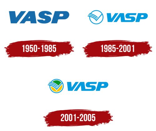
The VASP logo gradually evolved into its current form, adding new elements to the emblem. The modern logo is a compact combination of symbols representing flight and love for one’s homeland. The company aims to make travel to any part of the world easy and accessible.
VASP: Brand overview
Founded in 1933 by the State of São Paulo, VASP (Viação Aérea São Paulo) has become one of Brazil’s leading airlines. Its first flights connected the cities of São Paulo and Rio de Janeiro.
During the 1940s and 1950s, the airline expanded its operations significantly. It expanded its domestic services and began operating international flights to neighboring South American countries. By the 1960s, VASP had risen to a leading position and became Brazil’s largest domestic airline. It incorporated jet aircraft into its fleet and promoted Congonhas Airport as a hub.
However, VASP faced difficulties in the following decades as it faced increasing competition from new airlines such as Varig and Transbrasil. The company maintained a significant share of the Brazilian domestic market despite this.
The 1990s brought both expansion and difficulties to VASP. As the airline expanded its international presence with flights to the United States, Europe, and Asia, financial problems began to arise. A brief privatization in the 1990s did not improve the situation, and over the next decade, the airline gradually reduced traffic while struggling with debt and stiff competition.
In 2005, after more than seven decades of operation, VASP discontinued all remaining flights and filed for bankruptcy. This marked the end of an era for one of the pioneers of Brazilian aviation.
In its heyday, VASP served millions of passengers annually over an extensive domestic and international network. However, accumulated debts and an unsustainable cost structure led to the collapse of this once-illustrious airline.
Meaning and History
What is VASP?
It is a Brazilian airline headquartered in São Paulo. It operates domestic and international flights connecting major Brazilian cities to various destinations in South America, North America, Europe, and Africa. Known for its extensive network and significant presence in the Brazilian aviation market, it is critical in providing air transportation services for business and leisure travelers. Despite its prominence, it faced financial difficulties and operational problems, eventually ending operations.
1950 – 1985
VASP, an airline founded in 1950 and operational until 1985, was a significant player in Brazil’s aviation industry. The company’s first emblem was designed to reflect its status and ambitions. It appeared monumental and expansive, symbolizing the airline’s scale and importance in the region. The emblem consisted of large symbols, yet despite their size, the logo remained light and airy due to light shades, which added a sense of lightness. Each logo letter featured the sky, enhancing the company’s perception as an airline carrier.
The abbreviation VASP stands for Viação Aérea São Paulo, which translates from Portuguese as “São Paulo Air Transport.” The State of São Paulo government established the company and served this region exclusively. The name and logo style emphasized the regional connection and the strategic focus on serving the state’s residents and visitors.
The theme of maximalism in the company’s identity underscored its desire to be the leading carrier in the region.
1985 – 2001
As the company expanded its operations beyond Brazil, it updated its logo by adding elements that symbolize new ambitions and aspirations. To signify its expanding international presence, the logo was enhanced with an image symbolizing freedom—a circular depiction of the sun with a contour of a bird’s wing made of three stripes.
This new element in the logo appears as a bird soaring out of the solar disk, moving forward, symbolizing the company’s pursuit of new horizons and opportunities. The use of contour lines for the wing lends lightness and airiness to the entire emblem, emphasizing the ease and freedom of movement promised by the company’s flights.
The visual representation of the emblem embodies the company’s ambition to reach new territories with its flights. This element underscores the company’s global ambitions and desire to attract passengers worldwide by offering them the freedom to choose routes and quality service.
The color palette of the logo changed: the previous sky-blue color was replaced with a lighter shade of blue, further enhancing the design’s sense of lightness and airiness. This choice of color highlights the freshness and modernity of the company’s approach and visually aligns with the new symbol of freedom and progress.
2001 – 2005
Brazilian airline VASP used a logo with its name in large blue letters until its closure. The letter “A” in the name was unique: it had no horizontal bar, making it look like an inverted “V.” In addition, the letter “A” was connected to the letter “S” at the bottom. The bold italic font was balanced by thin lines forming a stylized bird. This symbol was on the left side and enclosed in a yellow-green circle with a blue border.
The unique design of the letter “A” and its connection with the letter “S” make the logo more distinctive and memorable. The stylized bird combined with the yellow-green-blue color scheme pays homage to Brazil’s national colors and gives the airline’s brand a sense of local identity and pride. The circle signifies unity or wholeness, while the blue border creates a contrast that increases visibility.


