![]()
Founded in 2018 by Joel and Benji Madden from the band Good Charlotte, VEEPS is a streaming service for live and on-demand concerts and events. As the official live-streaming platform for Live Nation and Ticketmaster events, VEEPS has reached millions of viewers with performances from artists like Billie Eilish, Bob Dylan, and Lil Wayne. The company partnered with Brooklyn-based Porto Rocha to create a new identity system and redesign the product.
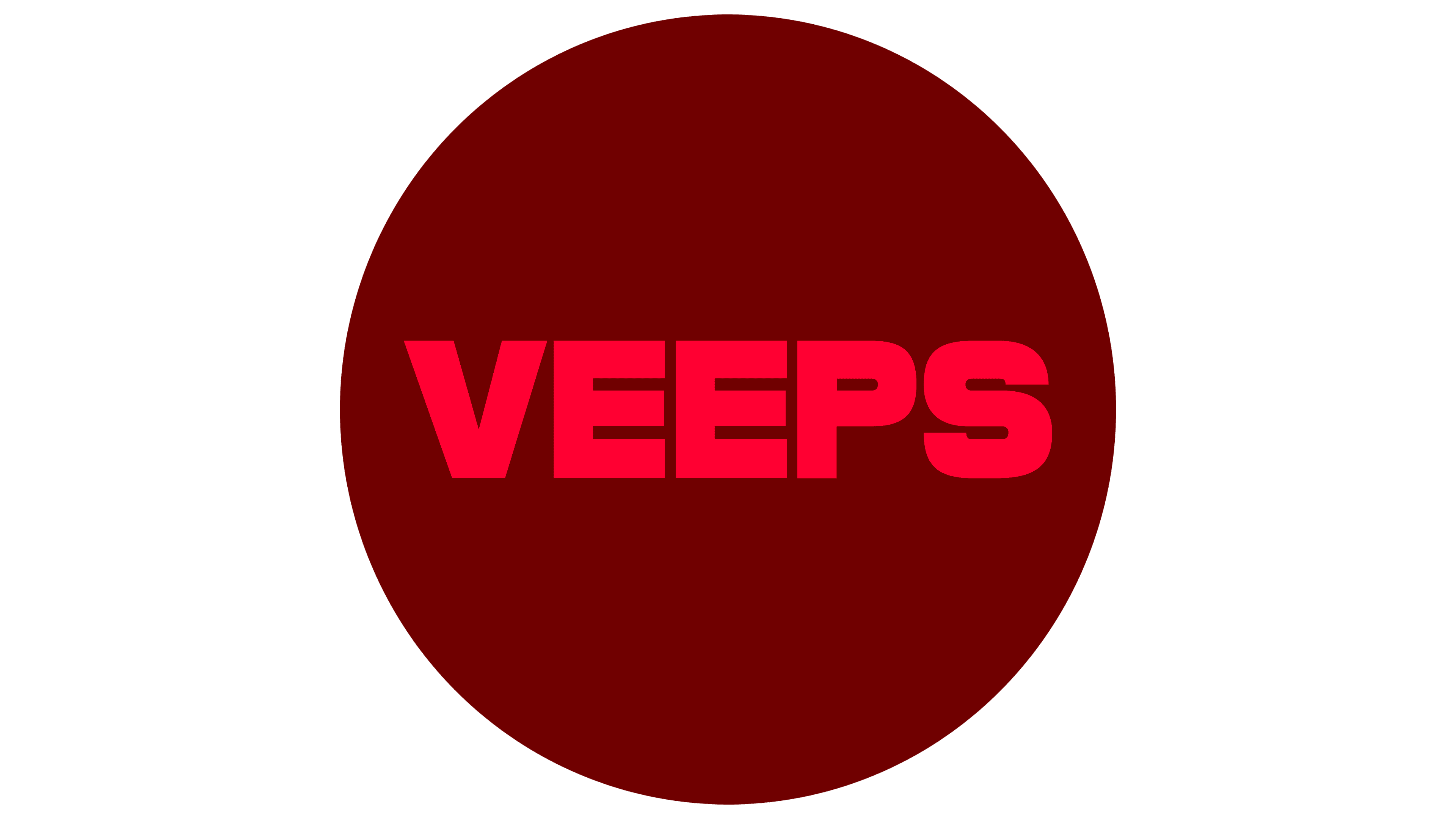
The old VEEPS logo was neutral and lacked character. It was functional but didn’t stand out, and the letter spacing issues made it look generic. The new logo is a bold upgrade designed to establish VEEPS as a prominent name in music culture.
![]()
The new logo is a striking, all-caps wordmark inspired by music editorial design. It is impactful and full of personality, working well as a title card and a simplified ‘V’ for sign-offs. The careful letter spacing creates a balanced and visually pleasing mark, giving VEEPS the gravitas needed to be recognized as a leader in the music-streaming industry.
The new identity’s color palette features bright scarlet and deep crimson. These vibrant colors bring energy to the brand and reference the red “LIVE” indicator seen in broadcasting. The combination of scarlet and crimson adds a bold element to the brand’s visual language, making it stand out from its previous black-and-white scheme.
The identity system includes black, white, and shades of gray as primary colors. These neutral tones provide a versatile backdrop that can adapt to the platform’s diverse music styles and artist imagery. The secondary palette is also flexible, allowing for the inclusion of colors sampled from accompanying photos. This ensures that the brand can integrate a wide variety of visual content.
![]()
A custom display typeface, VEEPS Ruder Plakat, was developed to command attention while remaining neutral enough to suit various music genres. This typeface is distinct and assertive, bringing a show-stopping presence to communications and digital touchpoints. It pairs well with Saans, a precise and utilitarian font used as secondary support, ensuring clear and consistent messaging across all platforms.
The visual identity system includes dynamic motion graphics that enhance VEEPS’ digital presence. These animations add engagement and modernity, aligning with the brand’s forward-thinking approach. The motion-driven identity system ensures that the brand remains visually stimulating and relevant in the fast-paced digital landscape.
The new logo and identity were designed to represent the VEEPS brand and to provide a flexible platform for the artists featured in the service. The design system allows for artist-specific branding to take center stage while maintaining a cohesive look that ties back to VEEPS. This flexibility is crucial for a platform that hosts various musical acts, from pop stars to punk bands.
The rebranding of VEEPS represents a bold step forward, aligning the visual identity with the company’s ambition and the vibrant culture of the music industry. Porto Rocha’s new design transforms VEEPS from a generic tech look into a distinctive and authoritative presence in live music streaming. The thoughtful use of typography, color, and motion graphics creates a dynamic and versatile brand ready to engage with a global audience and support a diverse roster of artists.