


 Verisign Logo PNG
Balance, sustainability, reliability, protection – all these qualities are embedded in the logo of Verisign, the American company that manages the domain registry and ensures website security. Therefore, Verisign’s logo appears serious and inspires confidence in potential customers.
VeriSign grew out of RSA Data Security, the company behind the RSA public-key encryption algorithm created by Ron Rivest, Adi Shamir, and Leonard Adleman at MIT. Jim Bidzos became head of RSA Data Security in 1986 and, by 1991, had built partnerships with Lotus, Microsoft, Apple, Sun, Novell, and other technology companies.
VeriSign was incorporated on April 12, 1995, as a spin-off from RSA Security. It received licenses for RSA cryptographic patents and backing from VISA, Intel, Mitsubishi, and Ameritech. Its role was to provide digital identity and trust for the early commercial internet. Microsoft Internet Explorer adopted RSA/VeriSign technology. At the same time, the browser lock icon and VeriSign check mark became visible signs of a secure connection.
By January 1996, VeriSign had partnerships with Netscape Communications, IBM, CompuServe, OpenMarket, and other major internet players. The company went public on January 30, 1998, and its shares rose 82% on the first day of trading, from $14 to $25.50. In 2000, VeriSign bought Network Solutions for $21 billion, gaining control of the .com, .net, and .org registries under agreements with ICANN and the U.S. Department of Commerce.
In 2003, VeriSign sold Network Solutions’ retail domain registration business for $100 million and retained the wholesale registry function. In 2010, it sold its authentication business to Symantec for $1.28 billion, including SSL certificates, PKI, VeriSign Trust Seal, VIP identity protection, and rights to the old VeriSign Secured mark. That same year, the company moved its headquarters to Reston, Virginia. By 2024, VeriSign managed about 169.6 million .com and .net registrations and operated the DNS root servers “A” and “J.”
Meaning and History
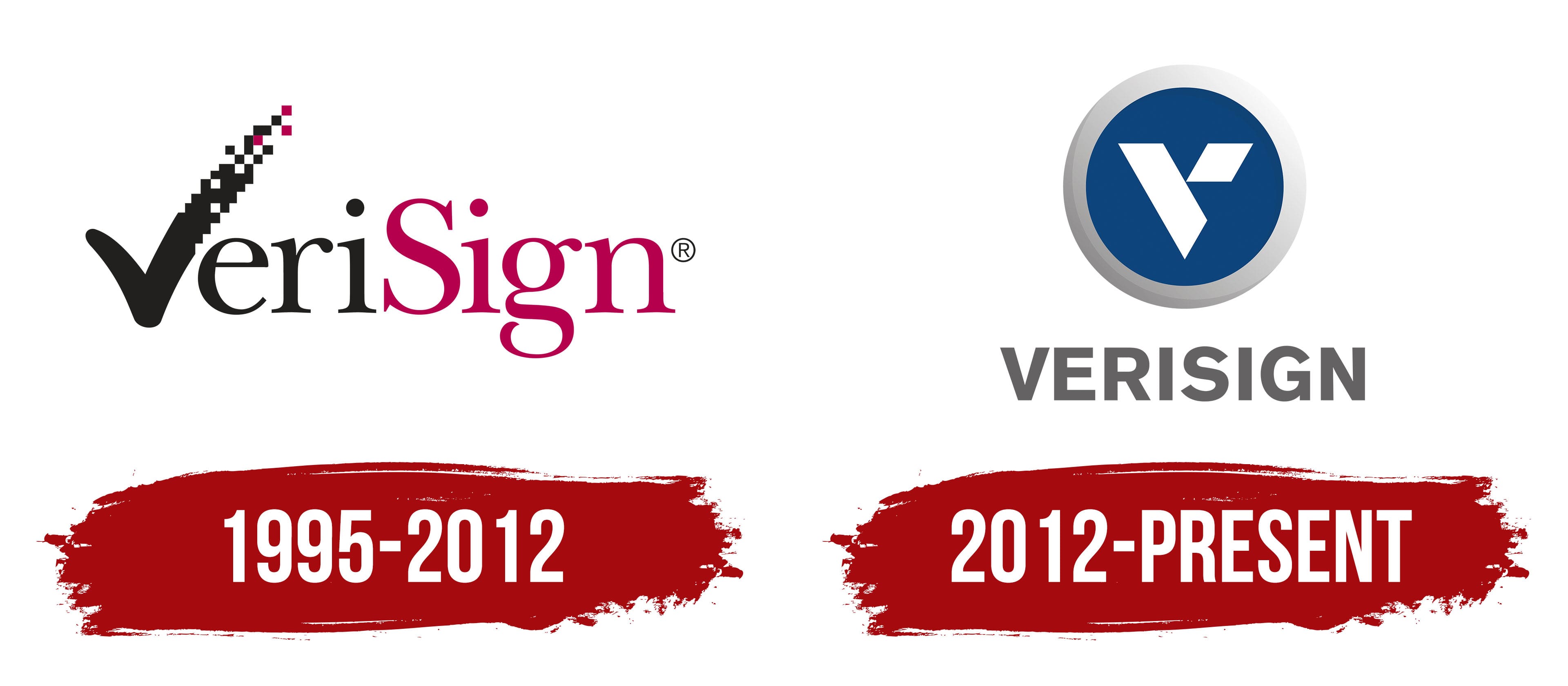
But the company’s activities are not limited to this. It also keeps websites secure by verifying the identity of their owners, the absence of malware, and domain ownership. If everything is in order, then the web resource receives a special sign known as the VeriSign Trust Seal. Its main element is a black checkmark that breaks down into “pixels.” The same symbol was used in the first Verisign emblem. But in 2012, the logo concept changed; the checkmark was replaced by a geometric design of a rhombus and a trapezoid inside a blue circle.
What is Verisign?
Verisign Inc. is a company that operates the registry for several popular domains, including .net and .com. It also provides online security services and keeps websites protected at all times with daily malware scans.
1995 – 2012
Verisign was created as a division of RSA Security and, until 2000, was mainly engaged in issuing digital certificates – electronic documents confirming the authenticity of public keys for user authentication. Accordingly, the checkmark, which was part of its first logo, symbolized trust and proven security. She replaced the first letter of the brand name, and it looked unusual: her right side, on top, was broken into “pixels.” The line, rising toward the end, dissolved into space, and among the black-and-white “pixels,” three microscopic dark pink squares were hidden.
Immediately after the checkmark were three lowercase black letters: “e,” “r,” and “i”. The second part of the name, “Sign,” began with a capital “S” and was dark pink. The lettering used a high-contrast font with long, thin serifs called New Baskerville Roman. Its closest analog is the New Athena Unicode Font.
Over time, the company began providing online security checks. So her check mark, which resembles the letter “V,” became a trust seal confirming the site’s reliability. Placing this sign on the pages increased traffic to web resources and significantly increased sales for online stores.
2012 – today
In 2010, the digital certificate verification business was sold, prompting Verisign to change its visual identity. The new logo appeared in 2012. Unlike the previous one, it is divided into two parts: the emblem and the word mark. The top half shows a blue circle with an annular border. It has a gradient, a transition from light gray to dark gray. Inside is a white symbol consisting of an isosceles trapezoid at an acute angle, with a rhombus adjacent to it on the right. Together, these two shapes form a “V” with a triangular cut.
Directly below the graphic sign is the brand name. Now it is completely gray; all letters are converted to uppercase and written in a standard bold sans-serif font. The clear symmetry of the glyphs corresponds to the geometric shape of the elements above the word “VERISIGN.”
Font and Colors
The current Verisign symbol resembles the letter “V.” However, attentive users have noticed that this “V” resembles the logo of the Indian financial institution Axis Bank Limited, which also features a trapezoid and a rhombus. The emblem of the American company consists of the same elements but is mirrored. By the way, the inverted, elongated rhombus resembles an element of the famous Mitsubishi Motors logo. But the first checkmark emblem was unique; upon seeing it, users immediately recognized the Verisign brand, because it was used as a seal of trust on trusted websites.
If the logo had an elegant inscription in the New Baskerville Roman typeface in the past, the company’s name would now look stricter and more serious. The designers chose a grotesque style for it, with many analogs, such as Craft Gothic Bold by FontSite Inc., Gothic 725 Black by Tilde, Rutan Bold by The Northern Block, and Sequel Sans Head Semi Bold by OGJ Type Design. They all belong to the category of geometric sans-serif fonts and have low contrast: the main and additional strokes in the letters are nearly the same thickness.
The word “VERISIGN” is fully uppercase, which is another difference from the previous logo. All glyphs are now grey, although they used to be black and dark pink. The emblem, located a little higher, has a much more varied color scheme. The circle is uniformly colored dark blue, while its border has a gradient from light gray on the right side to dark gray on the bottom left. Against this background, a white symbol stands out well as a stylized letter “V.”