Vestel: Brand overview
Vestel, hailing from Turkey, is known in the home appliance and electronics industry. Founded in 1984 in Manisa, Turkey, Vestel is one of the key members of the Vestel Group.
The company’s portfolio includes various products, including televisions, home theaters, refrigerators, washing machines, stoves, air conditioners, and small appliances, which are sold under the Vestel brand. In addition to its brand name, Vestel offers manufacturing services for well-known brands such as LG, Sony, Panasonic and Bosch.
Vestel is present in more than 120 countries, making it one of the leading manufacturers of home appliances, especially in Europe. To support its production activities, the company has several large production facilities in Turkey, research and development centers, and design centers located throughout Europe.
Vestel employs around 18,000 people worldwide. The company’s production capacity is impressive: its factories produce up to 25 million devices per year. Although Vestel is primarily known as a manufacturer of household appliances such as washing machines, it is also a significant producer of televisions and various consumer electronics on the European market.
Vestel is part of the large Turkish conglomerate Zorlu Group. The company continues to expand its horizons by launching new products that prioritize energy efficiency and use the latest technology and modern design elements.
Meaning and History
What is Vestel?
Founded in 1984 by Asil Nadir, Vestel has carved a niche for itself as a global leader in home and professional appliances. Headquartered in Manisa, Turkey, Vestel is highly regarded for its advanced technology, inventive design, and unwavering commitment to sustainability.
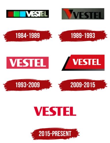
1984 – 1989
1989 – 1993
1993 – 2009
2009 – 2015
2015 – today
Vestel aims to draw attention to itself with a bright red logo. But the choice of color is not just about standing out. It’s also a way of showing love for the appliances and the customers who buy them. The font of the logo is smooth, with narrow spaces between letters. It’s similar to Hoftype’s Taxon Extra Bold, except that the capital “S” has strictly vertical cuts at the ends.
The bright red color is like a signal that makes you stop and look. It’s like the cherry on top of the cake, impossible to miss. The smooth font is like a slide on a playground: easy, fun, and makes you want to try it out. The distinctive “S” is reminiscent of a secret handshake, letting you know that something is up here.
Vestel color codes
| Medium Candy Apple Red | Hex color: | #dd052b |
|---|---|---|
| RGB: | 221 5 43 | |
| CMYK: | 0 98 81 13 | |
| Pantone: | PMS 185 C |
