The Viking Airlines logo resembles a beautiful Viking ship sailing across the blue sky. The sign combines the history and traditions of Scandinavia with modern technology. The emblem highlights the brand’s experience and ability to create optimal conditions on board aircraft.
Viking Airlines: Brand overview
Founded in 2003, Viking Airlines AB has quickly established itself as a reliable and efficient charter airline offering seamless European travel. Based in Sponga, Stockholm, this private airline has served European tour operators by providing safe and on-time flights for passengers. Headquartered in Sweden’s bustling capital city, Viking Airlines has become a reliable choice for those exploring the continent.
Viking Airlines’ commitment to fleet modernization and high service standards has allowed the airline to reach new heights. Investing in state-of-the-art aircraft to improve passenger comfort and safety, the airline has expanded its route network and attracted a wide range of tour operators. Consequently, the airline rapidly expanded its fleet and, by the mid-2000s, had secured its position as a major player in the charter sector.
However, the late 2000s saw turbulent times for Viking Airlines.
Unfortunately, Viking Airlines ceased operations on October 18, 2010, after seeking protection from creditors, and went into administration on December 2, 2010. Despite all efforts to revive the airline, Viking Airlines was declared bankrupt in February 2011, marking the end of its difficult journey.
Meaning and History
What is Viking Airlines?
It was a charter airline based in Stockholm, Sweden. It operated charter flights primarily to resort destinations in Europe, North Africa, and the Middle East. Known for its affordable and convenient travel options, it targeted vacationers looking for vacation packages. The airline had a fleet of aircraft suitable for medium-haul flights focused on providing reliable service to tour operators and vacationers. Despite initial success in the charter market, the airline ceased operations due to financial difficulties.
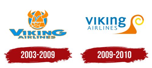
2003 – 2009
From 2003 to 2009, Viking Airlines adopted a unique branding approach inspired by Scandinavia’s historical roots and cultural heritage. The airline’s logo’s central element is an image of a Viking, reflecting a deep connection with the ancestors of modern Scandinavians and emphasizing the importance of historical identity.
The warrior in the logo is easily recognizable by the characteristic national helmet with horns, which serves as a recognizable symbol and adds a certain ferocity to the image. The detailed armor depicted reinforces this impression, evoking the bravery and resilience traditionally associated with Vikings.
The philosophy of Viking Airlines is deeply rooted in Viking qualities such as courage, strength, and a passion for travel. In ancient times, ships were the main mode of transport for Vikings; a notion symbolically reflected in the company’s ideology: if Vikings lived in our times, they would undoubtedly choose airplanes for their conquests and explorations.
The logo is enhanced by an image of the sun, serving as a backdrop for the Viking. This image symbolizes the airline as a brave traveler flying under the sunny sky, inspiring and evoking associations with fearlessness and a thirst for discoveries.
The color palette of the logo—orange and blue tones—echoes the coat of arms of Stockholm, the city where Viking Airlines began its history. These colors hint at clear blue skies and bright sun, creating associations with pleasant and safe journeys under the sunlight.
2009 – 2010
The Swedish airline has chosen a friendly logo with an authentic design. The friendly aspect is evident in the smooth curves and pleasant blue color. The authentic part is represented by a spiral reminiscent of the twisted horns Vikings wore on their helmets. This spiral element is colored in charming shades of golden orange and sunny yellow, giving it the overall appearance of a snail. The lettering opposite the spiral is arranged in two rows. The upper one is lowercase and bold, while the lower one is uppercase and thin. In either case, there are no serifs, only tiny extensions with sharp ends.
The smooth curves and a pleasant blue hue create an overall calming and disposing impression, echoing the image of friendliness. The spiral element adds historical and cultural authenticity, linking the brand to Swedish heritage. Contrasting font styles in the double-row lettering balance the design, offering both bold and delicate typography.


