


![]() Vimeo Logo PNG
Vimeo Logo PNG
The symbols in the Vimeo logo resemble a videotape winding from the host to the user’s storage. The emblem demonstrates modern technologies, cloud-based information storage, and remote access to a large number of videos and video-creation tools.
The platform Vimeo emerged from a viral moment. In October 2004, CollegeHumor published a clip of Ashlee Simpson on Saturday Night Live, which drew significant traffic. Developers Jake Lodwick and Zach Klein, working at Connected Ventures, launched Vimeo on December 15, 2004, as a side project.
For two years, the platform grew quietly while CollegeHumor remained the main business. In August 2006, IAC, led by Barry Diller, acquired a 51 percent stake in Connected Ventures for $21 million. Soon after, Google bought YouTube for $1.65 billion, prompting IAC to invest in Vimeo.
From 2007, development became full-time. In October 2007, Vimeo introduced Flash-based HD playback, ahead of competitors. Internal tensions followed. Lodwick was dismissed in late 2007, and Klein left in early 2008.
In October 2008, Vimeo launched Vimeo Plus at $60 per year, establishing a subscription model. In 2011, Vimeo PRO targeted professionals. A redesign completed in January 2012 shifted focus toward video display. In December 2014, the platform added support for 4K.
Expansion continued through acquisitions. In 2016, Vimeo bought VHX. In 2017, it acquired Livestream, which was later integrated as Vimeo Live. That year, CEO Anjali Sud redirected the company toward software tools. In August 2019, Vimeo Enterprise launched for corporate clients.
In May 2021, IAC spun off Vimeo as a public company under the VMEO ticker. Sud left in August 2023. In September 2025, Bending Spoons agreed to acquire Vimeo for $1.38 billion, closing the deal in November 2025.
Meaning and History
![]()
Vimeo is committed to maintaining a global presence. Its offices are located in various parts of the world and report to the headquarters in New York. The website traffic reaches over 175 million people per month. Users are offered free accounts (500 MB per week) and paid premium subscriptions that expand the volume of downloadable content.
But Vimeo is attracting attention for more than that. An important part of a video hosting strategy is its recognizable logo. The visual identity changed twice as the platform sought its unique style.
What is Vimeo?
It is a New York-based company that owns the eponymous video hosting service. The service was created in 2004 and was intended for sharing short videos. It was a project of the American holding company Connected Ventures, later becoming the property of IAC. In 2020, Vimeo gained independence, separating from IAC. Its name is formed by rearranging the letters of “video” and “me.”
2004 – 2005
![]()
The Vimeo service was created in 2004 to share interesting stories or creative ideas through online video broadcasts. Its name, at the same time, looked like an anagram of the word “movie” and a blend of “video” and “me.” This served as the basis for the first logo. The designers used uppercase black sans-serif letters and set them against a white-and-gray gradient background.
2005 – 2006
![]()
In 2005, the video hosting service’s name was changed to lowercase. The font became similar to the handwritten one, although the “v” and “i” were separate, with a small letter spacing. The developers rounded the letters, removing all corners. They also repainted the word “blue” and changed the background color to white, without adding any other shades.
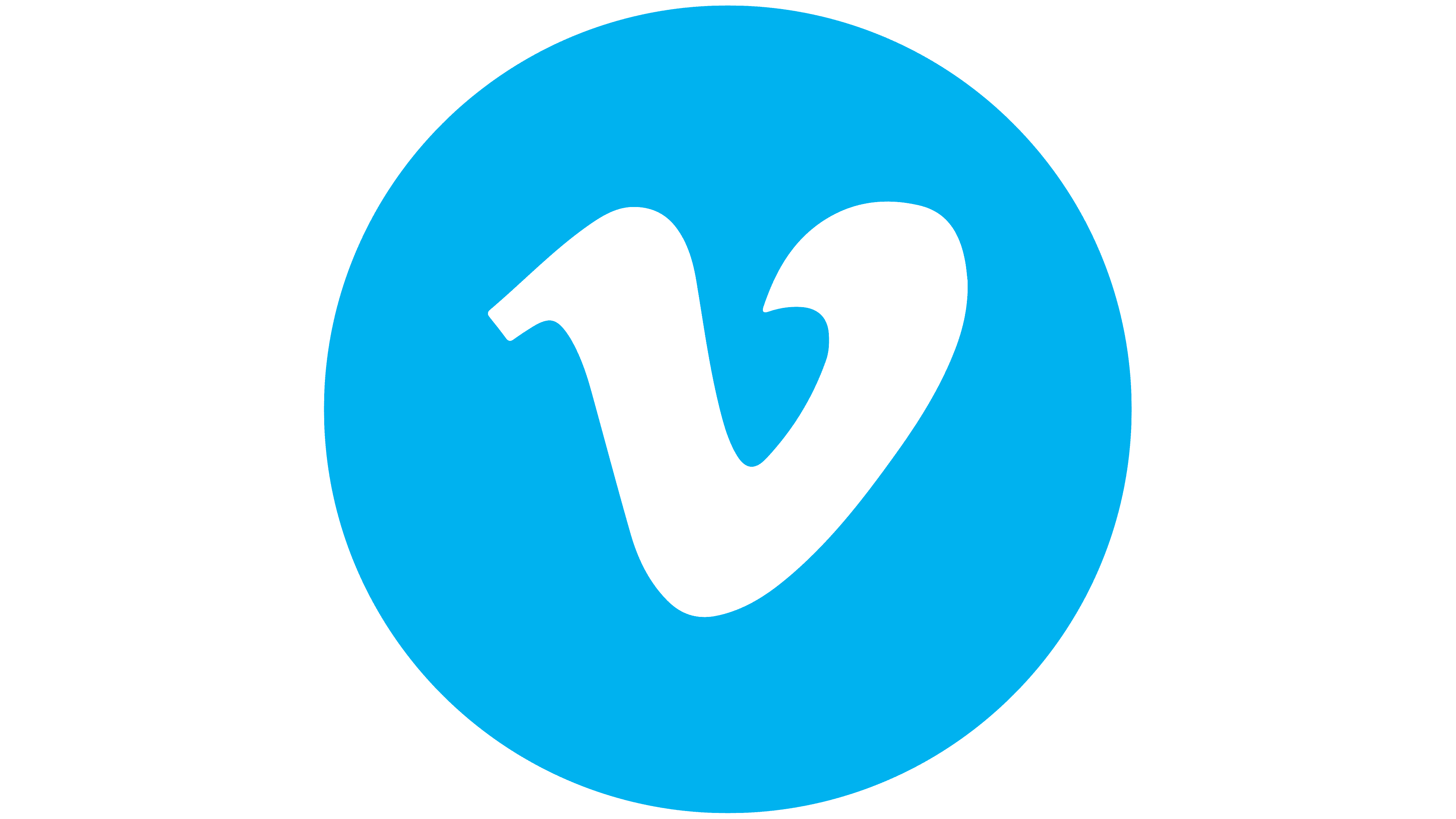
2006 – 2025
![]()
2006 proved to be a watershed year for Vimeo. It was then that the American video platform adopted its iconic logo, which is easily recognized. The design is based on the previous version. However, there are still differences: the creators connected the letters, increased line thickness, and aligned all diagonal strokes to the same angle. Simultaneously with the completion of the inscription, an icon in the form of a “v” appeared.
2025 – today
![]()
Vimeo introduced an updated logo that keeps the familiar style while appearing more refined and balanced. At first glance, the changes seem minimal, yet a comparison of the old and new versions makes the difference clear. The new look was developed by the studio TOOYA, whose team treated the original lettering’s character with great care, focusing on preserving its distinctive features.
Most of the work took place at the level of subtle micro adjustments. Stroke weights were evened out, letter connections and transitions were refined, and spacing between characters was improved. The wordmark became more orderly. The endings of the letters “v” and “m” were shaped to look more elegant and precise. The letter “e” has a thin stroke that does not repeat in other letters, giving the logo a sense of light originality.
The studio preserved the mark’s original rhythm and mood while improving its visual clarity. The new logo appears cleaner and more polished overall.
Font and Colors
The Vimeo wordmark replaces the full-fledged graphic symbol because it is unusual, vibrant, and recognizable. The designers aimed to convey the service’s relaxed mood and to arouse subconscious trust in users. Even small angles that appear at the ends of “v” and “m” do not spoil the overall impression. They look like serifs, when in fact, they are not.
The full logo, including the video-hosting name and the “v” icon, is set in the stylish Black Rose font from the Regular subfamily, designed by typographer Michael Hagemann in 2009. But the designers slightly changed the lettering, reducing the distance between them. If the inscription had been in the original typeface, it would have taken up a little more space due to the long connecting lines.

Global experiments with color ended in 2005 when blue replaced black. In 2006, the developers changed the shade, choosing the darker Vimeo Blue (# 1AB7EA). At the same time, the classic white background remained.