


![]() Vis a Vis (serial) Logo PNG
Vis a Vis (serial) Logo PNG
The Vis a Vis logo is strong yet simple. The emblem conveys the confined space and simplicity of prison life. The image surprises with the size of its elements, creating a sense of pressure and opposition.
“Vis a Vis” is a Spanish television series created by Globomedia, which first aired on April 20, 2015, on Antena 3. The plot revolves around Macarena Ferreiro, a financial criminal who ends up behind bars. The series immerses viewers in the lives of the inmates, exploring themes of corruption and the complexities of the prison system.
The success of “Vis a Vis” was so significant that after its conclusion on Antena 3, the series was revived on Fox España. Four seasons were released during its run, with the main characters’ adventures concluding on February 4, 2019. In 2020, a spin-off titled “Vis a Vis: El Oasis” was released, focusing on Maca and Zulema’s stories after their prison release. This spin-off served as the final chord for the original series.
Throughout its run, “Vis a Vis” had a considerable impact on television, attracting audiences with its compelling storyline and charismatic characters. The series became a significant phenomenon in contemporary TV, leaving behind a legacy of deep stories told with sharp social commentary.
Meaning and History
![]()
The series’s word emblem transports the viewer into a world of yellow robes and the supremacy of law. The color scheme and design resonate with the atmosphere prevailing in Spanish prisons. The emblem remains constant throughout all seasons. It is used in horizontal and vertical formats, with slight color differences that do not change the symbol’s meaning.
What is Vis a Vis?
A Spanish series about financial criminal Macarena Ferreiro serving prison time, it narrates the lives of prisoners and corruption. Five seasons (48 episodes) were produced. The first two were aired on Antena 3, while the 3rd and 4th were on FOX Spain. As a result, from the 3rd season onwards, there were changes to the cast, filming locations, and episode durations. The 5th season, titled Vis a vis: El Oasis, consisting of 8 episodes, was shot by Netflix in 2020 as a spin-off.
2015 – 2019
![]()
The logo consists of the large inscription Vis a Vis, which translates from French as “face to face” or “opposite each other.” The expression was the show’s original title for global release, but it was later changed to Locked Up.
The title captures the essence of the story, in which a young, naive girl confronts the “truth of life”: prison orders, complicated cellmates, and the lawlessness of prison workers.
The two large parts of the logo, separated by the small preposition “a”, represent two formidable opposing forces: the prisoners and the abusive prison guards. The criminals’ strength lies in their unity and in their attempts to escape.
The preposition also divides Macarena’s fate into “life before prison” and “life in incarceration,” “prospects before the escape,” and “consequences of the rash act.” The drama resembles the American “Orange Is the New Black.”
Font and Colors
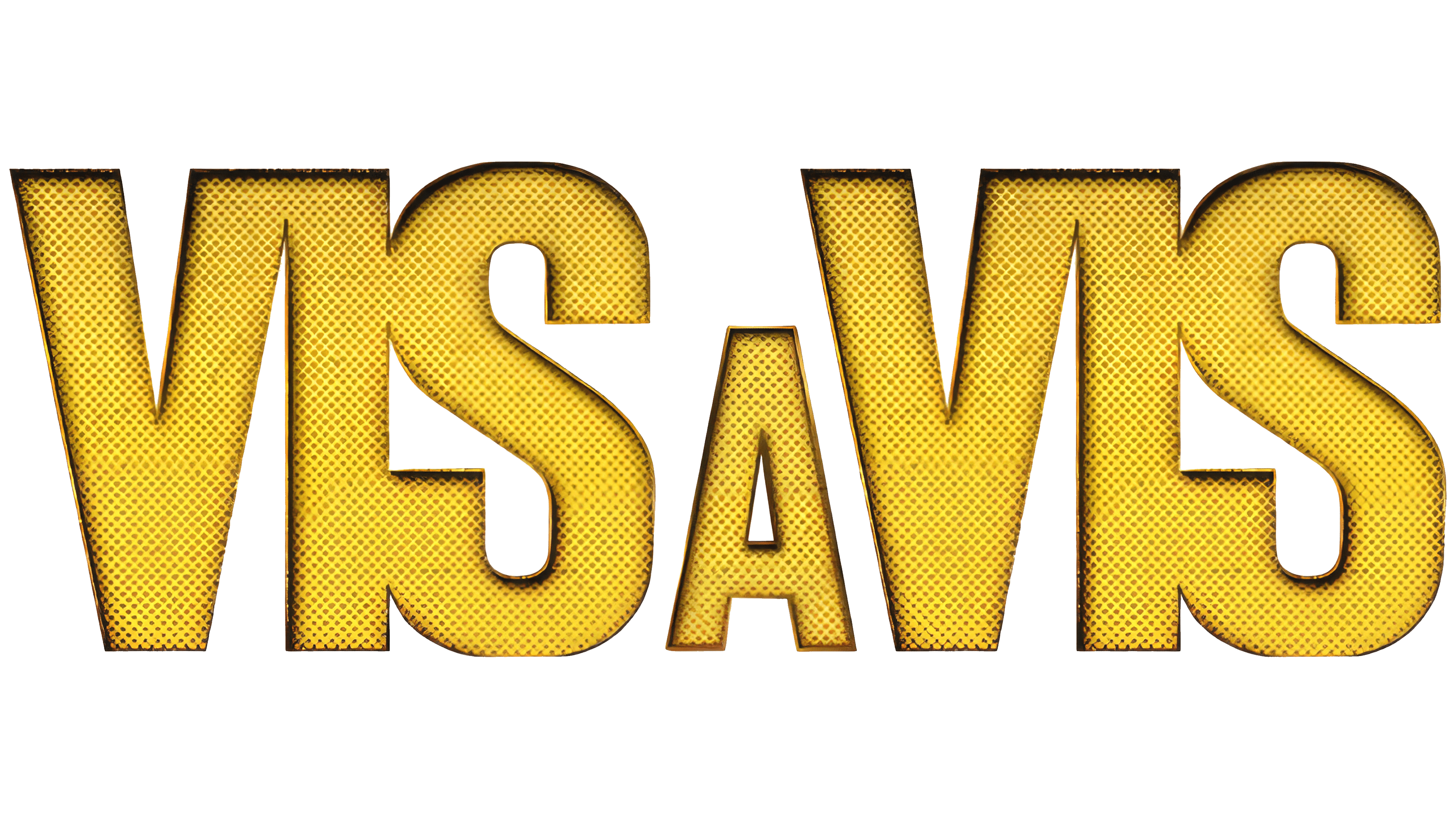
The logo is yellow, symbolizing the fabric of the prison robes worn at the Cruz del Sur high-security colony. Yellow, the color of the sun, helps to endure hardships, overcome difficult circumstances, and survive by uniting with others. The color emphasizes the ability to see the “light at the end of the tunnel,” maintain optimism, and fight for one’s future. These are the qualities that the main character learns in prison.
In the vertical format, the central “A” in black is placed over the other words. This technique further highlights the heroine against the general backdrop and shows her difference from the rest of the prison world. The yellow letters, black dots, and scratches appear to convey the corruption of the prisoners and guards.
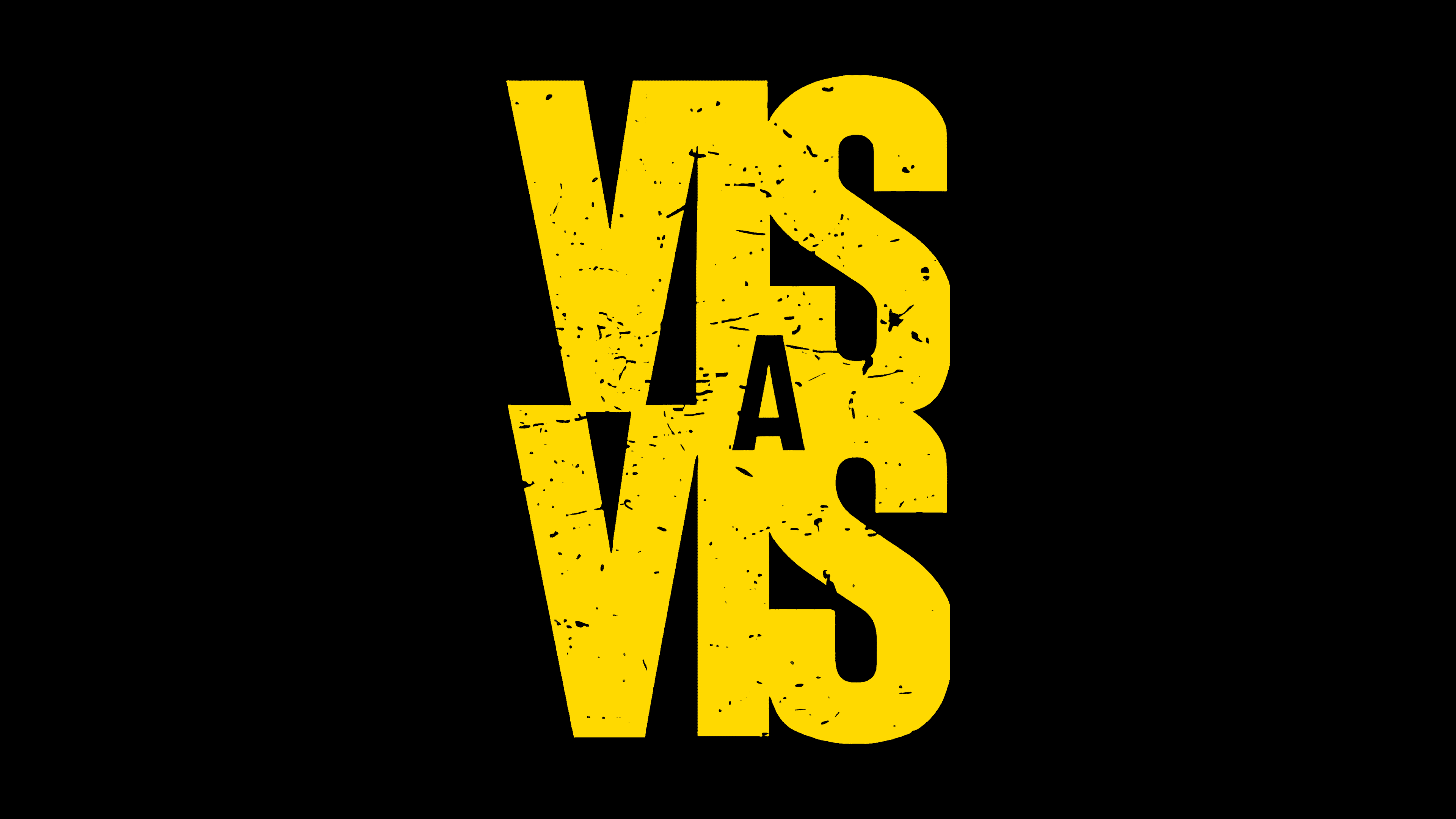
The font of the inscription, Gothic Outline Title Standard, is simple, just like the prison routine. The uppercase letters are written together. Their union symbolizes shackles and enclosed space.
Playing with character size conveys the idea of a small, weak person clashing with overwhelming obstacles. Each letter, like a tall fence on one side and the criminal world on the other, surrounds and pressures the young woman, trying to break and destroy her.