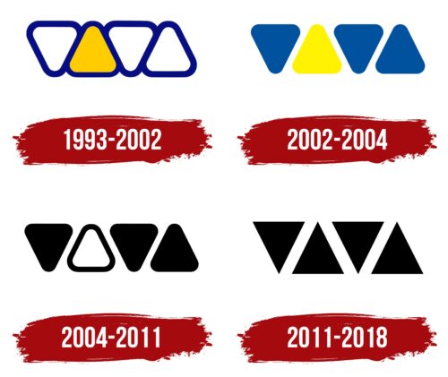
VIVA Logo underwent a significant redesign in 2011 following its acquisition by MTV. The new version retained the original triangular composition but brought a refined, elevated aesthetic. The geometric figures now boasted straight sides and sharp angles, complemented by a shift to a monochrome color palette. Solid black triangles were set against a white backdrop, imbuing the emblem with a modern and stylish feel.
The redesigned VIVA logo offers a distinct break from typical logo designs, thus standing out in the market. Its modern, powerful, and memorable appeal aligns with the channel’s persona, particularly aimed at engaging younger audiences with discerning tastes.
The triangular composition in the logo can be seen as a symbol of stability and power. Moreover, triangles are also associated with change, direction, and purpose, suggesting that the logo channel is dynamic, forward-looking, and goal-oriented.
The adoption of a monochrome color scheme, while seemingly simple, evokes a sense of sophistication and elegance. The stark contrast between black and white reinforces the logo’s visibility and impact, enhancing its memorability.
The VIVA emblem conveys a sense of modernity, power, stability, sophistication, and dynamism, successfully reflecting the brand’s identity and its target demographic’s tastes.
VIVA : Brand overview
| Founded: | 1 December 1993 – 31 December 2018 |
| Founder: | Viacom International Media Networks Europe |
| Headquarters: | Cologne (1993–2005), Berlin (2005–2018), Germany |
| Website: | viva.tv |
VIVA, which translates to “Video Exploitation Facility,” left a significant imprint in German television history as a free-to-air music channel that first hit the airwaves on 1 December 1993.
Throughout its broadcasting journey, the channel redefined music television in Germany. It introduced viewers to a fresh array of music genres, artists, and international hits, acting as a reliable source for music discovery and pop culture trends. It’s dynamic programming, from chart shows and music videos to lifestyle and youth-oriented programming, catered to a broad audience spectrum, earning it a substantial viewer base.
Meaning and History
The brand identity of VIVA was youthful, vibrant, and audacious. Its logo, a lively rendering of the name ‘VIVA’ in bold, bright letters, mirrored the channel’s energetic ethos and commitment to delivering exciting music content. The energetic shade, prominently used in the logo and the channel’s visual theme, resonated with the youth’s spirit, radiating vibrancy and innovation.
Its catchphrase, “Lebe Deine Musik,” meaning “Live your music,” represented the channel’s philosophy of embodying the passion and creativity of music in everyday life. This tagline echoed the channel’s dedication to providing an engaging and immersive music experience for its audience, deeply resonating with music enthusiasts.
VIVA wasn’t merely a television channel but a music institution that celebrated the power of music and its influence on popular culture. Its unique brand identity encapsulated its youthful spirit, passion for music, and connection with its audience, allowing it to thrive as a beloved music television channel for many years.
What is VIVA?
VIVA was a music and entertainment television channel based in Germany that operated from 1st December 1993 to 31st December 2018. It was founded by Viacom International Media Networks Europe, and its headquarters moved from Cologne to Berlin in 2005. The channel broadcasts music videos, reality shows, and other entertainment programming primarily aimed at young adults. Although it was originally created as a German-speaking alternative to MTV, VIVA expanded over the years to broadcast in various languages and countries across Europe.
1993 – 2002
2002 – 2004
2004 – 2011
2011 – 2018
VIVA color codes
| Black | Hex color: | #000000 |
|---|---|---|
| RGB: | 0 0 0 | |
| CMYK: | 0 0 0 100 | |
| Pantone: | PMS Process Black C |


