The VK logo is too abstract to be associated with a social network or a friendly conversation. But the stylish combination of signs attracts attention, so users immediately recognize the logo and the website to which it belongs.
VK: Brand overview
| Founded: | October 10, 2006 |
| Founder: | Pavel Durov, Nikolai Durov |
| Headquarters: | Saint Petersburg, Russia |
| Website: | vk.com |
Meaning and History
When the VK social network was only a start-up, they would call it Studlist.ru to show that the project focused on students and graduates. But the co-founders abandoned this version because it automatically limited the circle of users. Pavel Durov took a more difficult path. He heard the phrase “In full contact with information” on the radio and decided to change it. After a significant reduction, the word “VKontakte” remained, consisting of a preposition and a noun merged together. And from here, the international name has already appeared – VK. This option turned out to be the most successful because it was not associated with any specific strata of society. On the contrary, “contact” indicates the relationship between different people and the possibility of free interaction.
Another important part of branding was the appearance of the site. Pavel Durov wanted his social network to have a personal user profile on the start page, not a news feed like Facebook. He put the person first, not the content. Therefore, when you click on the icon in the upper left corner of the site, people get to their profile. This icon is part of the VK logo, which changed several times when the service owners did a redesign.
What is VK?
VK is the international name for the social network VKontakte, which is available in 86 languages. Its headquarters is located in the city of St. Petersburg. In addition, since October 12, 2021, the Russian corporation Mail.ru Group is also called VK. It was renamed in honor of the popular social network. VK owns its voice assistant, search engine, instant messengers, mail service, and other assets.
2006 – 2012
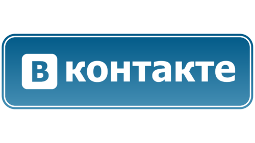
The history of VK began on November 1, 2006: it was then that the social network was open to a limited number of users. Interestingly, Pavel Durov himself created a logo for her, guided by the principles of conciseness and minimalism. He did it in just three minutes, sitting in front of a computer screen. The co-founder of the online platform typed the word “VKONTAKTE” in the humanistic Tahoma sans-serif font that became famous with Windows 95.
The blue “B” was shown inside a white square with rounded corners. A little to the right, with a slight indentation, was the second part of the name. It was white because a large blue rectangle with rounded corners served as a common base. It was adorned with a thin white frame outlined in blue on the outside. And for the visual volume, a smooth gradient was used.
Pavel Durov chose these colors because he believed gray, white, and blue do not cause negative emotions. He relied on the knowledge gained during his studies when an artist came to the lessons and talked about light, proportions, and great painters. And yet, as Durov admitted in an interview, it was an attempt to partially borrow the Facebook logo’s design.
2012 – 2016
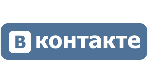
In 2012, the site finally moved to a new domain in the .com zone and received an updated logo. The designers changed the previous version quite a bit, removing the white border, removing the gradient, and adding a slight purple tint to the blue color.
2016 – 2020
On April 1, 2016, VK got a logo without Cyrillic inscriptions. At first, it looked exactly like the international version of the icon adopted in 2012. It was a blue square with rounded corners, inside a white monogram of the combined letters “V” and “K.” They had smooth edges and one triangular serif. And in November 2016, the emblem was updated, resulting in the lines becoming a little thinner. The employees of Moscow Design Studio: Ilya Ruderman and Olga Pankova, were responsible for the processing.
The author of the original monogram logo (from 2012) is Pavel Durov himself, although it was then created by Art Lebedev studio. The design company came up with hundreds of other variations with different combinations of “V” and “K.” Still, the social media executive rejected them and drew in pen a sketch that he thought was the most suitable. Subsequently (after many years), Artemy Lebedev criticized the result and admitted that his studio refused authorship so as not to disgrace himself. He compared the monogram to the Russian letter “Zh” without a stem and dismissively called it “under-Armani.”
2020 – 2021
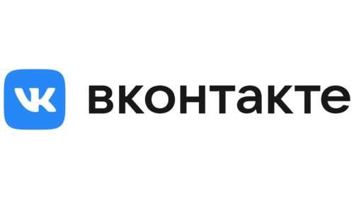
The return of the Cyrillic alphabet marked 2020. This happened on October 9 – on the eve of the fourteenth birthday of the social network. The VK logo retains a white monogram inside a square with rounded corners. She has not changed much, except that the shade of blue has become much brighter and lighter. To the right of the emblem, a black inscription “VKONTAKTE” in Russian was added. There was a step back – to the times when Cyrillic letters were used.
It was the largest rebranding in the history of VK. Designers not only gave the brand a new corporate color but also developed their font for it, whereas before, the name was not considered an independent graphic sign. The text block was typed in the grotesque VK Sans, created by VKontakte employees and specialists from the TypeType studio. This typeface has become a connecting element for all services included in one ecosystem.
2021 – today
In 2021, the Mail.ru Group took the name VK itself so that users know who owns the online platform of the same name. So now this brand is the only one for the Russian holding and all its services. The same goes for the monogram of the white letters “V” and “K” inside the blue square – it is recognized as a common graphic sign of the entire VK ecosystem. However, the social network logo still contains the Cyrillic inscription “VKONTAKTE” – exactly the same as in the previous version.
After a redesign in 2021, the shade of blue has changed: the developers have made it darker. The triangular serif has disappeared at the top of the monogram, and the sidelines have become clearer and smoother.
Font and Colors
The main symbol of the VK brand contains two letters from its name. This element was invented by the creator of the social network – Pavel Durov. Even though the sign resembles an inverted hieroglyph, it does not have any hidden meanings.
The word “VKONTAKTE” is written in Cyrillic letters using a font called VK Sans. This grotesque was developed by VK’s in-house designers and TypeType employees, who wanted the brand to have its unique typography. Three colors from the official palette were chosen for the logo design: white, black, and blue (shade #0077FF).
VK color codes
| Blue | Hex color: | #0077ff |
|---|---|---|
| RGB: | 0 119 255 | |
| CMYK: | 100 53 0 0 | |
| Pantone: | PMS 2727 C |
| Black | Hex color: | #000000 |
|---|---|---|
| RGB: | 0 0 0 | |
| CMYK: | 0 0 0 100 | |
| Pantone: | PMS Process Black C |


